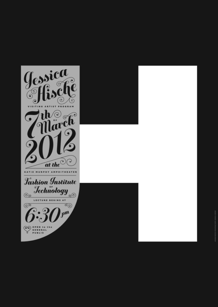
I chose this poster because I initially didn’t know Piscatello was using the initials of the artist so I wanted to know why ‘H’ was curved on one side, and, I thought I saw a familiar name from a previous type talk. The large block for ‘H’ would have been a sans serif while the ‘J’ could probably be classified as novelty. A lot of the text is calligraphic (in the style of Jessica Hische) and novelty/decorative with bold sans serif mixed in. I think the calligraphic type works in catching attention, if someone was passing it, they might stop to see what all the loops and swirls are out of their peripheral vision.


This is a good description of this poster—especially as it perfectly shows the way the sans and specialty types complement and clarify each other.