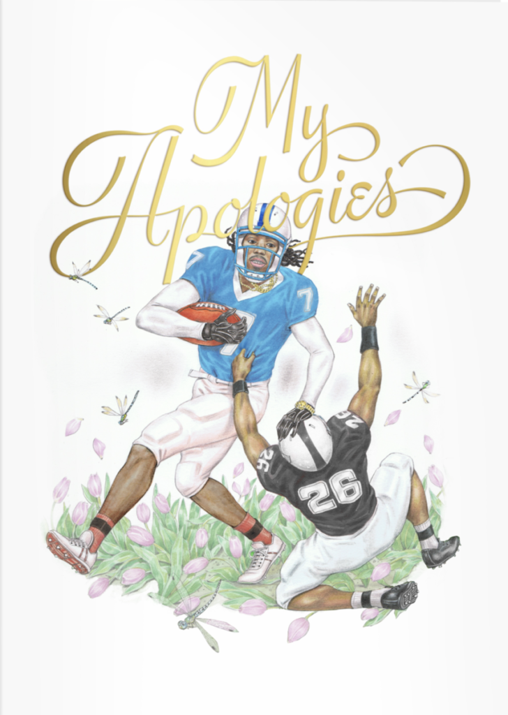
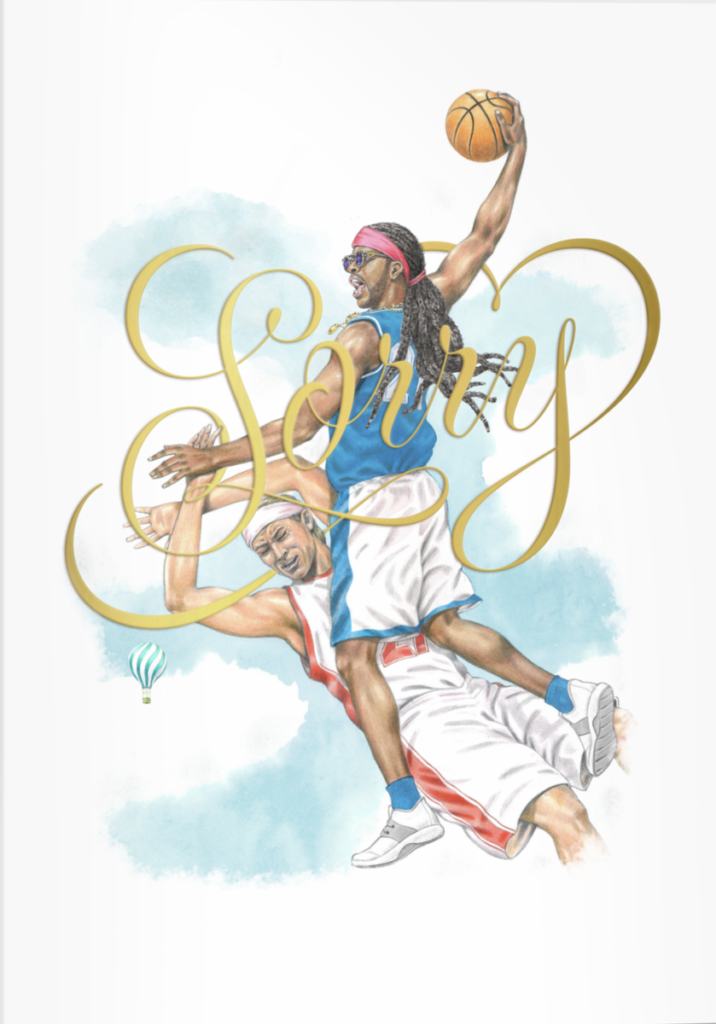
I chose Jessica Hische and her ‘Powerade Sympathy’. The overall piece(s) are funny as some give visual oxymorons; apologizing while actively pushing someone in the face. Similarly with the style of the lettering the phrase or sentence, in combination with the images, contrasts the actual sentiment.


Leave a Reply