The covers that immediately caught my attention were the ones that formed a circle or the path was set on a slant/diagonal. Type that doesn’t follow horizontal paths can be successful as they lead the viewers and keeps their attention as they’re “unconventional”.
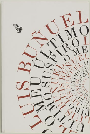
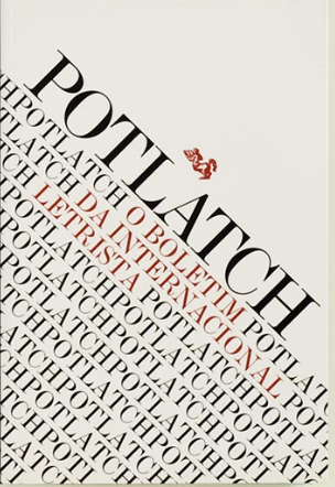
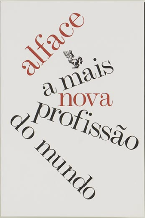


Well-said and well-edited, Zoe. “Unconventional” and “spark” (describing the third cover you singled out) are particularly-strong descriptions.