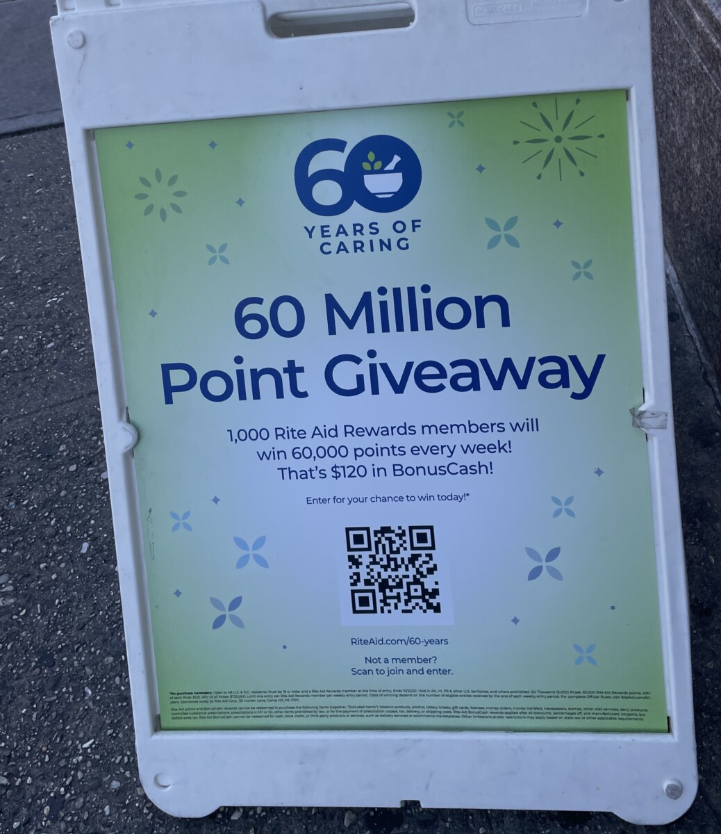
The bold is basically the heading and the regular is the information. This was found outside the pharmacy.
Beth Tondreau | COMD1127—D035 | Fall 2022

© 2024 COMD1127 Type and Media
Theme by Anders Noren — Up ↑
The OpenLab is an open-source, digital platform designed to support teaching and learning at City Tech (New York City College of Technology), and to promote student and faculty engagement in the intellectual and social life of the college community.


Leave a Reply