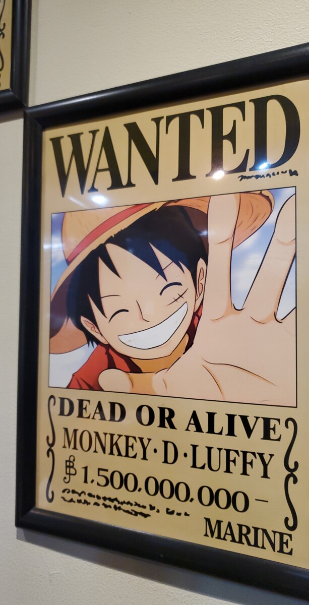
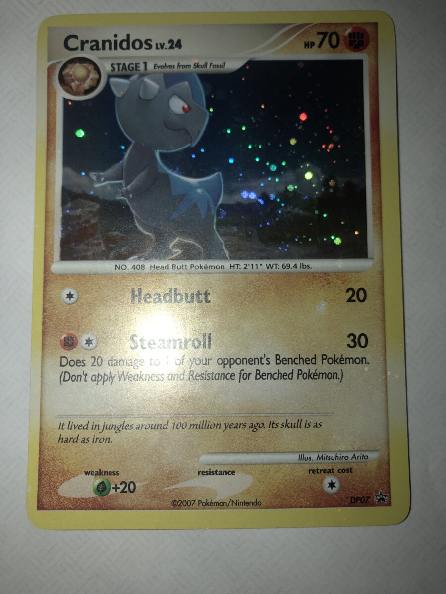
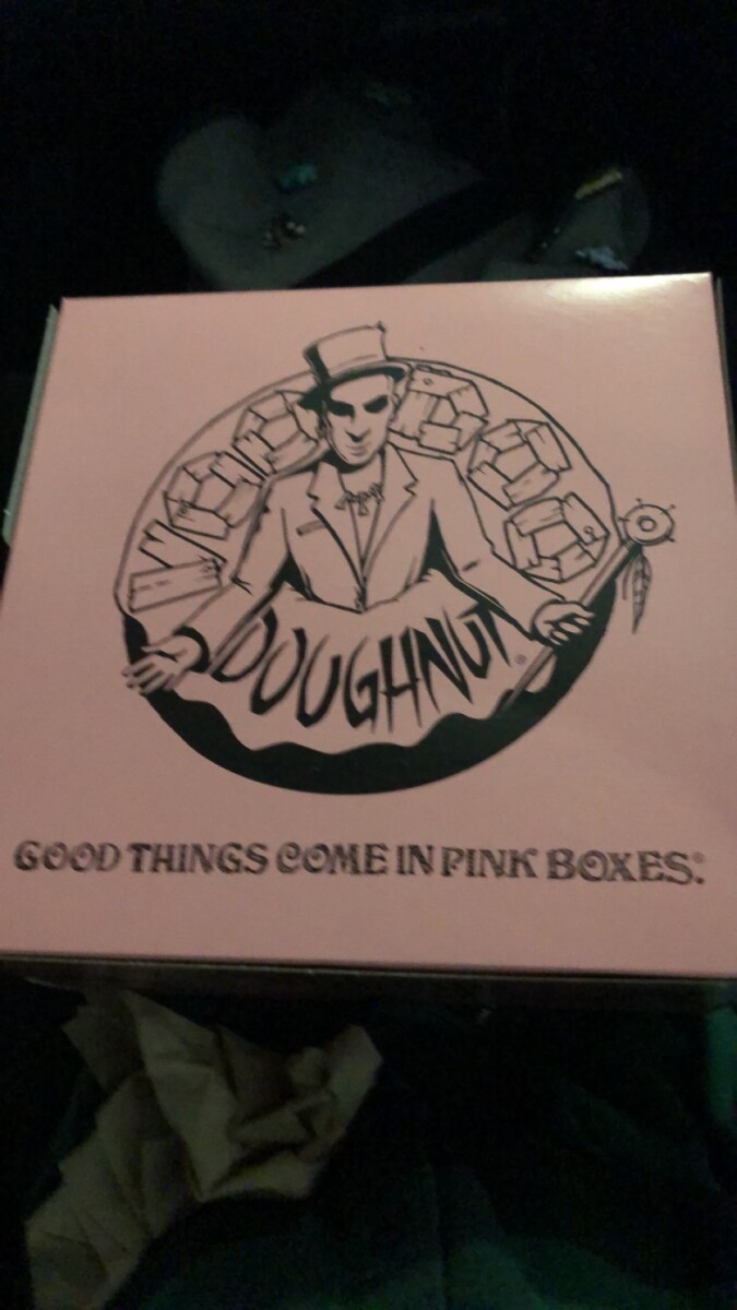
In the first picture I found at a ramen shop on the Upper east side, the Wanted has heavyweight as it is bold and the letters are big and thick as the name is lightweight with thin strokes in each letter. In the second pic I found in an old collection, the name of the pokemon and his attack moves are bold as well as the attack damage and it is done that way to catch the reader’s eyes since all of the things are important, the words In the parentheses are italic or seem a bit narrow compared to the other words while the word above seems to have regular weight, it is done this one to show what is it important in the text of the card and to make the card easier to read while looking for important information. The last picture I took at a doughnut store in FL, shows a combo of narrow heavyweight letters in the name and a unique typeface underneath, the narrowness helps the letters fit into a doughnut as seen in the image as well as capture the eye of buyers.


Leave a Reply