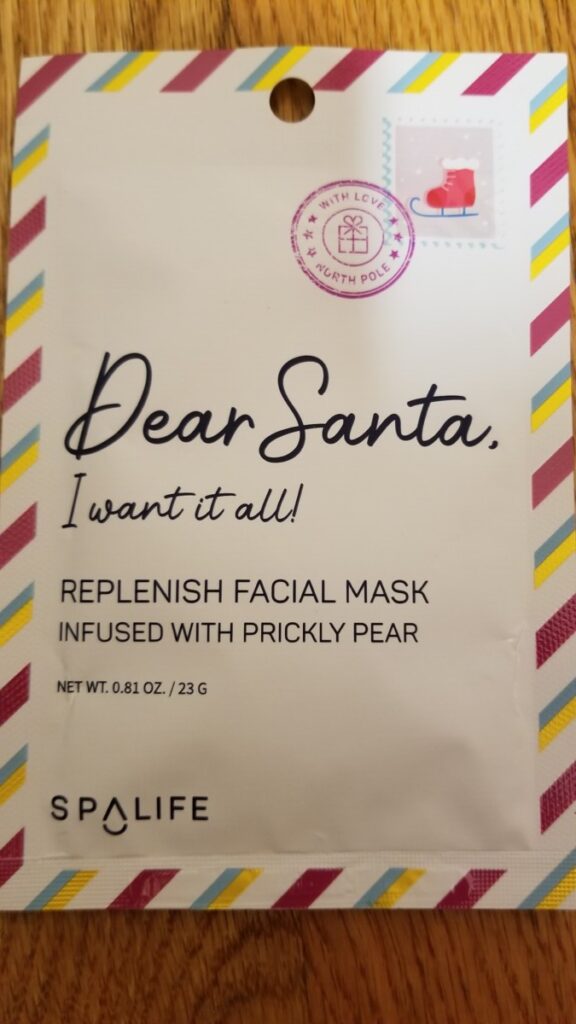


The second image is of a face mask packaging. It’s cute, formatted to look like fancy paper design with a postage stamp, like an actual letter, all that jazz. Then, in italics, is the opening of a letter addressed to Santa. It feels kinda real, like when people write actual letters addressed to someone.
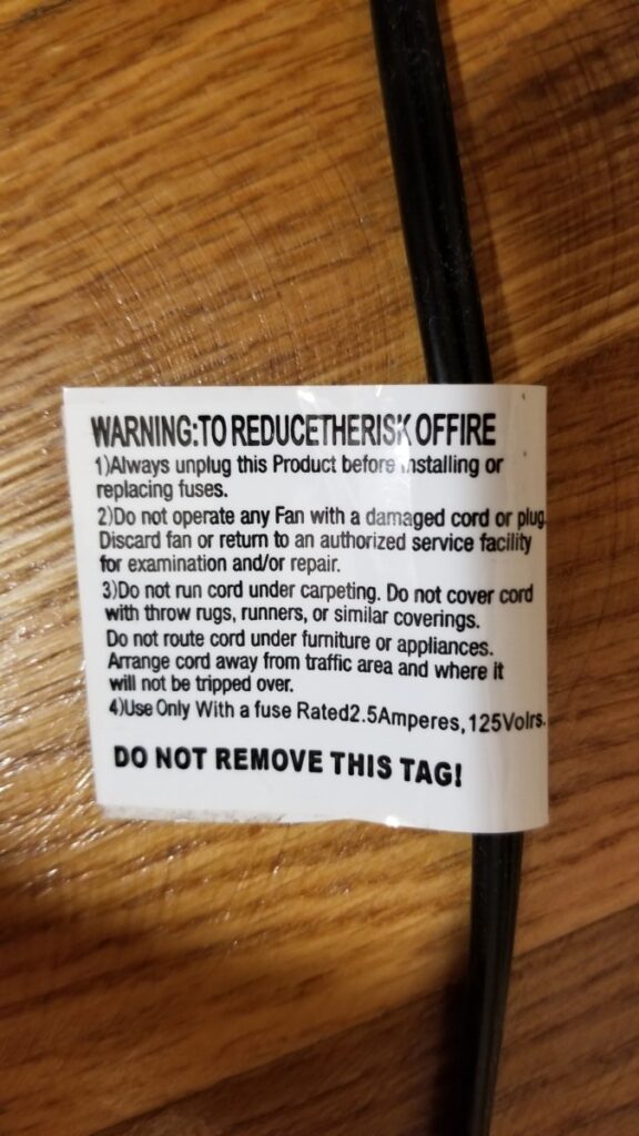
The third image is of bold next to regular, which in my opinion, reads “WARNING: TO REDUCE THE RISK OF FIRE *skip over fine print* DO NOT REMOVE THIS TAG!” It’s not a particularly bad design because, let’s be real: who has ever read those tags stuck to the wires of appliances? So far I haven’t, and nothing has set on fire yet.


Leave a Reply