While walking around the store and running some errands, I found these examples on the shelf at Target. The Glade logo looks like a script-style font. The logo looks very fancy and shows a sense of elegance. The “L” extends in a curve showing the creativity of using 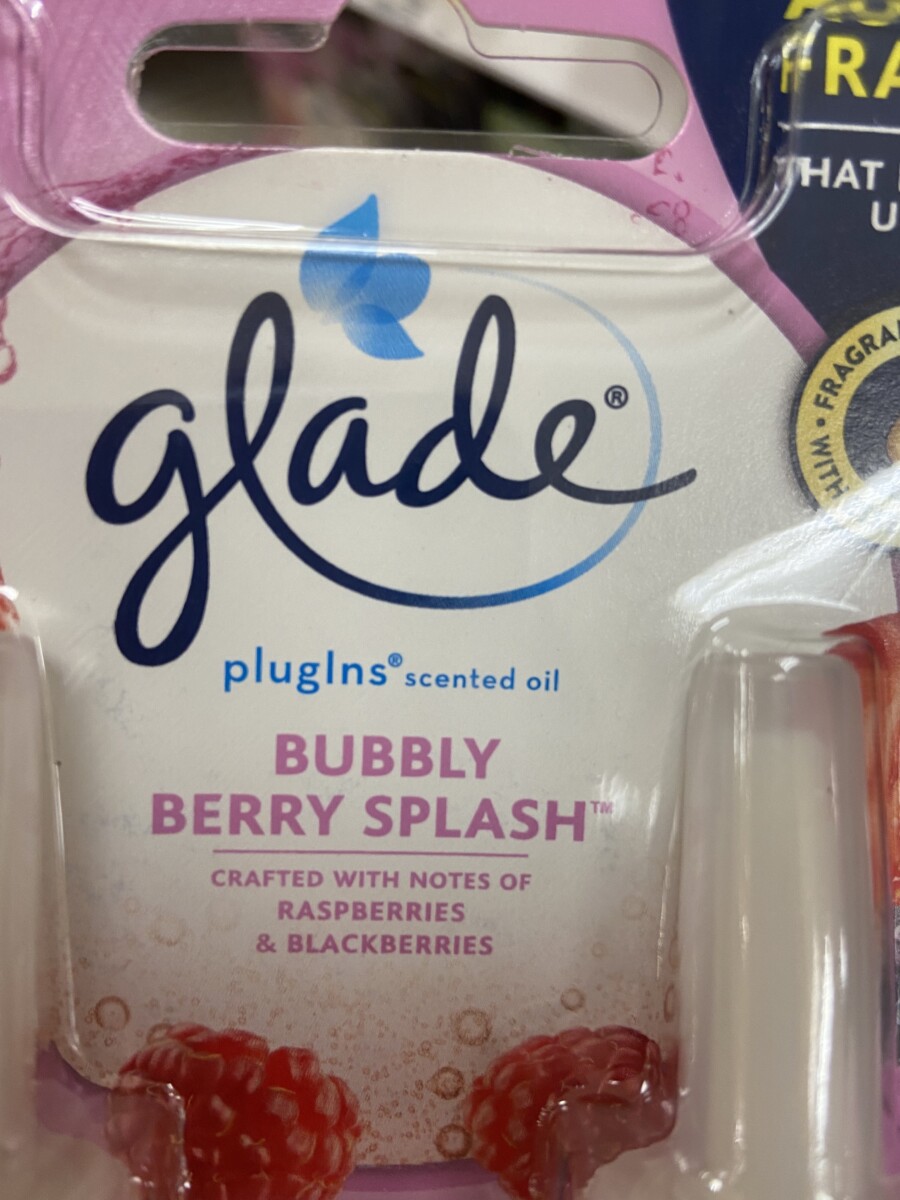
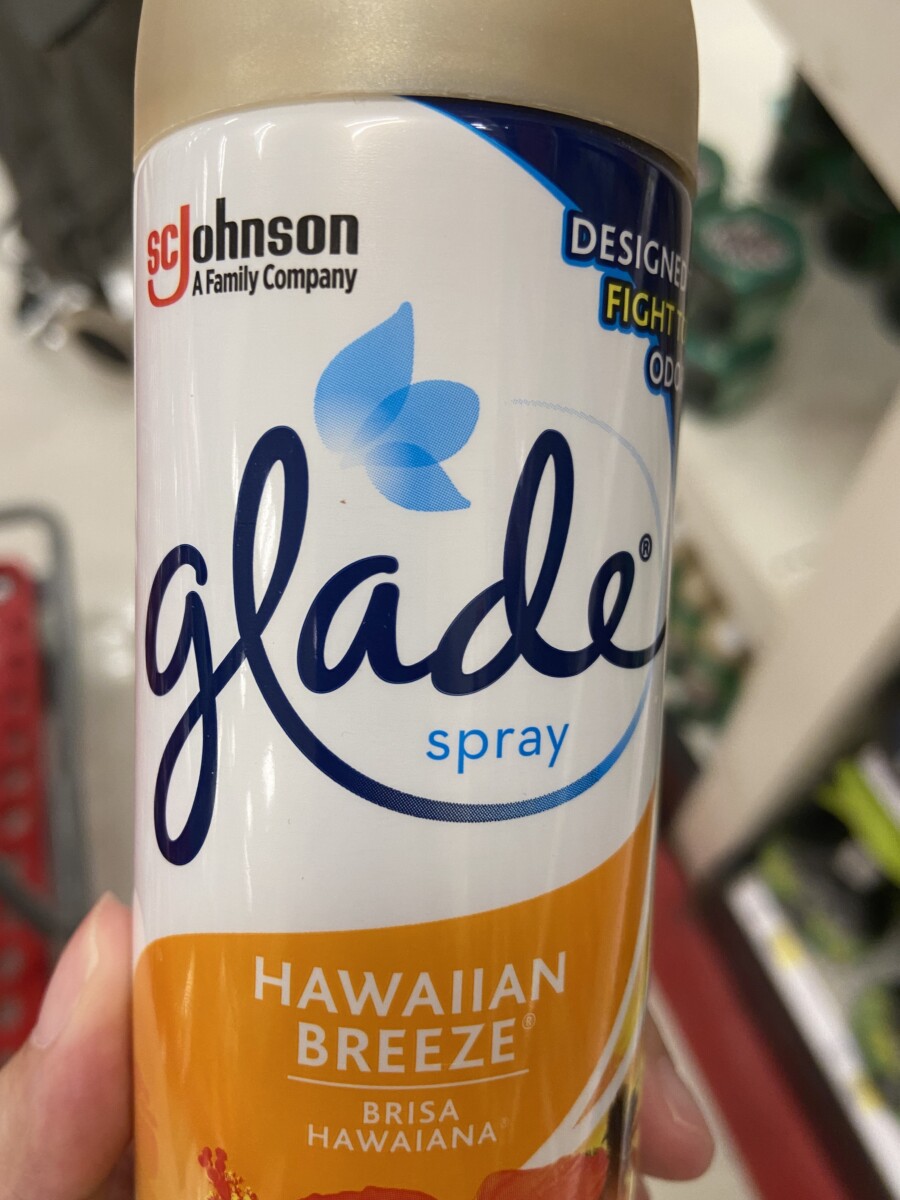 script. The logo looks very simple and pleasing to the eye. This matches the product because Glade is a product for air refresher and this style font shows a simple and clean look.
Beth Tondreau | COMD1127—D035 | Fall 2022
License

© 2025 COMD1127 Type and Media
Theme by Anders Noren — Up ↑


Leave a Reply