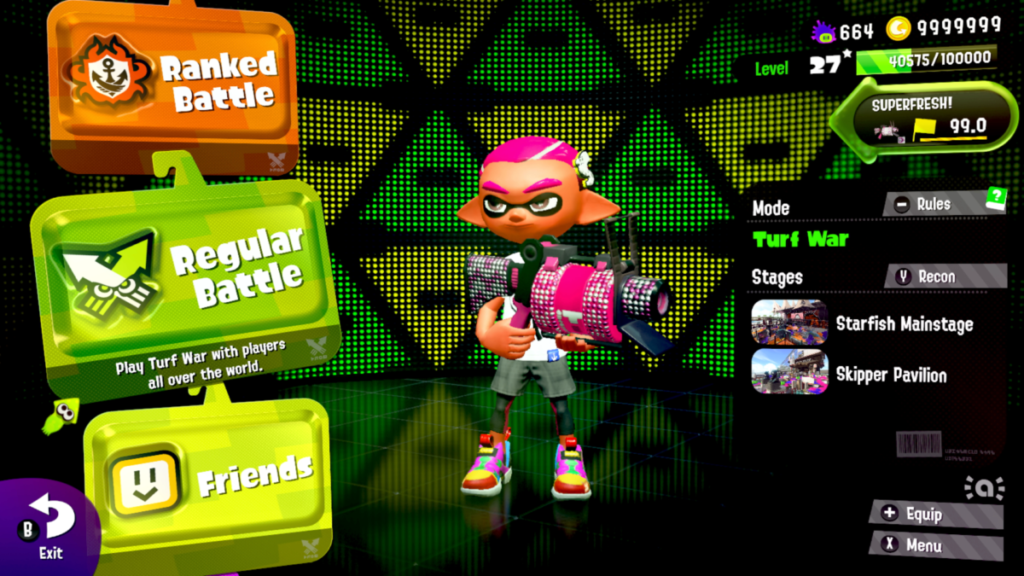
So as cheesy as it is I got this example from home playing Splatoon 2 for the Nintendo Switch. Here you can see two different types of fonts being put together. As one font describes the topic of a mode, and another font describing the details. ( Text that looks like “Regular Battle” is the topic.) With the smaller text it briefly summarize what the mode is about. They’re used together to help a player determined what they wish to do, before they begin.
KEY INFO
Professor
Beth Tondreau (Mary-Elizabeth)
Email
mtondreau@citytech.cuny.edu
Office Hours
Tuesdays and Thursdays from 11:00am to 12:00pm, Pearl-116 (after class).
Course description
A foundation course in typography with emphasis on using type in industry-related applications from print to interactive. Students will be introduced to principles of type design and terminology
Search this Course
Find Library Materials
Library Information
Ursula C. Schwerin Library
New York City College of Technology, C.U.N.Y
300 Jay Street, Library Building - 4th Floor
OpenLab Help
Sharing
Logged-in faculty members can clone this course. Learn More!
Acknowledgments
This course is based on the following course(s):
Leave a Reply