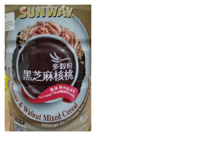
This is a tin of ground black sesames and walnuts that sat in a kitchen cabinet. The brand name at the top is sans-serif: It reminds me of people out in the fields wearing their bamboo hats. There’s even a shadow behind the brand name with a sun hanging out in the ‘S’. The product name is smooth flowing and neat with its serifs. It’s like an ad on T.V. where the voiceover is a silk-smooth voice or has a voice deep and rich like honey. Below the product description is a translation sans-serif. It is white so that it stands out enough to be noticed, but smaller and duller, not taking away attention from the attractiveness of the product name.
The brand name seems to draw in the consumer and the product name pulls the consumer into purchasing it.


Leave a Reply