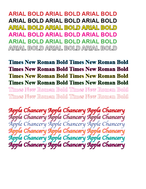
The “Arial Bold” font is what appeals to me because I’ve been using it for most of my work and because it’s a really straightforward font. Not only that, the font is really simple for me to read and comprehend. Aside from “Arial Bold,” I also like, “Times New Roman Bold,” as I like to use the font when it comes to an essay or when I’m doing a project, it also looks good when I write my name, “Samridha Lamichhane.” The writing in “Apple Chancery” appears a little fancier, and I really like how unique it looks from the other two fonts I chose. It has a good design of the font and I can also read the font well.
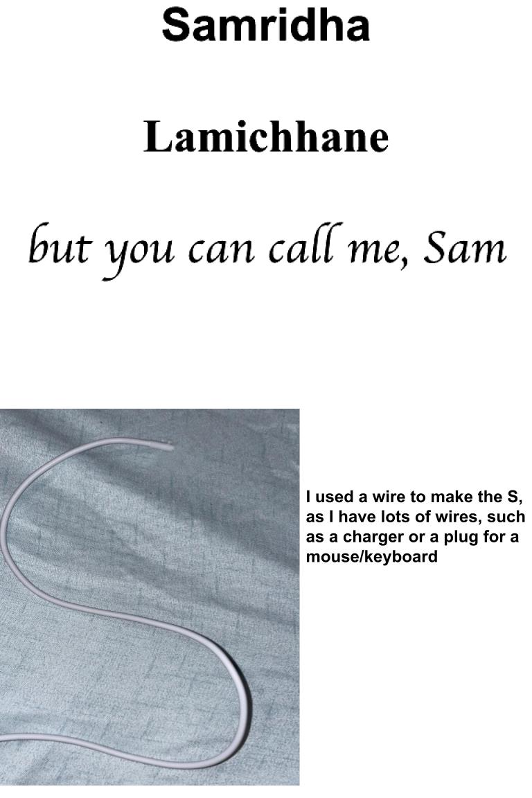


LOVE Love LOVE the “S”! Very clever use of your wires. What a great explanation, too. To make it more of a name tag, I suggest you incorporate your name and “but you can call me Sam” into the right side.
Thank you, and okay!