Class Info
- Date: September 13, 2022 (Tuesday)
- Meeting Info: In person, Pearl 116, 8:30 to 11:00am, followed by Professor’s office hours
Topics
—Grade Policy
—Variable Fonts
—Type: Weight, Width and Posture (Pages 5, 6, and 7 of Type Book)
—Notes for post-class Participation Activity
GRADE Policy
FYI:
—Type Vocabulary and Classification will be ONE grade
—Variations will be ONE grade
—Alignment / Leading/ Tracking will be one grade
More info to follow
Please review this Quick Reference PDF with Classification Info. We first saw this PDF in Class 03 and reviewed it in Class 05.
[Info added after class: we reviewed Pages 3 and 4 of Type Book, Type Classification. ]
Activity 1. Variable Type
Participation Activity. Complete in class

- Working with Variable Typefaces for design layouts and web
- First look to see if you have the typeface Acumin Variable Typeface or Source Code Variable if you have them ok, we will test them.
- Another option: Go To Adobe Fonts and look at typefaces designated as VARIABLE. Choose one and activate.
- Then, Type Challenge Activity: Variable Typeface
- Create new InDesign doc
- 11 × 8.5 inches (landscape)
- 1″ margins all around
- 1 page
- 3 columns, 2 picas gutter
- Use the word “Variable”(approx 72 pt size), copy/paste it so that is it now three times (one on each column)
- On column one highlight the word and go to the variable font type slider (depending on the typeface you might see a width, weight or slant slider), and bring the weight slider it all the way to the left.
- On column three highlight the and go to the weight variable font type slider, and bring it all the way to the right.
- On column two highlight the word and go to the weight variable font type slider and place as you wish. Copy paste the word two more times, and place under (in column two), move the slider some more and customize further.
- Save your work in Indesign and export as jpg named:
“Last Name_First_Name_ TC_Variable.jpg”. - Create a new post named “Last Name_First_Name_ TC_variable”
- Give it categories:
“Student Post” and “Student Post Type Challenge” - Insert jpg INTO your post.

Project 1: Continue Type Book:
Type Variations (Pages 5, 6, and 7 of book)
Earlier in the class, as a Participation Activity, we looked at some variable typefaces. Variable typefaces are being used more commonly. Soon we will start seeing more typefaces designed this way, allowing quick flexibility and adjustments to type as layout change.
We still have many typefaces that are not variable, but offer variations (fonts).
Objectives
Learn basic type variations in width, weight, posture, contrast, serif,
- Weight (Bold, light, etc)
- Width (Extended, Expanded, Condensed, etc)
- Posture/ Slant (Regular or Roman, Italic, Oblique)
- Contrast (High, low)
- Serif (brackets, angled, others)
- Continue page setup InDesign
Activity 2 (Graphic Assignment)
Graphic Assignment: Start during class; finish for Sept. 15, 2022
Complete Pages 5, 6 and 7 only (weight, width and posture)
See this PDF with variations of type, with specifications in red by Professor Beth. This PDF for Class 06 is also in Dropbox. DO NOT include the specifications in red; those are for instructions only.
Select first letter of Person or Group you chose
Page 5: WEIGHT
Use same typeface family for all characters on this page, and
always identify the typeface and font
5th column Title: Type Variations: Weight
—1st column blank
—2rd column = a light character
—3rd column = a regular character
—4th column = a bold character
** Follow the same format for other pages
Page 6: WIDTH
Use same typeface family for all characters on this page and
always identify the typeface and font
5th column Title: Type Variations: Width
—1st column blank
—2rd column = a condensed character
—3rd column = a regular character
—4th column = an extended or expanded character
Page 7: POSTURE
USE LOWERCASE characters
Use same typeface family for all characters on this page and
always identify the typeface and font.
5th column Title: Type Variations: Posture
—1st column blank
—2rd column = a regular character
—3rd column = blank
—4th column = real/true italic character (that is, an italic set in the face; do NOT tilt manually)
- Do not use the same typefaces used in any of the examples provided (faces to come) or Quick Reference Material
- (As always!) save your InDesign file
- Export pages 5 to 7 as a PDF
Lastname_variations_wwp_091322.pdf - [NOTE: In class, I did not stress adding the date as a suffix to your PDF; if you’ve already uploaded your work, the name will be OK as is.}
- Place PDF file only in Dropbox
Below are screenshots of samples, using a typeface named Frutiger (a Humanist Sans Serif designed by a man named Adrian Frutiger).
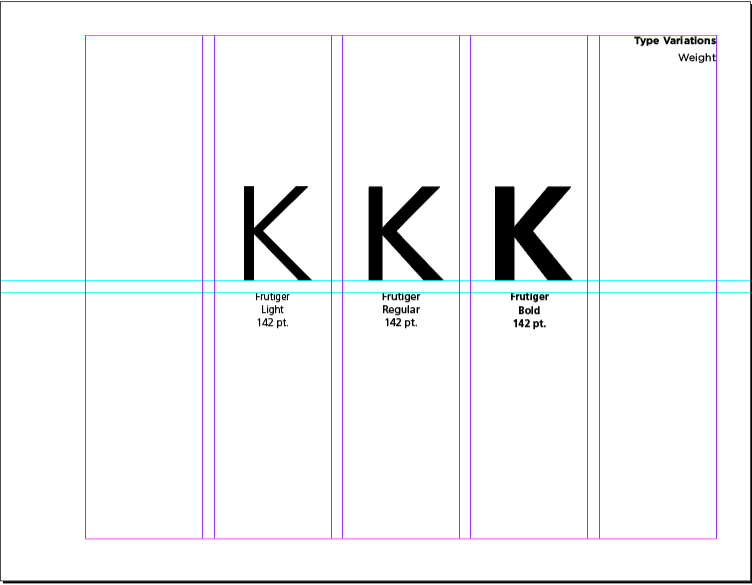
Choose and use a different face.
Of course, all pages include the heading at the top of column 5.
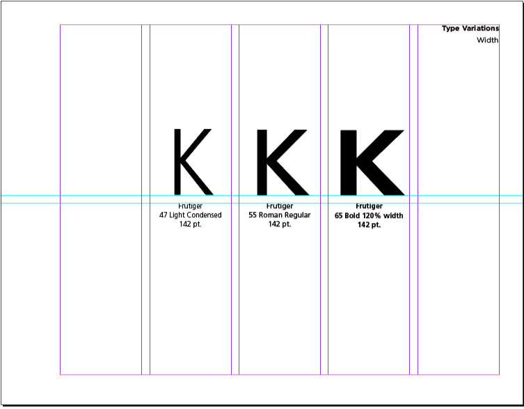
Choose and use a different face.
Of course, all pages include the heading at the top of column 5.
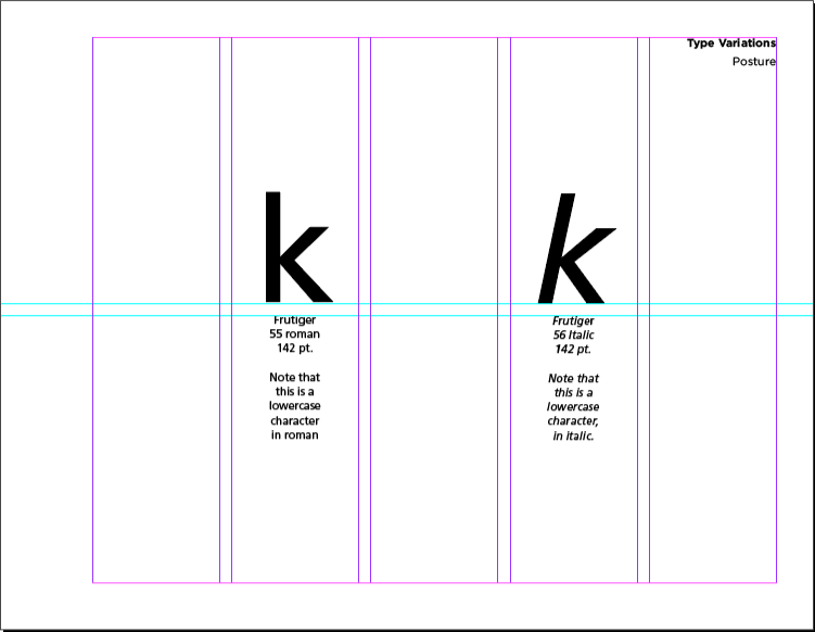
This is also an example using Frutiger. Choose and use a different face.
NOTE that page 7 shows examples of letterforms in only columns and and 4.
Of course, all pages include the heading at the top of column 5.
DO NOT USE THE SAME TYPEFACE SHOWN HERE. Choose your own face and insert your own captions, following the format listed above and shown on this sample.
_________________________________________________________
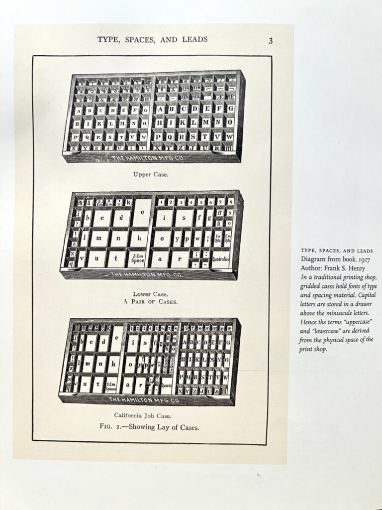
What’s in a name?
What is “Upper Case”? What is “Lower Case”? And where do the names come from?
_____________________________________________________________________________________
To-Do after class =Homework Assignments
Assignment 1. Started in class.
Complete Graphic Assignment pages 5, 6, and 7 and upload to Dropbox a PDF of those three pages only.
lastname_project01_wwp_091322
_________
Assignment 2. Do after Class.
TYPE SCAVENGER HUNT
Examine the use of variations in type. Why are things bold, or italic? why might something be condensed or extended?
For this Participation Assignment, Post:
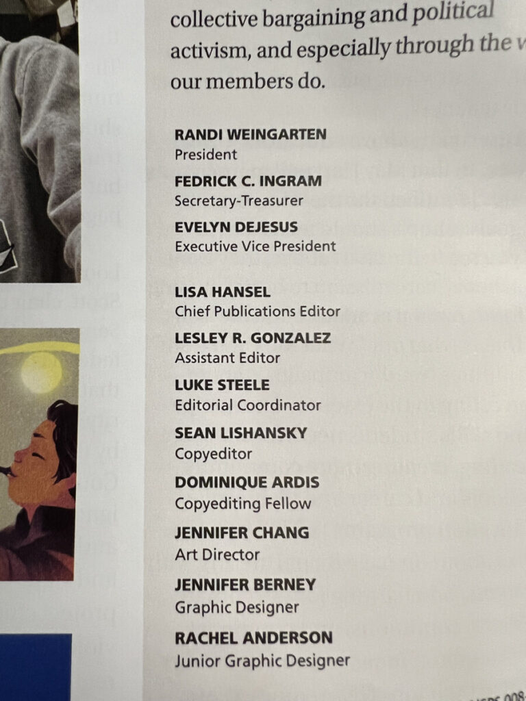
- One example BOLD text next to regular type (also referred to as ROMAN)
- One example of ITALIC next to regular
- One example CONDENSED/NARROW Typeface in use
Immediately below are a few examples showing: bold with regular, bold with light, different weights. You must also find a regular next to italic. [After class, I added a sample of regular type with italic—and bold—below.

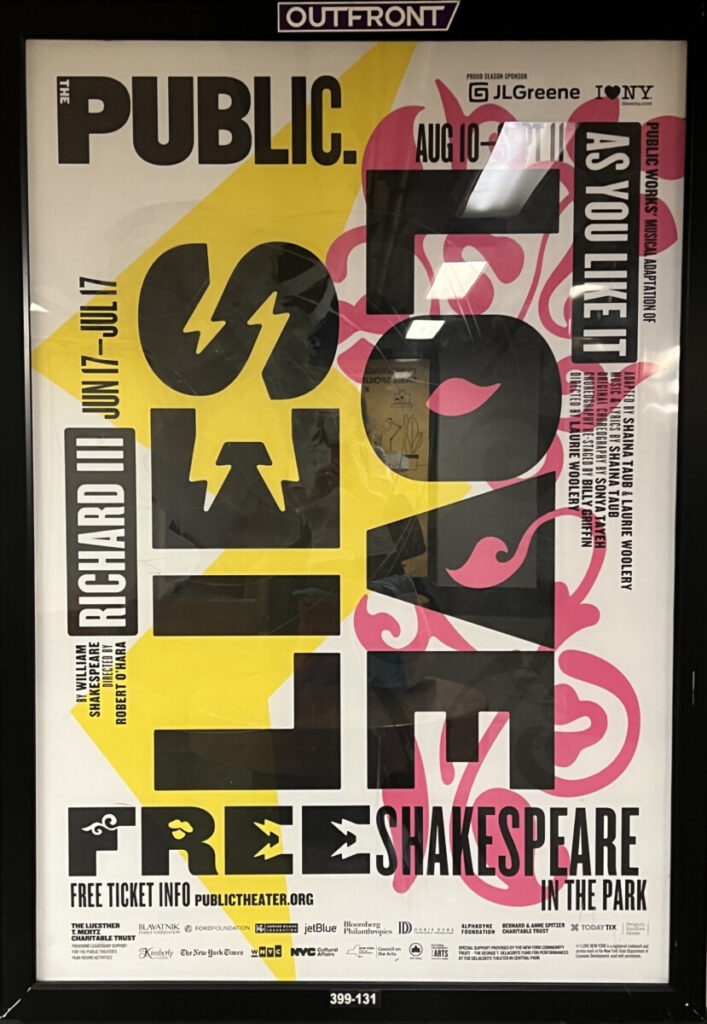
Extra info about the image on the right can be found by following this link:
https://www.pentagram.com/work/shakespeare-in-the-park-2022/story
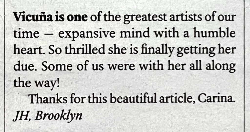
Here’s another example of text (a letter to a publication).
Reminder about Type Scavenger Hunt Gallery
—Go to your dashboard and create a new post:
—Give it categories (under the GEAR>Document>categories>STUDENT POST and STUDENT POST TYPE SCAVENGER HUNT)
—Add title: LAST name, first name: Scavenger Hunt
—Go to the small plus sign and add a GALLERY
—Then add your photos.
—Always write a caption with your comments: Where did you find your items, how they were used?

_______________________________________________________________________
Graphic Assignments are always due the day before class at 8 pm, and must be uploaded to Dropbox unless indicated otherwise. Assignments uploaded during class on the day that they are due are marked as late.
Participation Activities (Scavenger Hunts, Type Talks and Type Challenges) are due during class or the day before class at 8pm, as specified. The Participation Activity is saved as a jpeg and posted to OpenLab in the category specified.
Print this page


Leave a Reply