Class Info
- Date: Thursday, December 1, 2022
- Meeting Info: In person, Pearl 116, 8:30 to 11:00am, followed by Professor’s office hours from 11:00am to noon in Pearl 116.
Reminder about Refined Projects 01 and 02:
- Refined versions of Projects 01 and 02 are due by Class 28 (i.e. the night before class!) December 13, 2022.
- Project 03 is due Class 29 for final refinements. Everything must be completed by Class 29 (December 15)
- Presentation of Project 03 will occur in Class 30 (December 20)
Topic
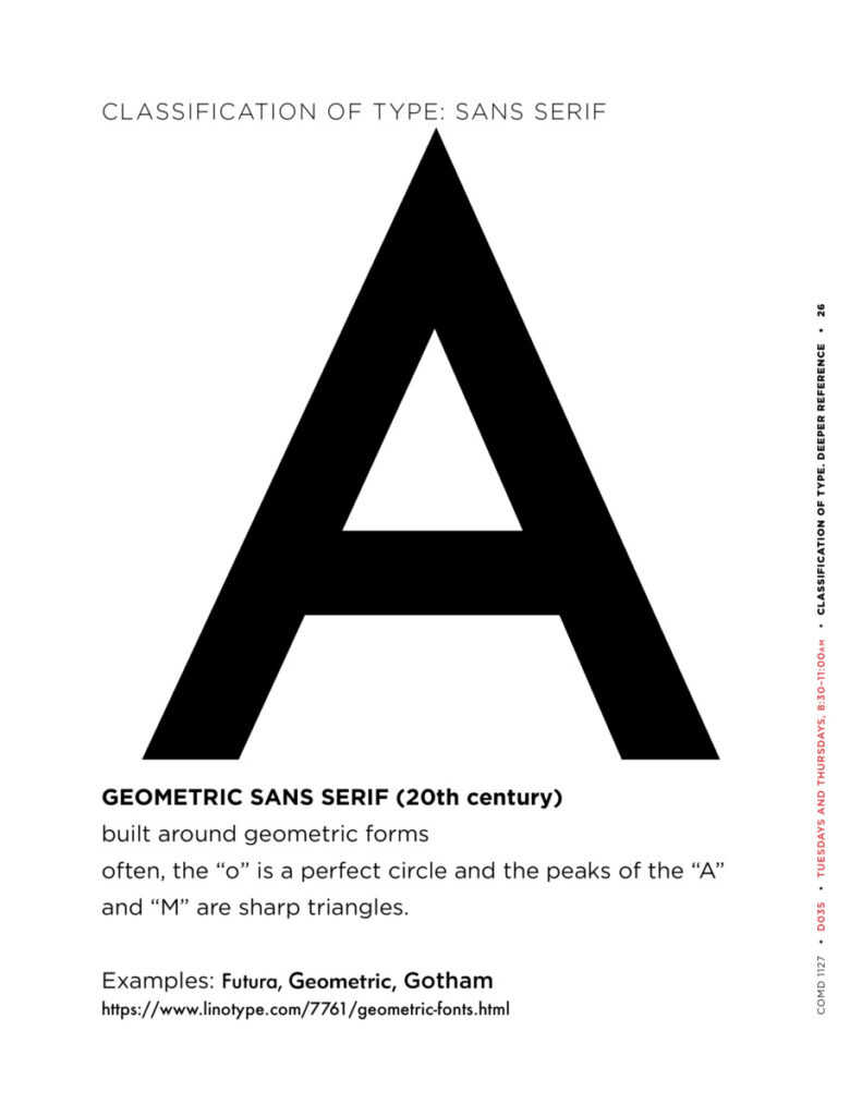
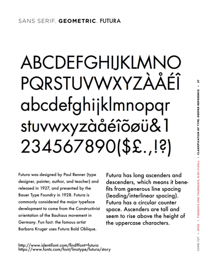
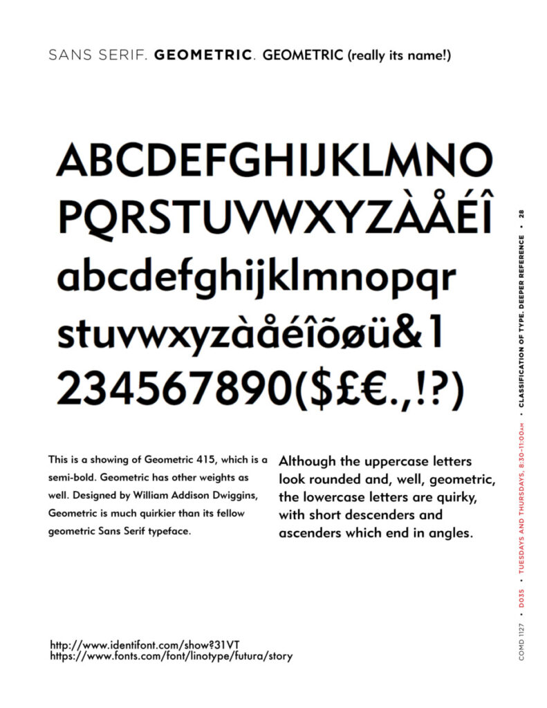
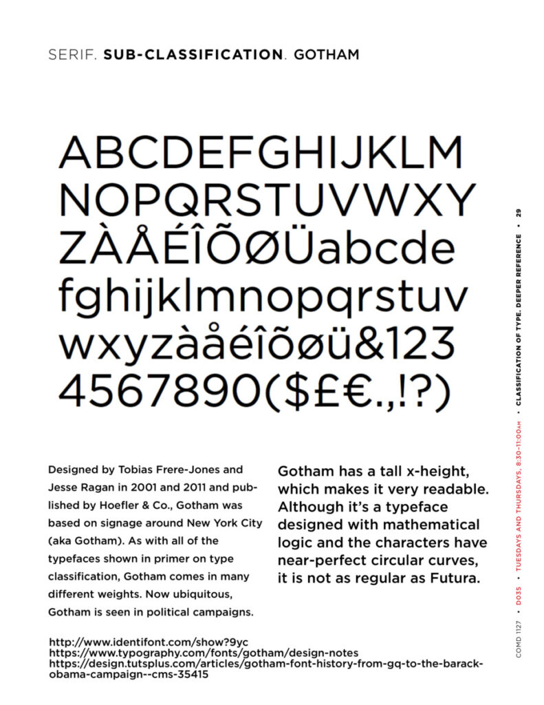
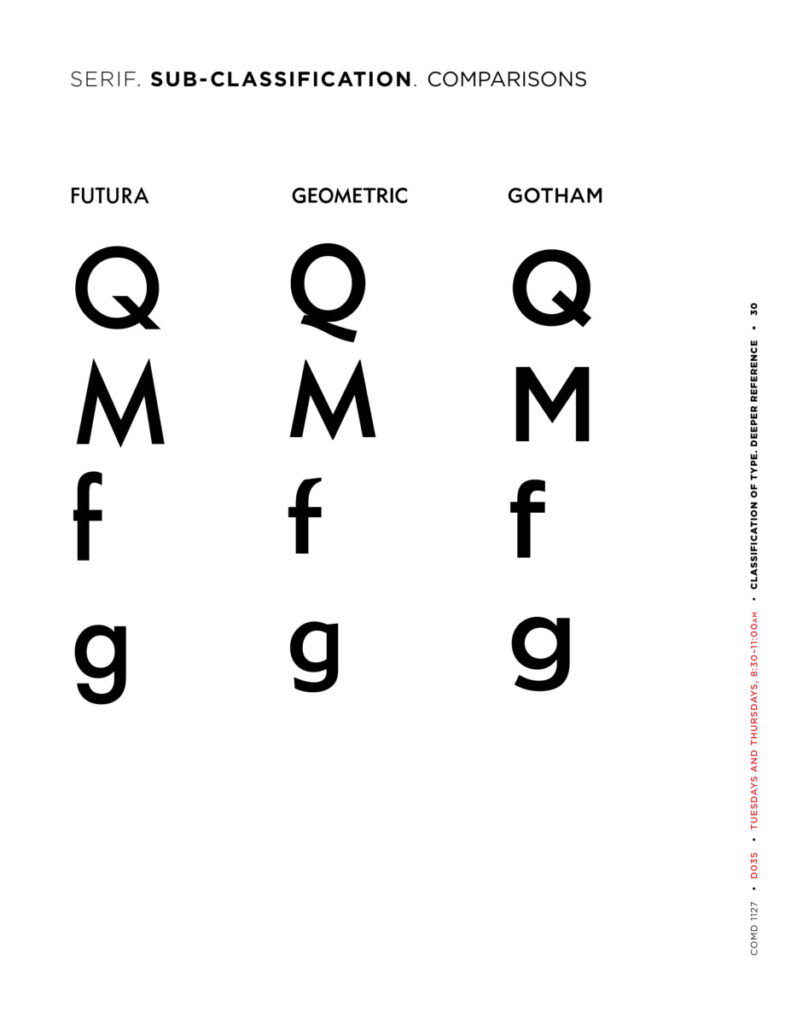
- Type Classification: Sans Serif. Sub-category: Geometric
- Project 3 : CONTINUE Posters; START Social Media Posts
Objectives
Explore contrast and legibility though use of actual color (other than black), imagery (photos), and type.
Review/Samples: Geometric Sans
See Interactive PDF on Dropbox and (the same) examples below.
Activity 1
Posters
- Continue to work on your posters.
- Have a look through the website of Poster House.
- Does your poster grab attention??
- Keep in mind that SCALE is important.
- Make sure the title of your concern is the most prominent or noticeable item. Your text and factoid can be smaller in comparison.
- Hierarchy is below. Note that “Cause for Concern” is like a flag; it declares the theme of the exhibit but it is not the title/main concern.
- Title
- Your brief text (can be MUCH smaller than you think
- Factoid (can be much smaller than text)
- Source of factoid (can be smaller than factoid
Activity 2
Social Media Posts: Design four
Description: In addition to your posters (you’ll present the strongest 2 out of 3), Create a series of typographical posts that will be used to promote the Cause for Concern Exhibit.
Specs: Use common social media square format 1080 x 1080 pixels
- The margins are up to you.
- (NOTE: In InDesign these will be 3.5 x 3.5 inches)
- Use RGB Colors for the third and fourth square.
- Take an abstract photo or create a texture.
- Use the above imagery as a background only. No illustrations.
- Use typefaces that relate to your Cause for Concern posters. These Social Media posts promote and partner with the posters.
- Your designs must take into consideration all concepts previously explained this semester: typeface selection, visual hierarchy, use of a grid, color and legibility, alignment, line space, word and letter spacing.
- Remember paths as well.
More Specs! Text on each of the four boards:
- Board 1: Cause for Concern Exhibit | link in bio
- Board 2: Cause for Concern Exhibit | link in bio
- Board 3: The name of your concern and other concerns | Cause for Concern Exhibit | link in bio (Same as 2, but with different layout)
- Board 4: Name of your concern (Or, you can use the word “HELP!” or “LOOK” or “ACT” (in the language of your choice) | Cause for Concern Exhibit | link in bio
Still More Specs: What to do for each of the four boards:
- Square 1: Black Text on White Background
- Square 2: White Text on Black Background
- Square 3: Photographic or Textural Background Choose RGB color of typography (remember our readability studies)
- Square 4: Use RGB color somewhere in the post.
Step-by-Step (if you prefer to work in InDesign, we can talk):
- Open Illustrator
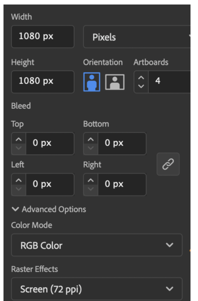
- Create new document 1080 x 1080 PIXELS / 4 artboards
- RGB color
- 300dpi for starters; 72 dpi for posting
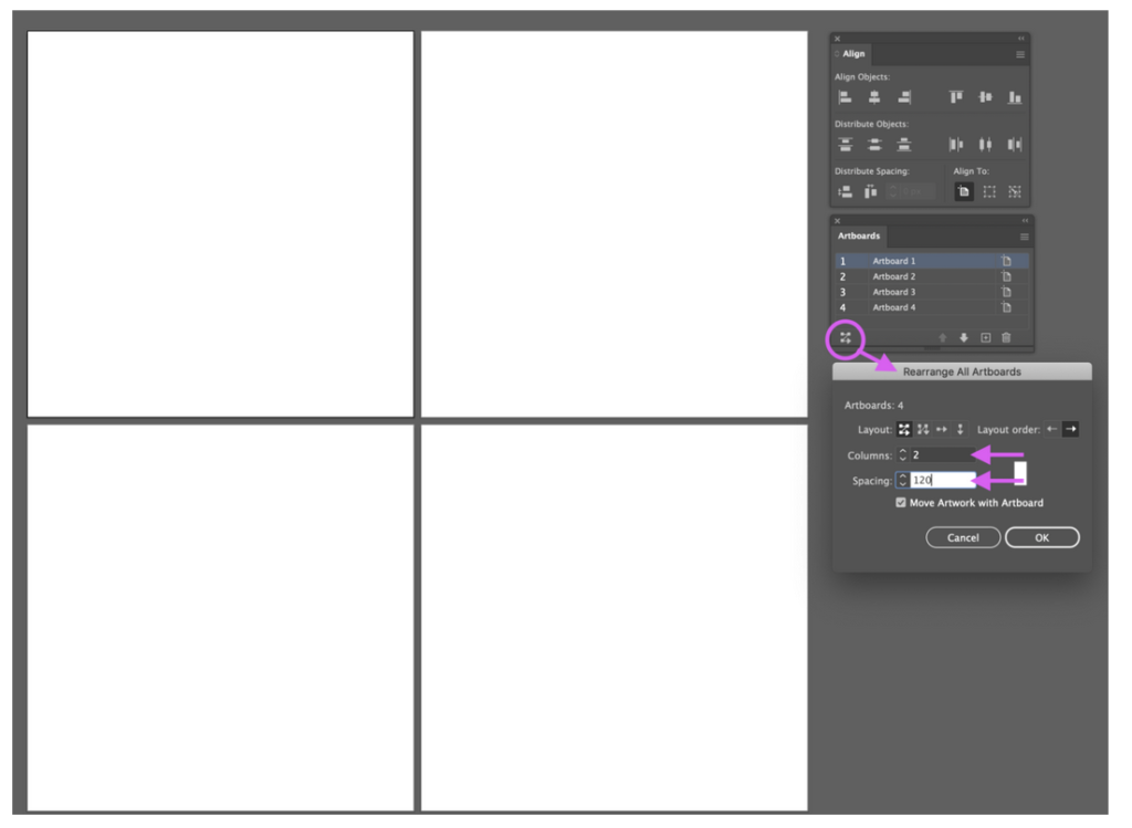
View ARTBOARDS, click bottom left of artboard window to get rearrange artboards:
Choose layout/ 2 columns / Spacing 120 pixels between
For your preliminary pass at Social Media Posts:
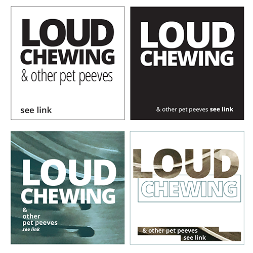
- Look at example below by Professor Maria Giuliani.
Again, our theme is different but the principles are the same. - (Note that your solutions must be different from these).
- When you work: is the hierarchy appropriate? Are the colors and images offering the viewer an easy to read experience? Are point size, line space and letter space working in a cohesive way?
__________
If you’ve done the basics as shown above, Experiment.
The examples below show 4 posts in the works. They are only a BEGINNING to experimentation.
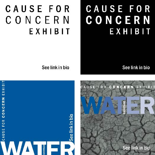
BELOW: SKETCHING AROUND AFTER DOING INITIAL FOUR
- Keep going. The examples below are further studies—and the beginning of experimentation.
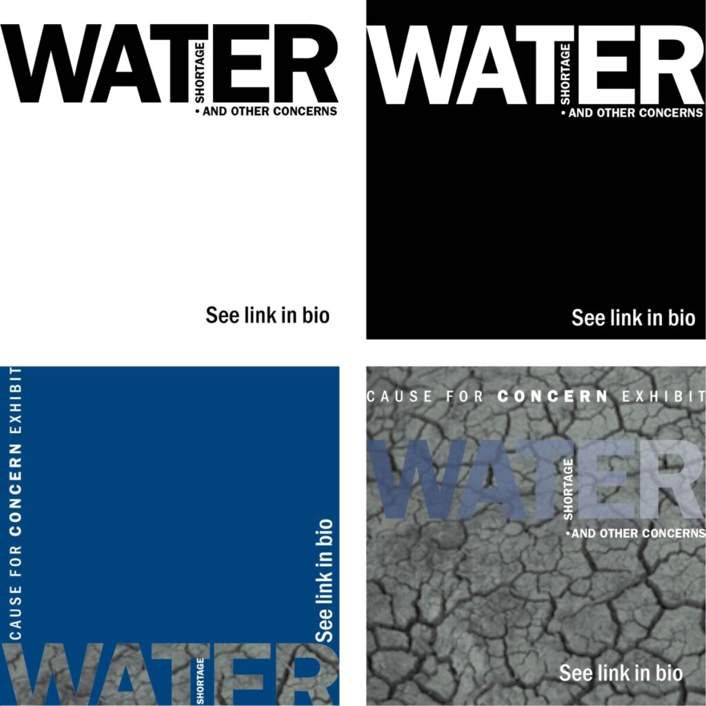
- Keep going some more! As shown, some of them are too flat and must be pushed farther or must be abstracted to become intriguing. The images by photographers Patricia Esteve (above) and Elizabeth Scaffidi (below) both need to be abstracted.
- NOTE: take your own images or use copy-right free images. For water shortage, other images could be: cracked or parched earth, dark wells, dirty rivers. Brainstorm.
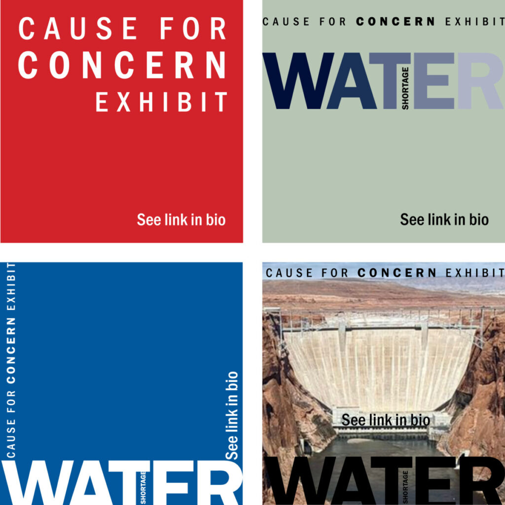
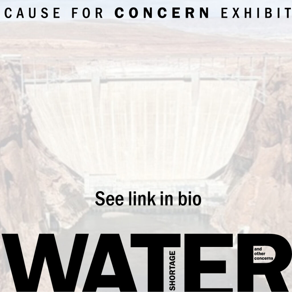
When you experiment, use the techniques we went over in earlier classes.
_____________
FOR YOUR POSTERS, here are some InDesign handouts we’ve already used:
How to get actual colors from a photograph and place them in the swatch panel
Assignment (To-Do After Class)
- Due next class: Refine Posters and Complete Social Media posts
- Save and package native InDesign files for Posters
- Save and Illustrator files for Social Media Posts and upload
- Name as:
- lastname_Proj03_Posters_120122
- lastname_Proj03_SocialMedia_120122


Leave a Reply