Class Info
- Date: Tuesday, November 29, 2022
- Meeting Info: In person, Pearl 116, 8:30 to 11:00am, followed by Professor’s office hours from 11:00am to noon in Pearl-116.
Announcement
- Refined/revised versions of Projects 01 and 02 are due on December 13 (the third to last class/2 weeks before end of semester).
Topics
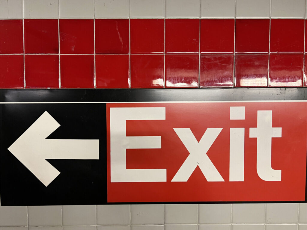
- Sans Serif Type. Transitional (Helvetica, Arial)
- Classification Samples done for you to date
- Miscellaneous Review
- Possible guest demo by Professor Neuringer
- Poster Exercise (Poster 3) with Text Wrap
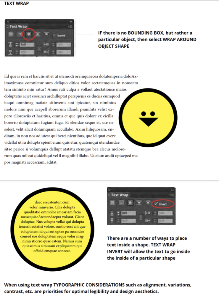
- What is text wrap and how to achieve it in InDesign?
- Continue posters for Project 03
Objectives
- Understanding text wrap (or runaround) and the relationship of between image, text, space and distance.
- General Review
Review. Sans Serif. Transitional:
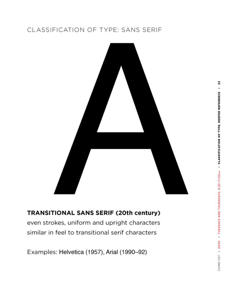
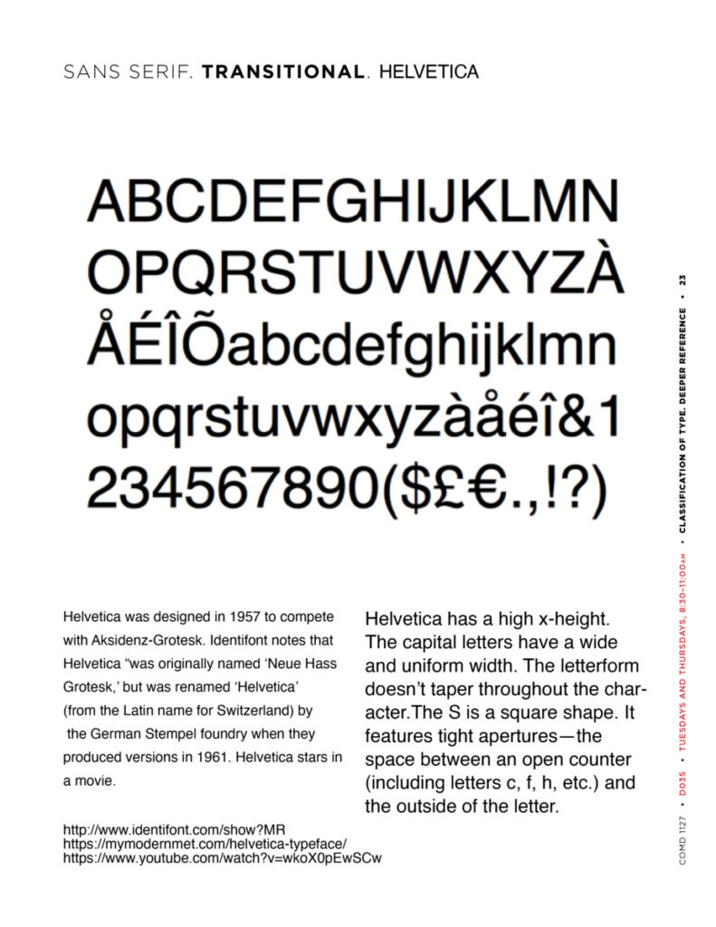
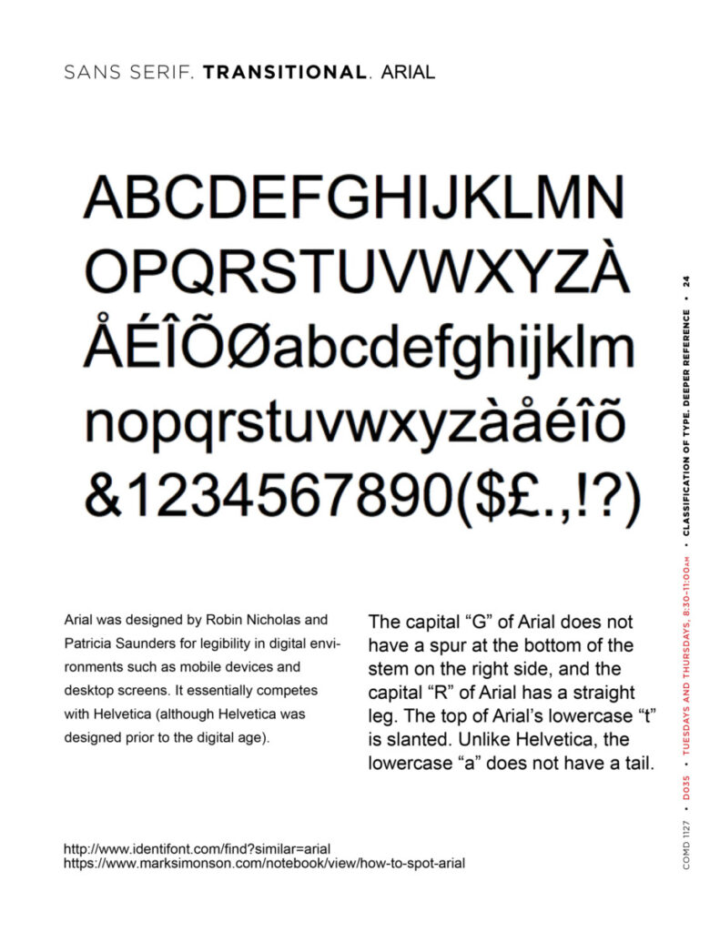
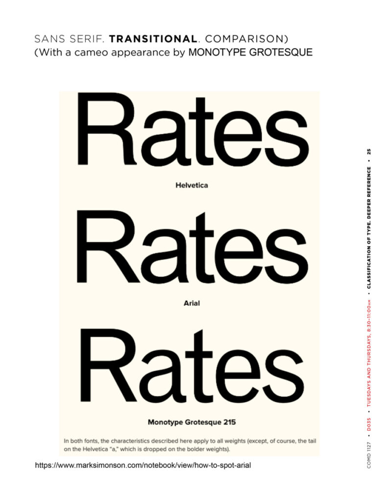
Review. Grid (also typefaces and hierarchy):
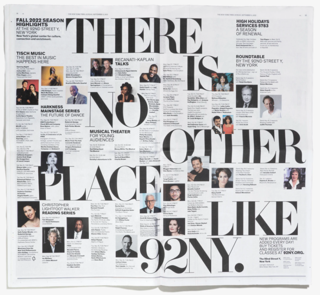
This is a spread (i.e. facing pages). How many columns are in the grid on each page?
What is the classification of the serif typeface?
Here’s a link to the Pentagram site, showing the entire range of the new brand identity devised by Michael Bierut and his team at the global and successful design firm of Pentagram.
Activities
Activity 1. Text Wrap
Text Wrap How-To is on this PDF and at the end of all of the specifications (specs) below.
- Specs: Use the same grid as the 2 posters you have in the works—that is, use the same grid as the one you set up on November 22 for today.
- Include a shape
- For this exercise, you must use text wrap
- OK to use color.
- For TYPE CONSIDERATIONS/APPROACH, apply principles learned in previous lectures.
- Include the text, thinking all the while of hierarchy:
- Series title (small): Cause for Concern
- Main Title: the name of your concern
- Your brief copy. For sketching, it is OK to indicate the copy in your sketch as opposed to doing it digitally. Interpret using only type for now. For your text, you may need to edit or adjust well review.
- One fact or factoid (do some research; go beyond the first Wikipedia entry you find) and its source.
- You can begin to incorporate imagery so you can practice text wrap.
- At the poster foot: Your Name
- ALSO: for the TEXT WRAP EXERCISE, in order to have more text, use your fellow students’s texts (delete the titles and names). Text is here, linked to Dropbox.
- Reminder of the specs of the document you set up on November 22.
You did the following:- Size 11 x 14 inches. NOTE: this is a much larger size than we’ve been using to date.
- 3 pica margin all around
- 8 columns / 1 pica gutter
- 12 horizontal rows / 1 pica gutter
- In your Parent Page: GO to LAYOUT>CREATE GUIDES>ADD the rows and gutter> Under OPTIONS/Fit Guide to>click margin
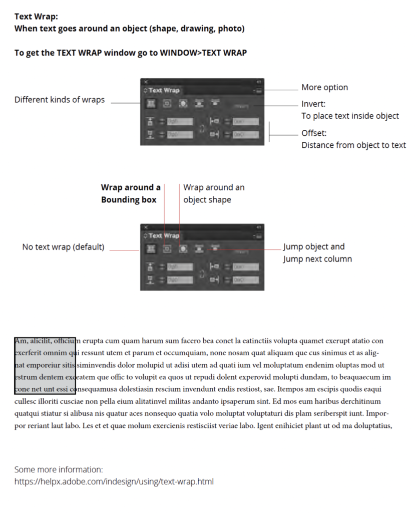
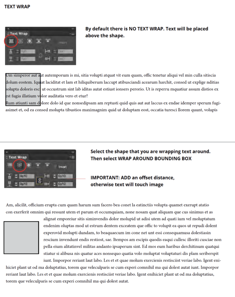
Activity 2
Continue to work on your 2 posters, devising and refining different type solutions
Assignment (To-Do After Class)
- Continue the first 2 Posters, refining, revising, trying different approaches
- Complete layout of Poster 3 EXERCISE with text wrap.
See PDF with assignment details (sample is for “Pet Peeve,) but adapt to “Cause for Concern”) - Package posters and upload the packaged folder to Dropbox.
- Save Indd file (and therefore packaged folder) as:
- lastname_Posters 1_2_3_112922
- Note: Posters 1 and 2 are versions of your concepts; Poster 3 is a text wrap exercise.
- lastname_Posters 1_2_3_112922


Leave a Reply