
This project was a simple symmetry project. We were told to pick an object of nature or mechanics and recreate an image we found in different variations. The four variations were: illustration drawing,image related graphic,concept related graphic and arbitrary graphic. With these four variations of design we were then directed with these designs to create a symmetry like design. We did not have to use each of these designs, but we were first required to draw each of them out twice. In order to create our symmetry design we then used these designs that were hand drawn.
After creating this design, I felt a different type of way about symmetry. I decided to use a flower as my inspiration. Creating the flower as I recreated it for each variation actually was a battle, but once I decided on some of the ways I wanted to actually create the variations it helped a plenty on creating my design. Once I got to the part of actually creating my symmetry design, I also debated on a couple of different way I could create a design. Once I finally had an idea in place, I begin to create it. As I created my design I realized that it had turned more into a pattern than an actual symmetry design. Although I had created a pattern design, I felt that it worked way more than if I had done a symmetry design. The shapes and drawings I created,synced more into the design and created a better look overall.
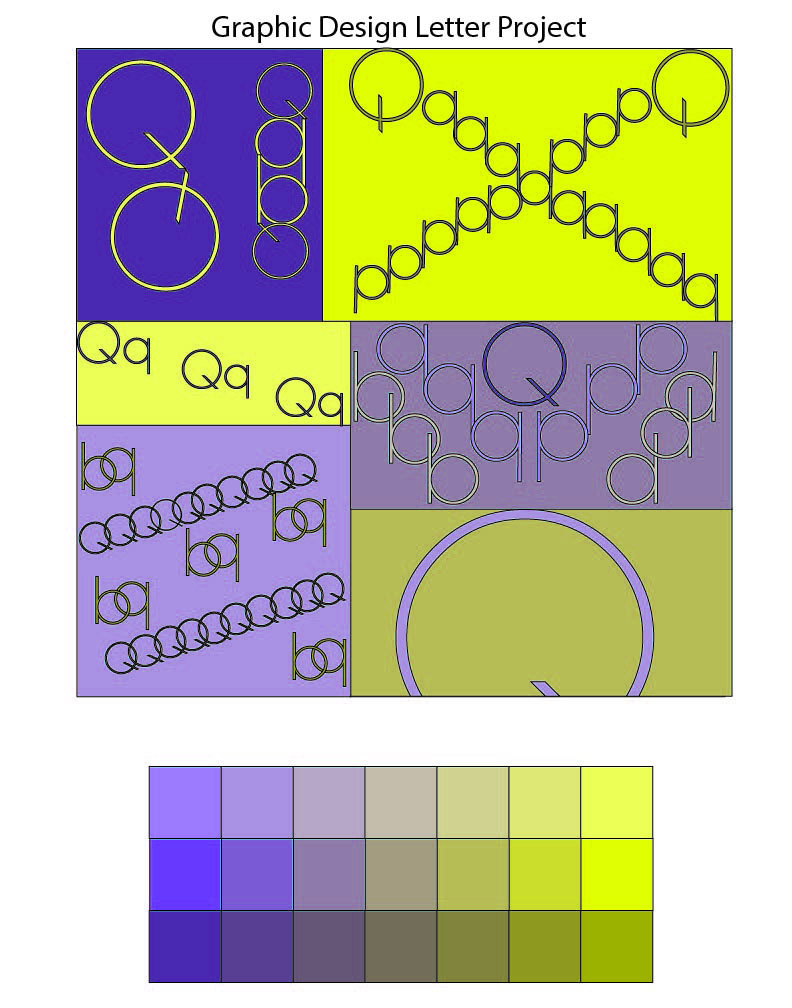
This project was a letter form project. We were told to choose a letter, and a color. Once we had chosen our letter and color, we then needed to come up with a design. While creating and designing this project, I learned plenty of things during the process. I felt that this project taught a lot about complementary colors and design.
While creating this letter form design, it took a lot of time to actually think of a design. Coming into this project I had no knowledge of what letter designs should actually look like and also had no knowledge complementary colors. Choosing the color purple, I at first used the color green because I felt that they fit well together. Instead I found out that, yellow is the complementary color for purple. Not only, did I have a problem with the colors. I also had a problem using my letter as design. I, at first had a design in my mind which I knew I wanted to include into my project, but when it came down to recreating it on the screen, it was very complicated. As I created my design, I changed and modified my design plenty of times which caused me to become very indecisive about the project as an entirely. Finally when I felt that I had a concrete design in place, and something I felt proud about.
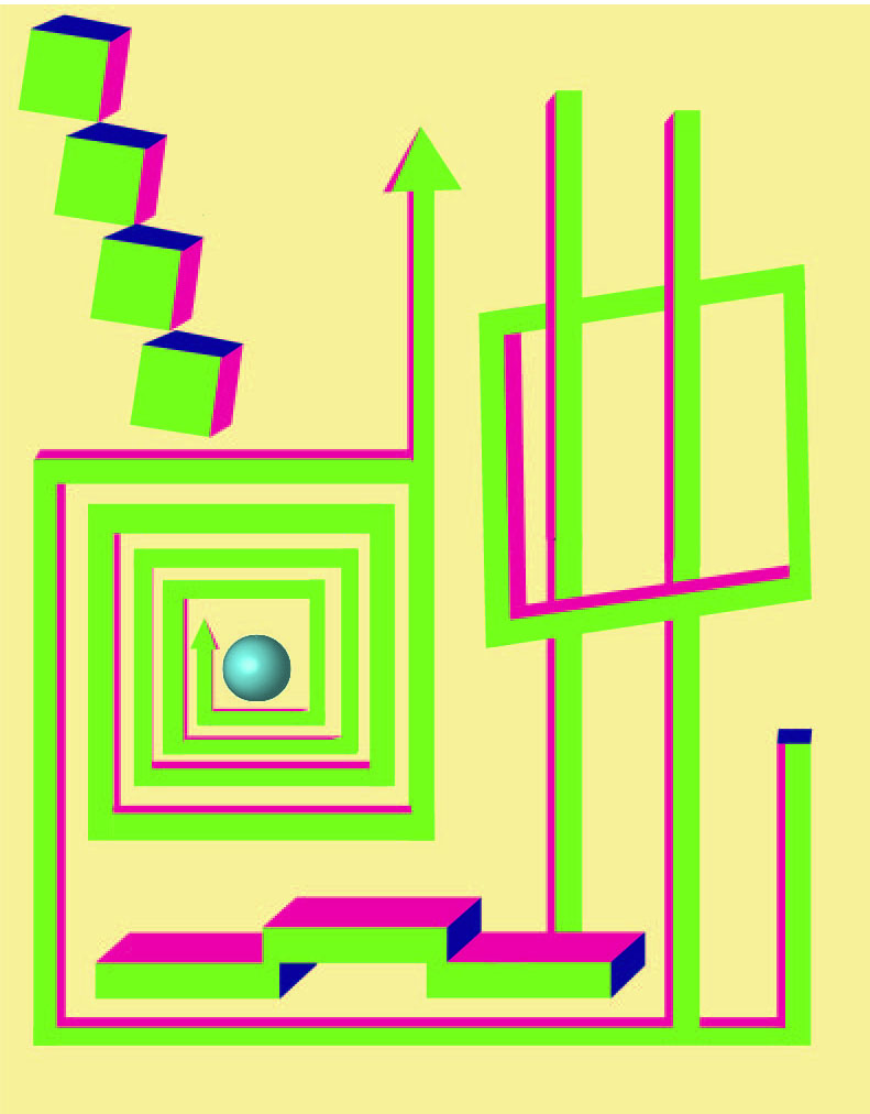
This was a project given on 3D design and shape. First going into this project, I had a bunch of complications along with many times I was indecisive about my whole project. I created many sketches and thought out many designs before even getting to create a concrete design. Once I finally got to a design, it took me plenty of times and tries to find something I liked. I wasn’t entirely sure of how I wanted to execute to my design. I tried out plenty of designs then I got this design. After hearing a criticism from other students in the class, I was able to perfect my design and create a design in which i believed show case the exact type of 3D form I was looking for all along.
Creating this project, it took plenty of tries and thinking. Not only did this project give me a better understanding of 3D form, but also helped me advance my understanding in space and the program illustrator. While creating this design, I had to learn and build my knowledge on tools and things I had never really decided to use before. This design also allowed me to text my limits and abilities with certain things. Overall, this design and project went fairly well and allowed me to learn new concepts of design.

