VR App Developer

Category: Uncategorized (Page 1 of 2)

34th Annual Wreath Interpretations Exhibit Artist Reception

20161211_110128

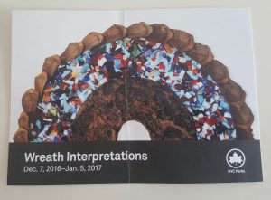
Wreath Interpretations Exhibit is an annual holiday tradition at the Arsenal Gallery in Central Park. The exhibition is organized by NYC Parks and many of the wreaths are for sale and a percentage of sales support the Arsenal gallery and Parks’ public art programming. The Arsenal Gallery is dedicated to examining themes of nature, urban space, wildlife, New York City parks and park history.

I have never heard about this annual gallery exhibition until one of my coworker send an email to me and the other coworkers at the studio stating that her art piece is on the display at the Arsenal gallery for the Wreath interpretation Exhibit which will be available to the public from December 7, 2016 – January 5, 2017 and inviting us to the Artist Reception of the Wreath Interpretations at December 6.

20161206_175546

My coworker Mayuko Fujino is a self-taught papercut artist from Tokyo currently based in New York City. Inspired by Japanese traditional stencil textile designs, she has been practicing her art since 1999 and takes a new approach to paper cutout technique by combining it with used magazine collage and other used/found materials. Her works have been exhibited internationally at locations such as SOFA Art Fair New York, Pulse Art Fair Los Angeles, and UAMO Art Festival, Munich, Germany, and featured in a book which introduces 25 of the world’s top papercraft illustrators written and compiled by noted papercraft illustrator Owen Gildersleeve entitled Paper Cut: An Exploration Into the Contemporary World of Papercraft Art and Illustration. She has worked on art commissioned by clients including New York City’s Department of Transportation, Nokia, Panasonic, Condé Nast, and WFMU Radio. *Stated from her website

thumbnail_wreath1

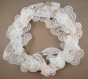
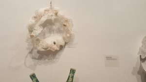
Close up look of her encaustic + paper cutout wreath

I like how she used 2d object such as a paper and made it go together with other 3d objects such as the shells, wood and made it work together to make an art piece that is both visually pleasing and has a lot of details and a meaning behind which will interpret differently from a person to person . The paper cutout is cut very precise and looks almost like machine cut.

20161206_180651

20161206_175510

20161206_180103

20161206_180646

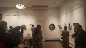
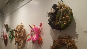
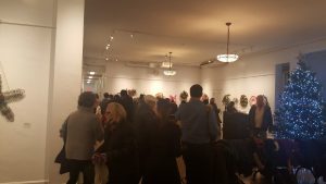
I haven’t been to a gallery before nonetheless an artist reception, the place looked very festive  as Christmas was near and all the artist that provided the art piece for the gallery are present at the gallery. The gallery was fill with family members and colleagues of the artist drinking and enjoying company while looking at each others art piece and talking about it and giving it their own interpretation of what the artist meant.

20161206_175808

20161206_181127

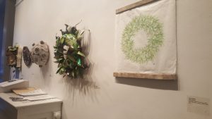
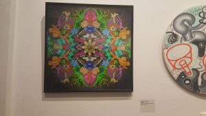
Other than the art piece by my coworker these top two are my favorite from the gallery. The first art piece is a done by Paul Aaron Johnson and he used archival digital pigmented ink print with lenticular lens sheet. It is a very big flat piece but it’s more 3d when viewed from side to side. I like the used of the color and the lenticular lens sheet used it look 3d while being 2d, and I like the use of bright color which makes the 3d effect pop up even more.

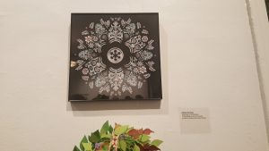
I also like the second art piece as how very detailed it is. I like the use of the negative save which gives the arts its own shape. There is not much color used in this art piece but I like its minimalistic approach to the color.
Cooper Hewitt

cooper_hewitt_logo_detail

For the class field trip, we went to Cooper Hewitt which is a design based interactive museum of Smithsonian.  The museum is devoted exclusively to historic and contemporary designs. Cooper Hewitt educates, inspires, and empowers people through design by presenting exhibitions and educational programs and maintaining active publications. In this blog, I will be talking about three famous furniture designers for their art/design work that I found interesting.

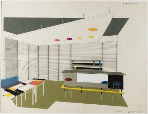
DRAWING, BAR GALLIERA, CA. 1950 by Mathieu Matégot

272083_156a7d5c96e51fca_b

This drawing by Mathieu Mategot, it’s medium is pen and ink, brush and gouache collage on paper. The drawing and the design has a very retro vibe while being very modern even tho it was from 1950. The color in the drawing works very well together almost in harmony. The lines in this drawing make it even more interesting to look at and the use of negative makes it look as it was intended as the true color. The artist does a lot of furniture design which you will see in this bar gallery drawing. All of his art pieces look and feel like a piece of art that you will see in the museum/galleries but on another hand, they also work as they are intended to.

ARMCHAIR, 1976 by SHIRO KURAMATA

276494_9b0bd5af54489f60_b

This glass armchair because of its special adhesive it looks like the glass is just floating in the air.  Shiro Kuramata just like the previous designer is also a furniture designer who does interior designs.  Such a minimalistic piece that looks very fragile and transparent taking the shape of an ordinary armchair which is supposed to hold the weight of a full grown person. This armchair is very intriguing to watch as it makes us question the use and the strength of the glass and the comfort as it made from a very fragile material such as glass. Shiro Kuramata designs of furniture are very sharp and edgy while being made of material that makes it transparent or material that the furniture is not intended for.

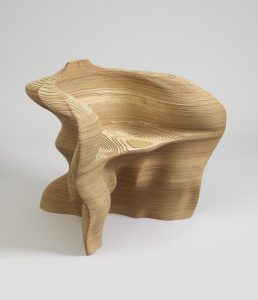
SLICE ARMCHAIR, 1999 by MATHIAS BENGTSSON

272316_c9d20629076b4eef_b

This wooden arm chair by Matthias Bengtsson was very interesting to watch but would’ve loved to sit on it to see how comfortable it is as it does look very comfortable because of how ergonomic it is. The slice or layers look like the topography of mountains and I liked how its made from one block of wood. The designer has made many renditions of this same design of an armchair but with different materials. Mathias Bentsson is also a furniture designer who makes designs that represent nature.

In Cooper Hewitt when we get into the museum we are given a pen that we can interact with touch tables that they have at every floor where we can look at art pieces and make our own design and save it to the pen so later we can view it on their website with the online code provided with the ticket. Looking through the art pieces that I liked which I selected through the pen and it seemed that most of the art pieces designers were furniture designer so I made this field trip blog about them.

Boosted boards pitch

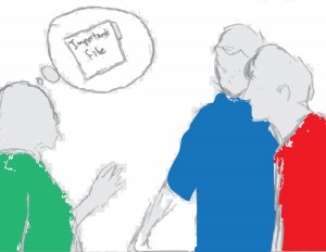
Boosted boards Storyboard 8.5 x 11 Second colored rough drafts-page-001In an office setting, the supervisor is in need of an important documents for her meeting that’s happening in a few hours, but the file is in another office which is 8-10 blocks away. Both of the intern wants to go fetch it for her. And so begins a race.

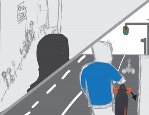
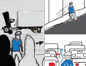
Boosted boards Storyboard 8.5 x 11 Second colored rough drafts-page-002The intern with the red shirt run to the bus stop to see there a huge line of people and not a sight of the bus. In the other split screen the intern with blue shirt takes out his boosted board and place it on the ground and proceeds to ride it,

Boosted boards Storyboard 8.5 x 11 Second colored rough drafts-page-003The red intern sees the blue intern zooming by while he waits for the bus, he couldn’t take it anymore and calls for an uber car. While the blue shirt is going uphill and zooming through the maze of the traffic.

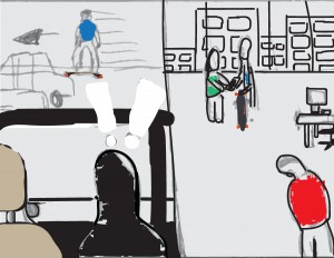
Boosted boards Storyboard 8.5 x 11 Second colored rough drafts-page-004While stuck in the traffic the red-shirted intern sees the blue intern heading back to the office so he hurries back too. When the red-shirted intern gets to the office and he sees the blue-shirted intern handing the supervisor the important documents and getting praised for it. The red-shirted intern feels sad and the blue-shirted intern notices it.

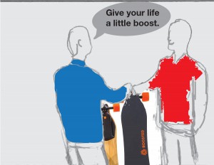
Boosted boards Storyboard 8.5 x 11 Second colored rough drafts-page-005The blue-shirted intern heads back to his office and bring his spare boosted board with him and hand it to the red-shirted intern and says “Give your life a little boost.”

Boosted boards Storyboard 8.5 x 11 Second colored rough drafts-page-006As their supervisor is in a meeting so they get an extra break hour which they spend cruising around on the boosted board.


Boosted board storyboard black and white rough

Boosted boards Storyboard 8.5 x 11 rough drafts.1

Boosted boards Storyboard 8.5 x 11 rough drafts.2

Boosted boards Storyboard 8.5 x 11 rough drafts.3

Scene 3 and 4 will have some minor change in the final.

Boosted boards Storyboard 8.5 x 11 rough drafts.4

Boosted boards Storyboard 8.5 x 11 rough drafts.5

Boosted boards Storyboard 8.5 x 11 rough drafts.6

The information of each scenes will be here from the previous storyboard.

https://openlab.citytech.cuny.edu/tkalden-eportfolio/files/2015/11/Boosted-storyboard-1.pdf 


« Older posts