Reflection 10/3/17

For this class, we saw two TEDtalks about Stefan Sagmeister. He is a graphic designer who originated from Austria, but currently works in New York City. In both of the TEDtalks that I saw, he spoke about the correlation between design and happiness. From my understanding of this, it is a rather tricky feat. While showing happiness is a very simple task, making people feel this way is easier said than done. What makes this especially difficult is how outlandish some of his ideas tend to be. Even now, some work makes me smile, while others keep me in a state of utter confusion. Regardless of whether or not you understand what he creates, he still manages to keep an attentive audience.

Despite not being able to make sense of everything Sagmeister creations, I find myself unable to dislike anything because it’s all so weird. I can’t properly explain it, but his designs come off as extremely weird. For example, he created a piece called “AIGA New Orleans Jambalaya”, which shows a decapitated chicken running away from typography. As I stare at this piece, I can’t help but ask myself, “What the f*ck am I staring at”? It’s so weird that I have no idea how to properly react. Yet, I can’t dislike it. I prefer to learn more about it than hate it.

Aside from the oddities that Sagmeister creates, I find it very interesting how he is very collaborative. Usually, most designers would either limit whom they want to work with or just stay solo. However, he seems to be very interested in collaborating with other graphic designers. An example that was shown during one of the TEDtalks was a set of steamed windows with happy messages written on them by Sagmeister, and other designers, such as Milton Glaser. I found this idea of collaborating to be very intriguing since I find it strange to see designers at a higher level working together just because they want to rather than having an incentive. It’s as if Sagmeister has such a powerful charisma that makes people want to work with him even if they have absolutely no reason to do so, and I find this to be a very amazing trait to have.

Adding to the aforementioned charisma, not only do people respond to it, but also it seems that he also likes to give said feelings back. In one of the TEDtalks, he brings up other people’s designs that made him experience happiness. One experience in particular was Ji Lee’s “Bubble Project”, where blank speech bubbles were places all over New York City, and the public would fill them in with anything they wanted. He felt happy from this project because it allowed him to be just as invested in the design process along with the entire public. When you think about it, he doesn’t have to acknowledge a random designer’s work, and just focus on his own instead. However, this project made him so happy that he wanted to give some of his charisma to this designer by talking about the project with such passion. To me, this shows that he genuinely appreciates designers, and their work instead of being so self-absorbed.

Overall, I find Sagmeister to be a very interesting designer. To me, he stands out from many designers with his oddball designs, ability to collaborate, as well as his charisma while retaining professional design decorum. Most designers would rather stick to themselves, and act all uptight towards others. Instead, he is very positively involved in his projects, as well as an interested spectator towards others’ designs. I can’t help but want to see more of his work to feel the happiness, and positivity that is portrayed in them.
Reflection 9/26/17

For this class, we saw a TEDtalk called “Intricate Beauty by Design”. From my understanding of the video, it was mainly about creating designs by thinking beyond what is outside of the box. This alone was very perplexing since I don’t tend to do that. Usually, I think outside of the box in the sense of coming up with an idea on what character to draw. My method is visually unconventional, and that is about it. After that, I tend to avoid going overboard as much as possible.

As far as thinking beyond what is outside the box, speaker Marian Bantjes also displays work that she had done with common objects through unconventional methods, such as designing with sugar. This really had me baffled because not only am I too cheap to waste sugar like that, but I never expected anything to actually be designed with such an unexpected medium. I am so used to seeing digital programs, and traditional mediums (pencils, pens, etc.) that hearing about such a method required me to do a double-take. Never did I expect for artists to use common household items to design a piece. Then again, I tend to be in a standard illustration bubble, so this idea would have never crossed my mind.

Aside from the unusual methods, I noticed that designing this way is very time consuming. For example, Marian had drawn out very specific valentines, but it was very time consuming since she made over one hundred of them. Even with the sugar design, it must have taken a painstakingly long time to make all of those letters in a very neat, and tidy manner. This concept of time had always been something that I am bad at. This comes from how impatient I can be after a certain amount of time. After a while, I end up getting passive-aggressive, and just start something else. I believe that if I apply Marian’s patience to my own work, then maybe I can get a lot more designs done instead of just .scrapping them.

Lastly, I would like to add that the use of such common objects gave me a whole new perspective on how to actually finish a project. Seeing Marian’s valentines made from recycled christmas cards had shown me that you can make something unique and personalized from scraps instead of starting fresh. Even though an object may appear to be useless, it somehow isn’t. Rather, it can add a lot of flair to an idea that one may have since it was perceived to not make any sense. Not only that, but it increases the “wow factor” of a design, thus making people hover over it like a flock of birds. It’s not something that I would even think of doing, but now I would actually try it in the future.


Meaningful Play

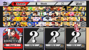
Currently, a game that I had found interesting is Super Smash Bros for Wii U. The game has meaningful play in the sense that it is very evaluative. It has a discernable aspect where any action has a very perceptive response. You could attack your opponent already perceiving that either it will do minor damage, maximum damage, or depending on the difficulty level, the attack will get dodged as well as counterattacked. Regardless of what you do, you know that there will definitely be some sort of hostile response. Aside from being discernable, the game’s outcomes are integrated into the game’s system. There is a chance that you could win from the attack or lose by missing, and getting counterattacked right back. A player can even win or lose just from time running out during the match. Whatever action you do, it will affect your end result in some way, shape, or form, which allows for meaningful play.


Strong Suit

My strong suit is being able to imagine whatever idea I manage to come across. I have an endless imagination that could conceive whatever I want to think of. Regardless of how ridiculous an idea could be, I will bring it to life as best as I can. There is no such thing as too crazy when I try to come up with an idea. As long as I have an ability to illustrate, I will create it.

Reflection 8/29/17

As I walked into this class, I did not really expect much. This type of class is not something that could interest me. Normally, I tend to be more enthusiastic about anything related to illustration as opposed to just graphic design. To be very blunt, I’m just taking this class to complete my upper electives requirement. Never did I expect to actually find such interesting subject matter during class.

For starters, I had to get a crash course on the different types of past graphic design. Russian Constructivism, Dadaism, and Swiss International Style were some of graphic design styles that I had to get recaps for. This turned out to be an interesting recap as the explanations were more straightforward here than in the History of Graphic Design class that I took two years ago. Instead of spending an entire semester vaguely explaining what these styles were, the core information was properly explained in one hour. Also, the explanations were not boring either.

Aside from the design recap, we also had to ask questions about what we expect to know in the class. However, I didn’t even have a question to give. It wasn’t because I knew everything (which I obviously do not), but because I had no idea as to what I should expect. For somebody who primarily cares about just drawing all day, I did not come to class with Topics in Graphic Design on the brain. Plus, most of the questions that I could have asked were already brought up, so I was left at a blank for the rest of the class. In a way, this provided the reality of my situation being that I am not the only one who is curious about some sort of aspect to this class, even though I find myself to be extremely clueless.

Lastly, I found myself watching a TEDtalk about the clarity and mystery that can be used in graphic design. This was the moment when I had an epiphany; I already had this graphic design knowledge staring right at me this whole time. Like the examples used in the TEDtalk, there have been many times when I have seen content look either obvious, helpful, confusing, and just straight up ridiculous because of how they were designed. I see stuff like this everyday, but never did I actually analyze anything in this sense until now. It felt like a wake up call as I can now see designs, and wonder about what went on in the designer’s mind when trying to create content.

In short, my first day in this class was a real eye opener. It was a huge reality check about how there really is a hell of a lot more to graphic design than just having a process of thumbnails, and other sketches to create something. I now see that everything is in a web of many different aspects of what pertains to graphic design, which includes different styles, approachable questions, and interpretations. There truly is a lot more for me to learn, and comprehend about graphic design now that I found myself just scratching at the surface of it all. Can’t wait to see what else is there to fully understand in this class.

Illustration 1 Project 2: Grab Votes, Not P#ssy

This project was a rather difficult one to tackle. I am not one for caring about politics, so creating an illustration about it took a lot of brain power to complete. While I did not view an article, I did take advantage of a serious scandal; that being Donald Trump’s “Grab them by the p#ssy” comment. I approached this comment by creating a visual representation of “lady parts” as actual cats in a claw machine. The goal is NOT to grab them, but instead, grabbing a voting ballot. This illustration’s visual message is to respect women, and vote against those who oppose this.

thomas-arocho-gvnp-process-book

thomas-arocho-grab-votes-not-pssy-poster

What I Found Interesting @ Cooper Hewitt Smithsonian Design Museum

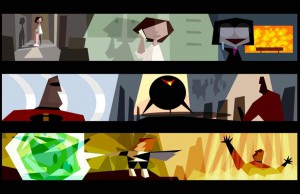
As I expected, the Pixar exhibit interested me the most. All of the concept art and storyboards gave an in-depth look at how extensive it is to make an animated movie, regardless of it being 2d or 3d. One piece of artwork that stood out a lot was this colorscript used for the Pixar movie The Incredibles. It shows that regardless of art style, a story can still be conveyed properly.

Pixar-colorscript

http://www.cooperhewitt.org/events/current-exhibitions/pixar-the-design-of-story-4/

What I Want to See @ Cooper Hewitt Smithsonian Design Museum

At the museum, I would like to see the Pixar: The Design of Story exhibit. As someone who is attending City Tech for the Animation/Illustration/Game Design module, this is something that would interest me for future studies. Also, I want to see those clicker pens that explain the exhibits. My interest in technology makes me want to see them. 0_0