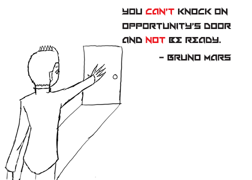
This design was created to be very straightforward. So, I drew a person trying to approach a faraway door. I felt that sometimes, a quote needs to be represented in a simplistic way so that it can be a lot easier to comprehend. To enforce the image a bit more, I added emphasis to the words “can’t” and “not”. With these two words emphasized, It can show that the person is not allowed to knock on opportunity’s door as he is unprepared to do so.
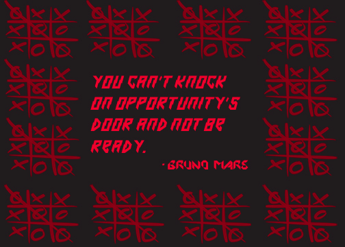
The process of making this particular design was rather tricky. I had to think of what may properly fit with the quote. After a few days, I finally thought to use tic-tac-toe. Since there are so many opportunities to win in a game of tic-tac toe, I thought that it would be suitable to use it as a representation of this quote. I even added some “electrifying” type to convey how the quote’s original owner is somebody who breaks boundaries, just like how tic-tac-toe can break the mind by losing repeatedly.
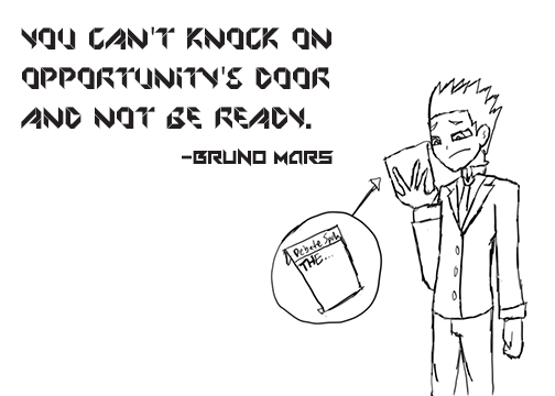
This particular design is supposed to represent being unprepared for something very important. The person is supposed to make a speech, but he did not write anything down. As such, he will have to ad-lib something abstract to get by. I expanded this even further by making the font a little abstract as well. Although this is very daring, I thought that making it look like unprepared work might convey the quote in a literal sense.

