David Consuegra (1939–2004) is a Columbian graphic designer and illustrator. He studied fine arts at the Boston University and later at Yale. He spent time training with designers such as Paul Rand and brought back contemporary approaches back to Colombia. He also spent time teaching and dedicated his teachings at the Universidad de Bogotá Jorge Tadeo Lozano, the Universidad de los Andes, and the Universidad Nacional de Colombia. He also wrote many journals and books including Nova (1964-1966, six issues) a history of art (En busca del cuadrado, 1992), a treatise on typography (American Type Design and Designers, 2004), and two books for children (Una vez tres veces and El mundo de los colores, both 1983).
His many designs incorporate typography, as he has designed many typefaces himself like the Chorus, Negret, Museal, and Croydon. David Consuegra loved to incorporate his cultural identity into his works.
I personally have an appreciation for typography and I appreciate that he likes to incorporate typography into his works in a way that pushes the boundaries on what type can be. I think his art have a playful and free-form feel that seem artistic and bold yet tasteful.

Many of his designs were inspired from pre-Hispanic indigenous objects and made reference to water, weaving, fauna, and flora.

My Design:
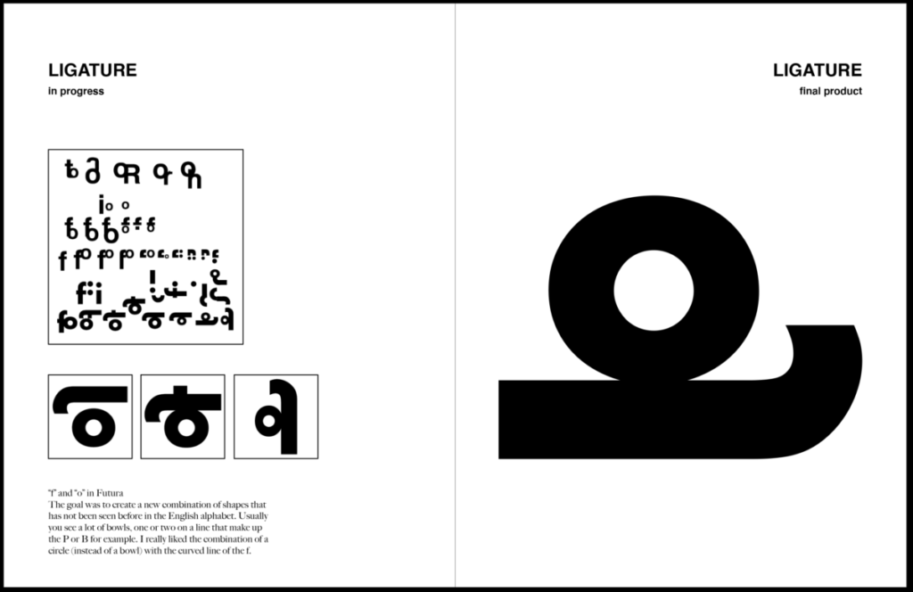
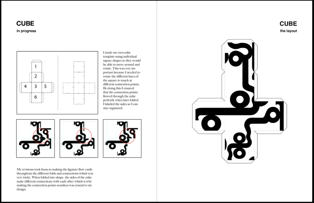
Here is a Ligature I made using futura typeface, and I turned it into a cube design.
I also incorporated some of my cultural influence here in this design as well. The different ligatures resemble Korean letters even though I am using the English alphabet. Ligature resembles this Korean writing ( 으 ).


Leave a Reply