Katherine McCoy and David Frej “Typography as Discourse” 1988 pgs 81-83 found in our main text Graphic Design Theory: Readings From the Field by Helen Armstrong.
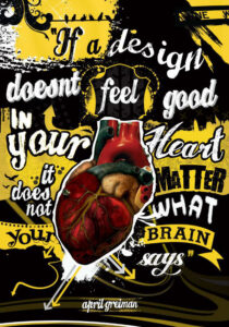
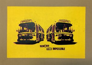
The image is a piece made by April Greiman and the second one is a piece made by Jamie Reid. In the first image, there is a lot of randomness and boldness in design. There are also multiple types of fonts used and they are placed in the composition randomly. The Picture of a heart is also placed right in the middle, which overlaps some of the text.
The second image seems to have a similar pattern in terms of the random and frantic placement of objects on the composition, but without much text. Both images are associated with postmodernism because they are not going along with or conform to traditional design rules of making everything in an orderly fashion. The text in both compositions isn’t organized or linear but is used in different types, colors, and sizes in the composition.
When the author says typography as discourse, she means that typography can in itself be used as means to express a message of the designer. That means that a designer can alter text with no limits and that they should experiment with those letters. When the author says “…no longer are their one-way statements from designers. The layering of content..”, they are saying that the postmodern allows designers to try to have multiple meanings or interpretations in their art piece. People can ask multiple or just one question(s) and get multiple answers about a design piece.
Annotations
- https://hyp.is/Hn4_3EjUEeyWSjO8fpT3fw/designopendat
- https://hyp.is/DVnXsEjVEeyqCgcwp4FPQQ/designopenda
- https://hyp.is/6rM_IEplEeyo7q-wLCvXCw/designopendata.files.wordpress.com/2014/05/graphicdesi


Recent Comments