Roland Barthes “Rhetoric of the Image“ essay from Image – Music – Text, Translated by Stephen Heath. Hill and Wang, 1977
Question/Prompts
- How do images hold and convey meaning?
- How do we understand them?
- What are they trying to say?
- How do they persuade and influence us?
Response
After taking a look at the reading I can better understand that it is many aspects of the advertisement to give those initial first thoughts of what it is about and what the advertisement is for. It could be the first words you see or what colors immediately draw your eyes. Not only that but advertisements could also have more than one meaning, almost like how art pieces can since they are open to interpretation. It’s purely up to the designer’s thoughts to put something down and then the people or consumers can take it from there. Looking back at that pasta poster we can see how they used a linguistic message to hold different values in the advertisement. So it’s that first thought that the designers want to get into the observer’s head that matters.

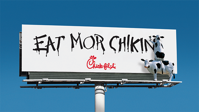
The advertisement I chose here is for Chick Fil La during their 20th anniversary that was called the “Chikin Cow Campain”. It’s quite humorous at first since it plays on the dark humor of how cows don’t want to be slaughtered so they would rather a person eat chicken. Then you would realize that Chick Fil La only has chicken products so the use of cows is unheard of from them, you would think they would use a chicken but they went this direction. Also, this would be a good advertisement for people who may not eat beef but still want fast food like Hindus. So with this use of humor, Chick Fil La tries to get more customers to encourage people to eat more chicken so you don’t hurt cows is an obvious message to see but you can draw more from it if you stare at it longer.


Recent Comments