Paul Rand’s “Good Design Is Good Will” in Graphic Design Theory: Readings From the Field page 64-69 and Steven Heller’s “Underground Mainstream” in Design Observer
Paul Rand’s “Good Design Is Good Will” in Graphic Design Theory: Readings From the Field page 64-69 and Steven Heller’s “Underground Mainstream” in Design Observer
Question/Prompts
- Is the concept of mainstream vs. underground relevant in advertising of the 1950’s / 1960’s and is it relevant today?
- What is “culture jamming”?
- Provide a visual example and description of early avant-garde culture jamming.
- Provide a visual example and description of culture jamming today.
Reading Response 7
Well, the concept of mainstream vs. underground in advertising that has been around since the 1950’s/1960’s is relevant today. As it can be seen adopted into today’s mainstream from the underground scene. Specifically, an advertising campaign that comes to mind is one used by KFC. The underground style they used is anime they adopted the style and made Colonel Sanders into an anime video game character which they made to market KFC to a different audience.

The term “culture jamming” is when mainstream advertising is used in a satirical manner usually made to poke fun at commercial advertising.
Some examples of early avant-garde culture jamming would include the Mad magazines one specifically targeting crest “Look Ma, No Cavities, and No Teeth Either.” It poke fun at their ad campaign that had a similar slogan where it would say “Look Ma No Cavities” to imply that Crest itself is that strong to prevent cavities when in reality you need other products to complement toothpaste.
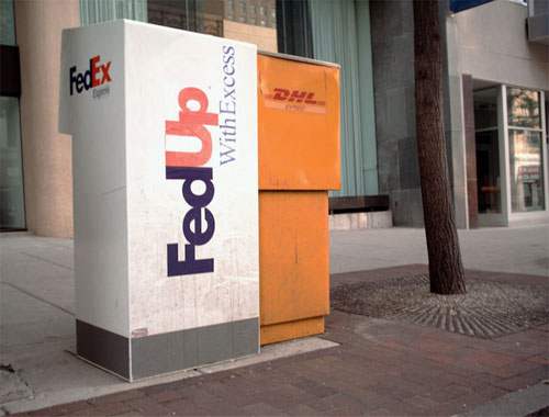
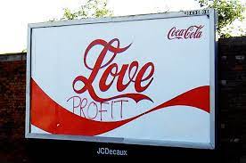
Some examples of culture jamming today would be this McDonald’s one I found as it uses the advertising style of McDonald’s and sends a message using that style saying that if you consume McD’s then weight gain will ensue. This one I found that doesn’t seem conventionally designed by a designer is one I found interesting as it showed a different way culture jamming can be achieved in a physical manner. These other two I found the first one being Malboro where they use their advertising slogan of “Welcome to Malboro Country” with a scene of office works going out for a smoke instead of it being the usually manly man cowboys. The second one I found was a play on FedEx where they redo the logo and instead of it being the usual FedEx it has been changed to FedUp and pokes fun at how their service is.


Hypothesis Annotations
https://hypothes.is/a/xTP3kDZ9Eey8NUNHu4CygA


Recent Comments