4/12,13,14
I made homepage and search result screen for mobile and it was more difficult than desktop screen design as I expected.
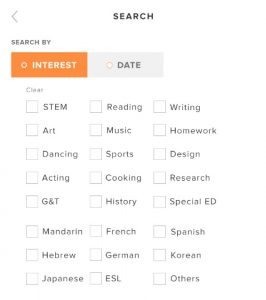
This is the first design for search page. On desktop, “INTEREST” and “DATE” are as tags and parents can pick whichever they want to search by. However on mobile, it’s really difficult to design tags since space it limited. So I designed check bottom and made it in orange when it’s selected. I didn’t really feel right about this since the orange box kind of looked like CTA on the bottom.
I didn’t want to have too much color on one screen and I though the thing that has to have color was CTA. So I revised it to have less color.
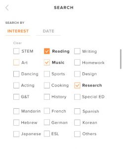
This is the second design. I changed button styling, getting rid of boxes and having underline instead. It looked cleaner for sure, but at the same time I felt like it needed more attention. Maybe having boxes was better than this button styling. Also I played around the check box styling. Currently checkboxes looked pail for some reason, so I looked at many websites for reference and found the checkbox that has color on stroke when it is not selected. I tried it but it didn’t work for our site since our brand color orange is warning color. If I made them in orange, it looked like required checkboxes. So I decided to keep them in grey when they are not selected but made them darker.
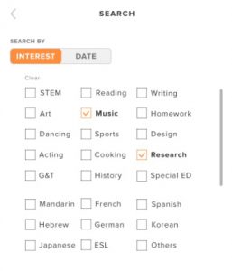
This is the final design. I ended up designing a toggle button and It looked the best out of what I tried. It caught attention and very clear what they can search by. My supervisor agreed with this design and she said that she’ll send this design to developers. I’m worried about how it would look like since our developers in Vietnam are limited what they can do with coding especially for mobile screens.. but hope it turns out well.


