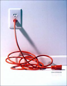
 UCLA Extension / 98f_Lee Clow
MASTER GRAPHIC DESIGNER SERIES UCLA EXTENSION 12/13/01
I like this design because it makes me think what this book about and want to know more about this book as It’s hard to find the title of this book at first glance. Also it gives me eye catching impression because of the color of the cord. My eyes lay on the red cord first and the title of this book last as I read top left to bottom right. So I think visual flow is done well. Overall it’s very simple and sophisticated, but at the same time it’s very dynamic design.
UCLA Extension / 92.sp_Ivan Chermayeff
MASTER GRAPHIC DESIGNER SERIES UCLA EXTENSION 12/13/01
This gives me dynamic impression because of the colors. The use of primary colors is very grabbing attention and I have playful feel to it, which I think a good fit to the purpose of this book. Also, the hand writing title matches the image well and placement of the type makes nice contrast to the image.


