2/8,9
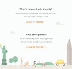
Continued to create illustration for the home screen, and got it done!
Through this project, I realized that if the illustration looks great, it doesn’t mean that it works with design. When you use illustration for websites or any other media, it should go well with the contents. So you need to be careful on colors and textures you choose. For this project, the illustration is going to be on web screen, so I decided not to use any outlines on illustration to make it look soft and not stand out on white background.
This internship program gives me a lot of opportunities like this illustration project and I’ve been learning a lot of things that I can’t learn in the school. I’m so glad that I got an internship from this startup business where I can challenge my self as a designer.


