Landscape Expanded: Abstract 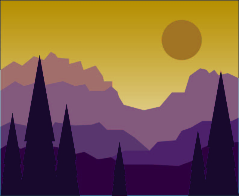
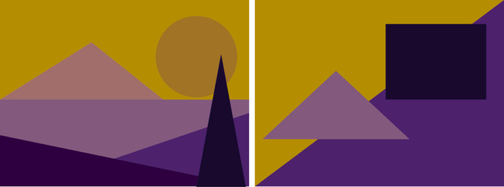
Digital Atmospheric Landscape 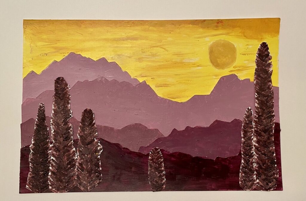
Painted Atmospheric Landscape using primary colors yellow and violet 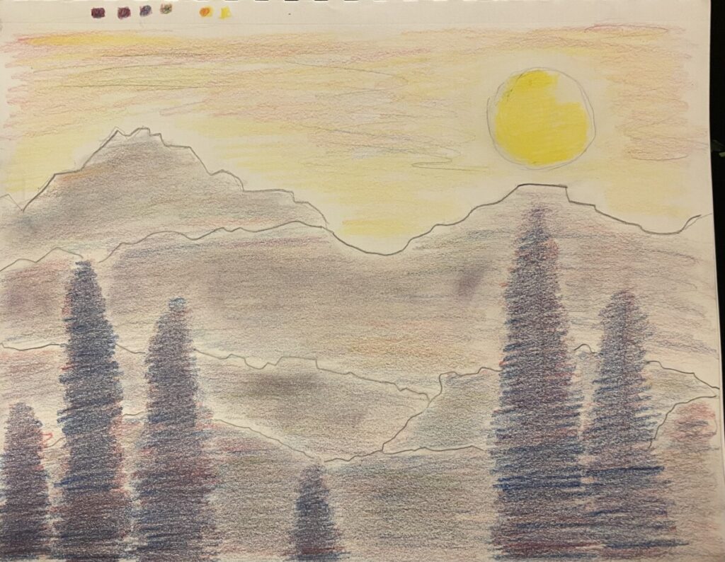
Final Sketch 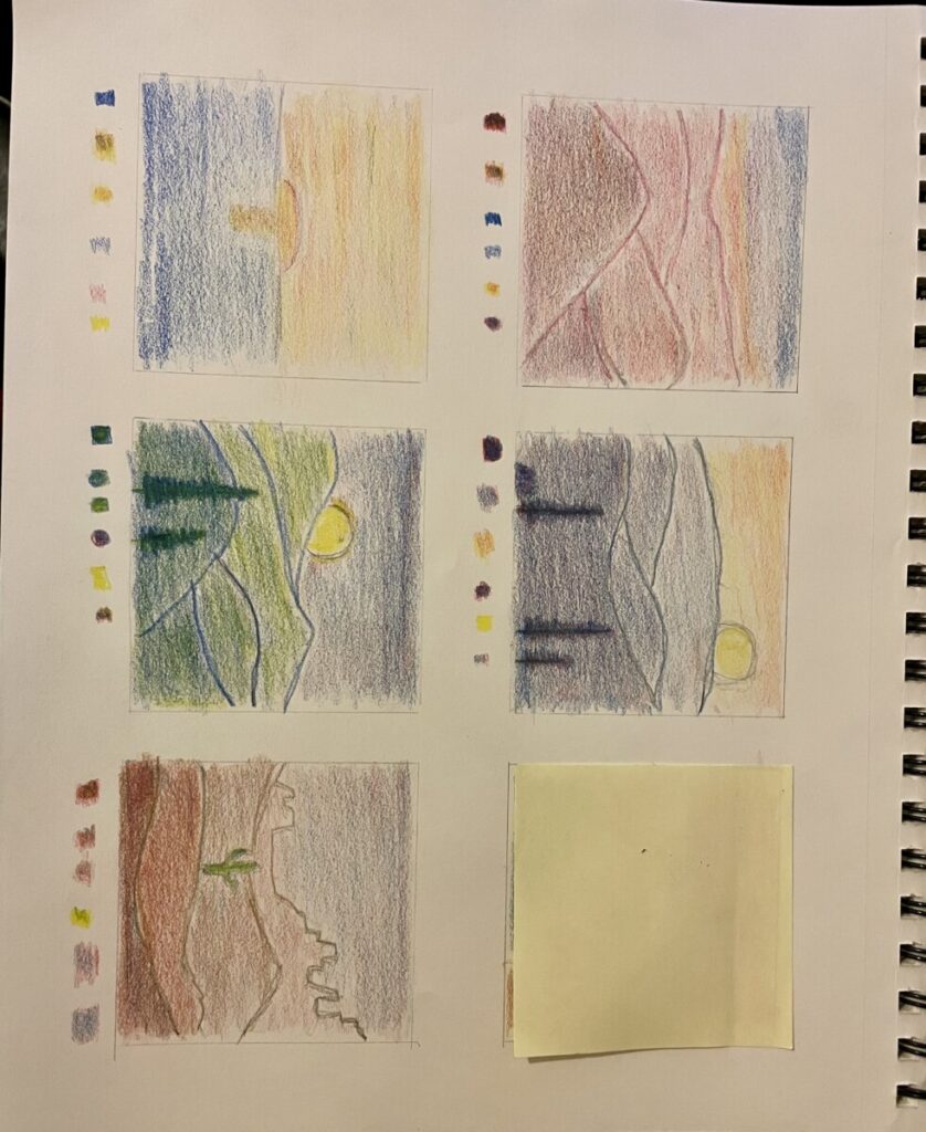
Thumbnail Sketches 
Inspiration image with mosaic filter 
Inspiration image I took 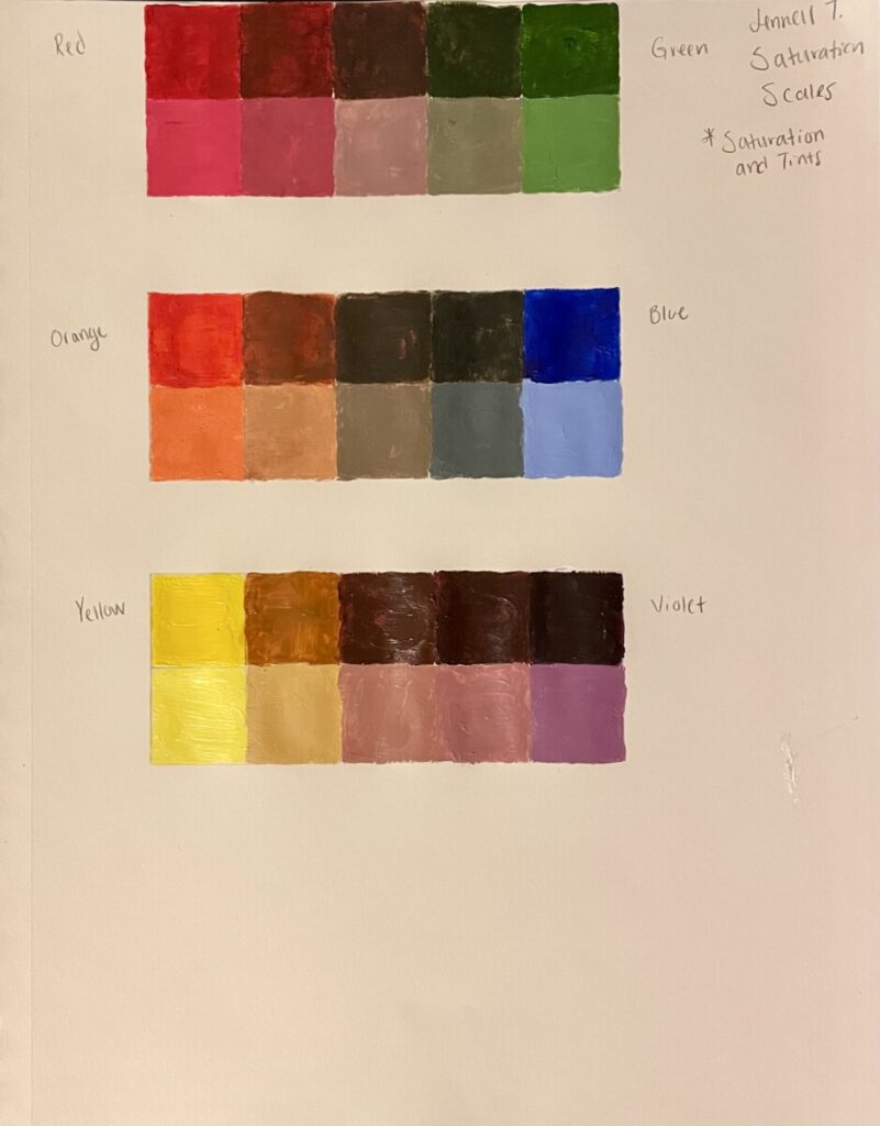
Saturation Scales with paint 
Simultaneous Contrast with paper color samples 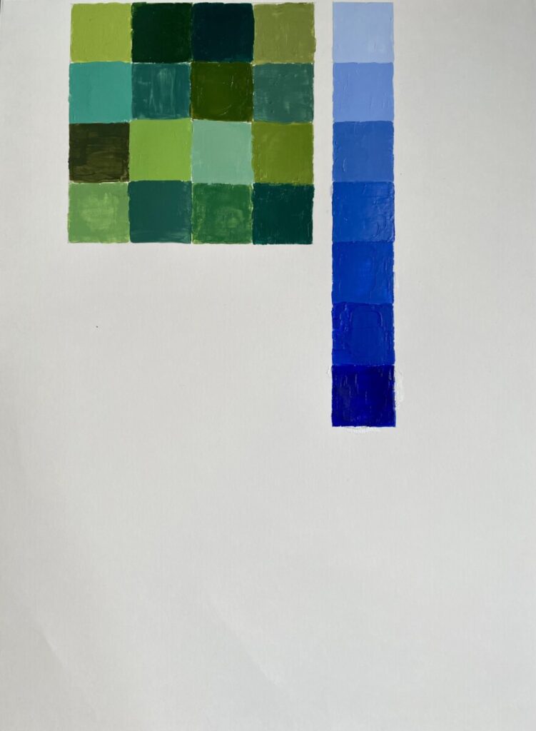
Monochrome Color Scales 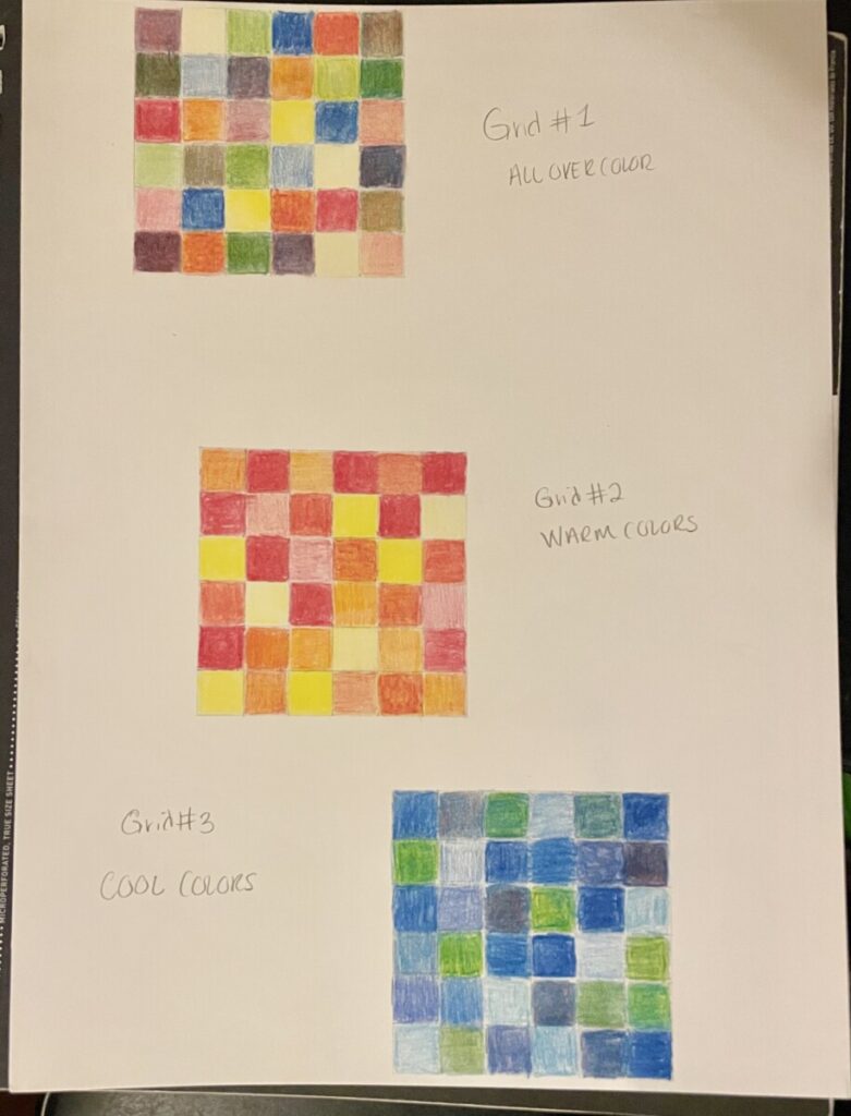
Color Grids with colored pencil.

Throughout this project I explored color theory by creating a variety of compositions using colored pencil, acrylic paint, and adobe softwares. Learning about saturation, hue, and value while using CMYK and RGB coloring systems. After doing independent research on color theory I created color grids using the primary colors of red, blue and yellow colored pencils; and I constructed a monochrome grid with paint. With the first set of color grids I experimented with making three types of grids, cool, warm, and mixed. I found it to be quite difficult to mix the colored pencil on the smooth surface of the bristol paper. The monochrome grids were a lot easier to create because the paint was easier to mix. I used ultramarine blue and white for the 1×7 grid and various values and tones of green for the 4×4 grid. Next, I created simultaneous contrast color designs using color paper samples, here I was able to understand the impact that light and dark valued backgrounds had on middle hues of the same color. Some made the middle value appear darker or lighter as if they were two different hues. This was very intriguing and can easily be seen in digital work.
In the development phase I researched atmospheric landscapes in relation to color analysis. Identifying the color palette that was chosen, and how value changed as the distance in the photo increased. I then created my own landscape sketches, some with paint and others with colored pencil, and I found that colored pencil did a wonderful job of distinguishing tone on sketch paper. For my final landscape sketch I decided to move forward with the complimentary colors of yellow and violet of various shades, I created both a paint and digital iteration. I struggled a lot with the paint aspect of this project and hope to develop my skills for the better soon. My digital iterations were a lot cleaner of course but they gave me the opportunity to use the CMYK coloring system which will be beneficial for me in the future.


Leave a Reply