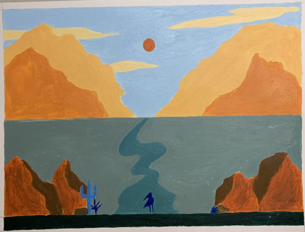
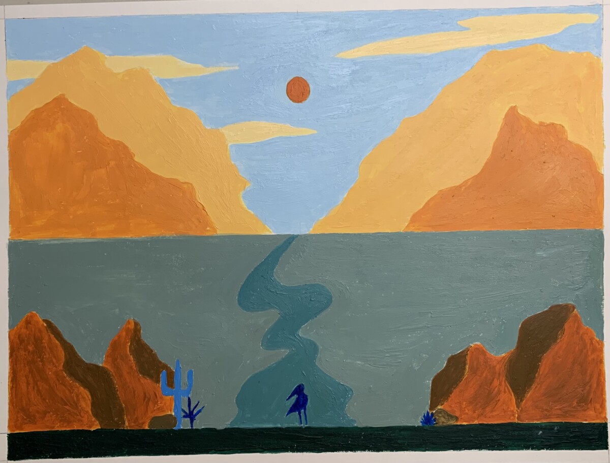
Finished Landscape Painting 
Color Landscape Expanded 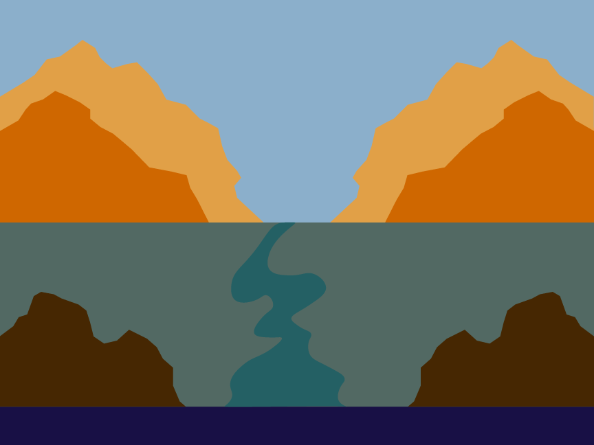
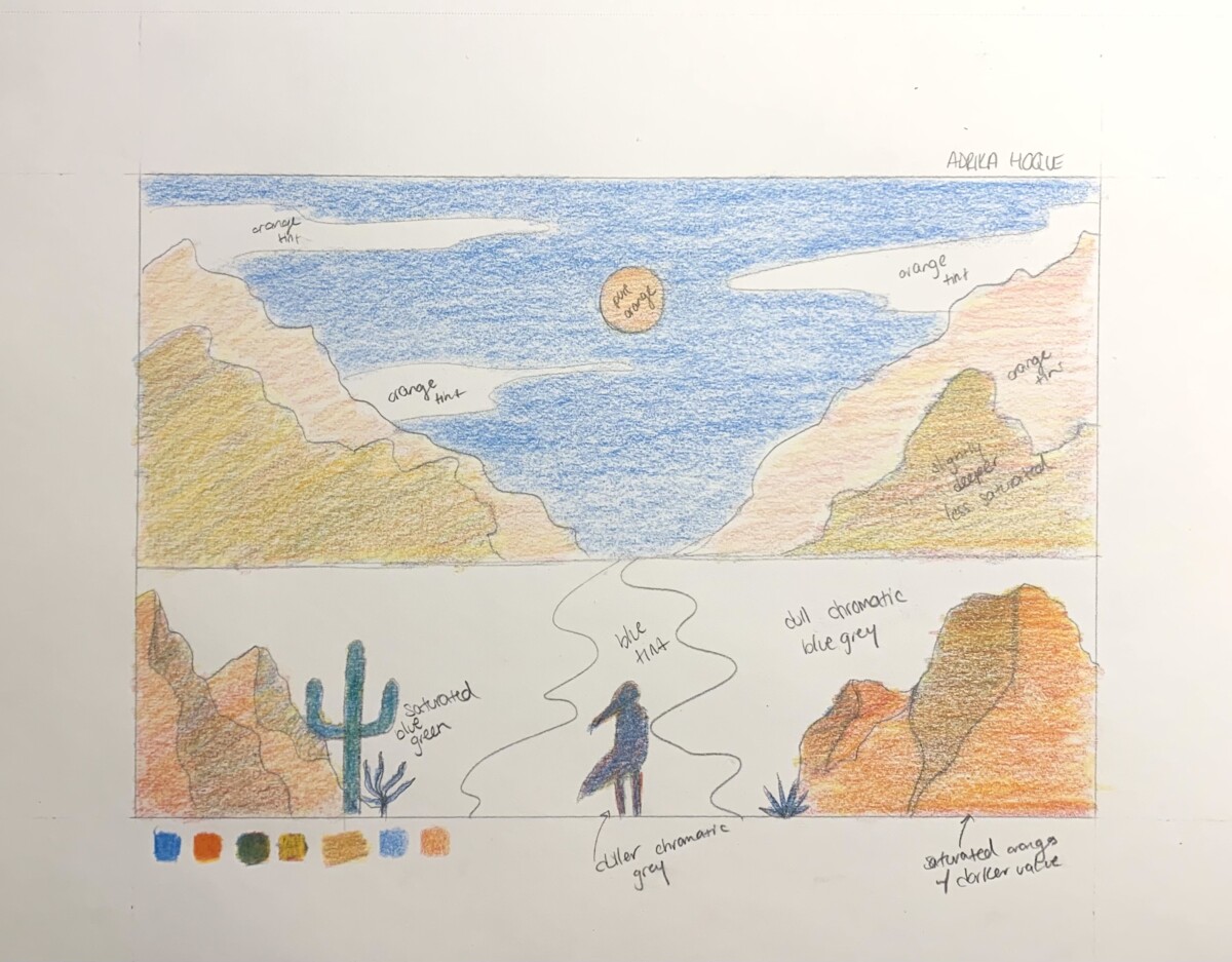
Color Landscape Expanded 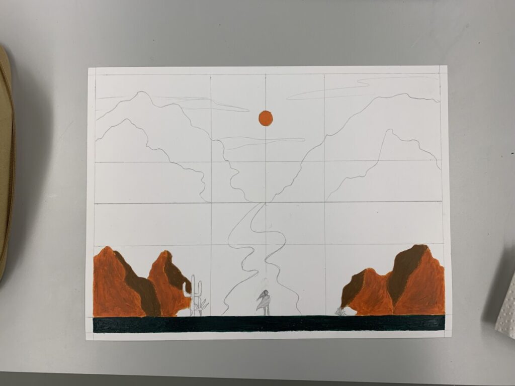
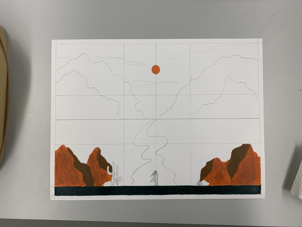
Landscape Painting in Progress 
Refined Sketch 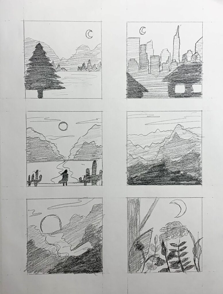
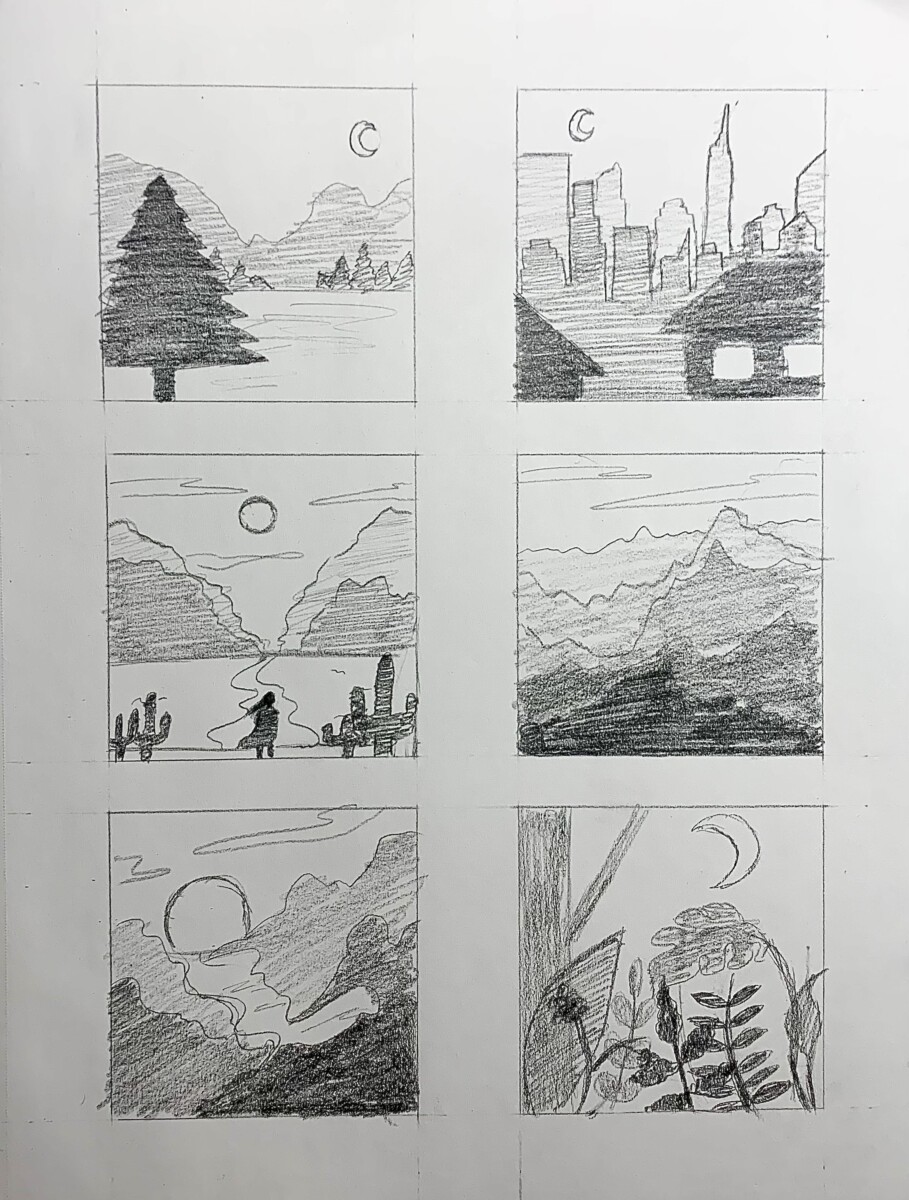
Atmospheric Landscape Thumbnails 
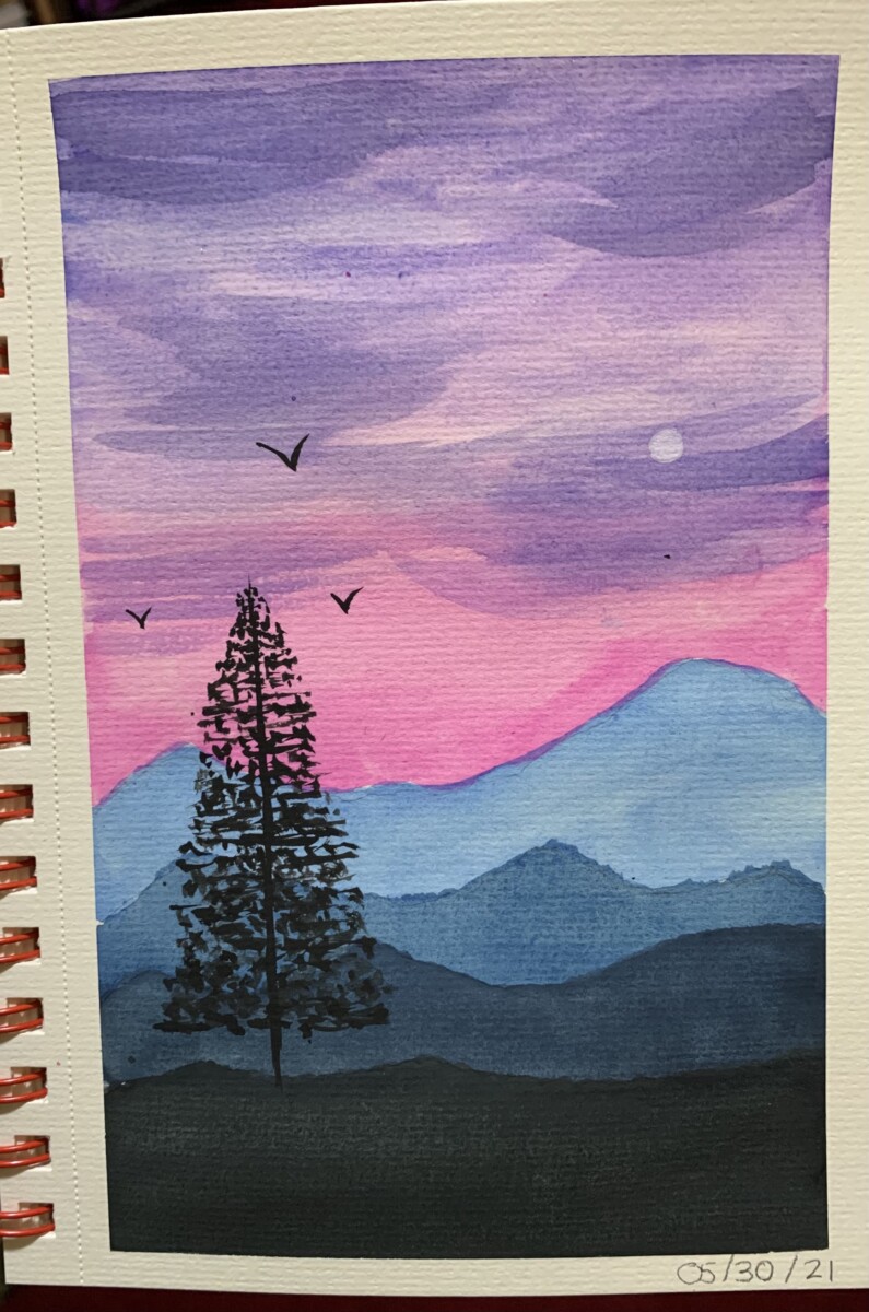
Watercolor Landscape previously created by me 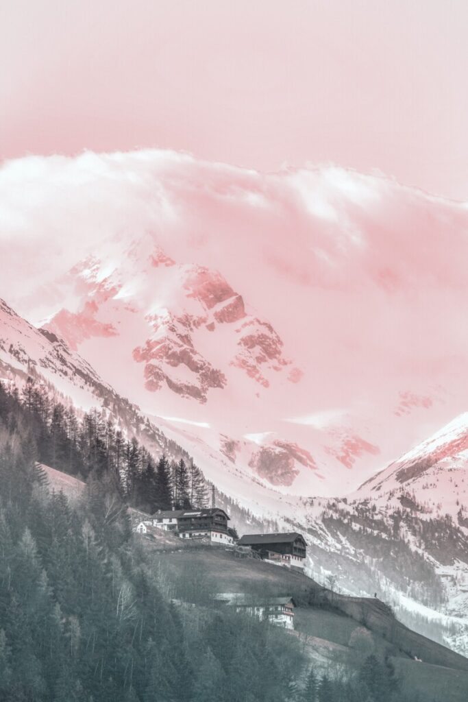
Landscape Inspiration 
Mosaic Inspiration 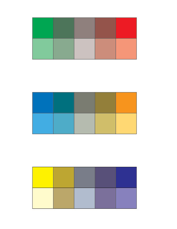
Digital Complementary Scales 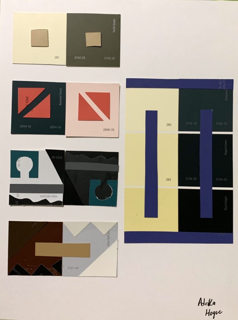
Simultaneous Contrast 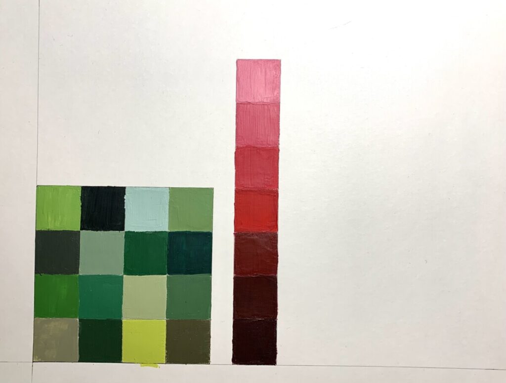
Paint Color Grids 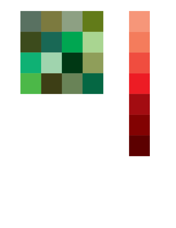
Digital Color Grids 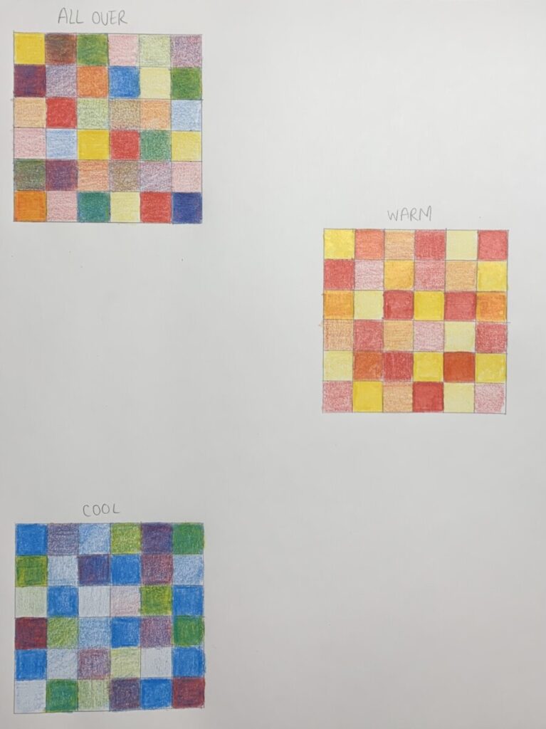
Color Pencil Grids 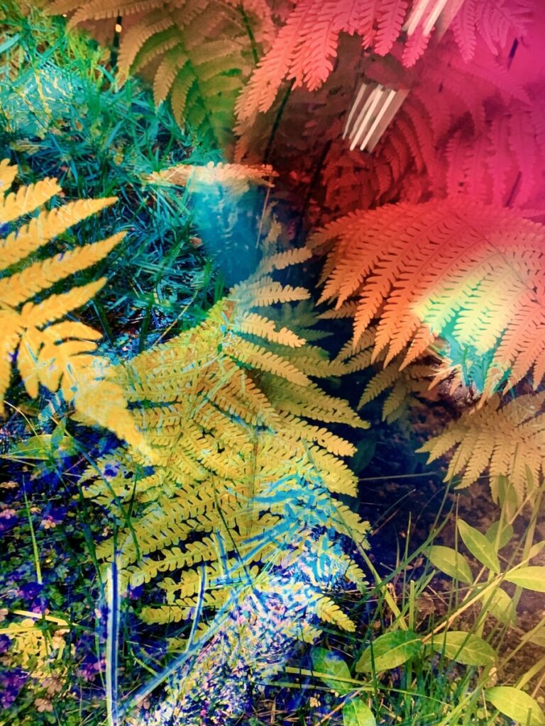
Color Inspiration Picture

The Process
This project started off with researching and learning about color theory and relationships. We started off by looking for inspiration images of color and then analyzing the relationships between them through color palettes, saturation, and value. After that, we moved on to color pencil play using only red, blue, and yellow. I was able to create different hues through mixing the colors such as green, purple, and more muted hues. I did an all over, warm, and cool palette using just three pencils.
Paint was used next to create two different monochromatic grids. One was a value monochromatic scale, adding white to make a tint and black to create a shade. The other paint grid was more of an all over monochrome, adding tones and analogous hues such as a blue green or yellow green. Then I recreated the paint grids on illustrator to get a better sense of mixing colors digitally. Through understanding color relationships better, we moved on to simultaneous contrast. Making a collage with the paint swatches was very enjoyable and creatively freeing. I created some interesting compositions using stable and ambiguous figure ground and you can really see how different the mid tone looks compared to the lighter and darker hue.
The next phase of the project was then to create an atmospheric landscape using everything we learned about color. We were tasked to use complementary colors, either green/red, orange/blue, or purple/yellow. Creating the complementary scales was very informative as I learned how much of each hue created a darker or duller color. The chromatic grays created in the middle are able to add a lot of dimension to the finished piece. I gathered inspiration pictures of landscapes and cityscapes and turned them into mosaics to get a better look at the color palette. I included a watercolor piece made by me showcasing a landscape where the foreground is much darker. Using those inspiration pictures, I created small thumbnails of my landscape using different times of day and and value. The refined sketch was created after to lay down the base colors and get an understanding of what goes where. Working on the finished painting was nerve-racking as I didn’t want to mess up or end up with colors that I hate. Overall, I really loved how it came out and spent many hours perfecting it. The color landscape expanded helped simplify the forms and shapes and you can really see the composition of the piece. This project was very enjoyable and I was happy to finally play around with color and learn a lot at the same time.


Leave a Reply