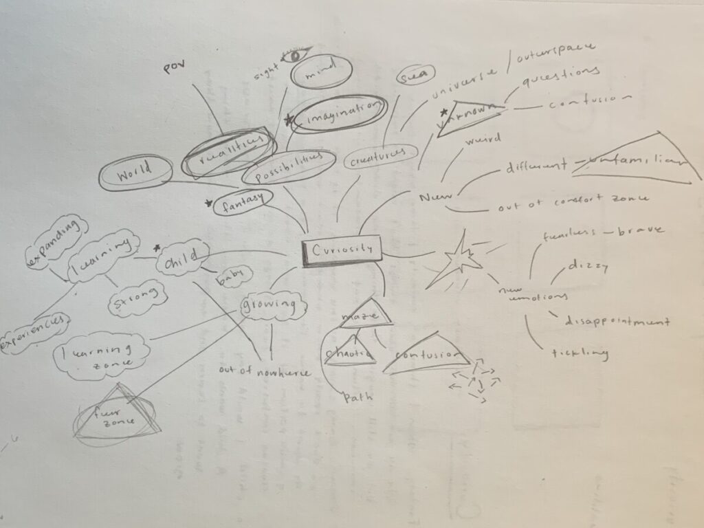
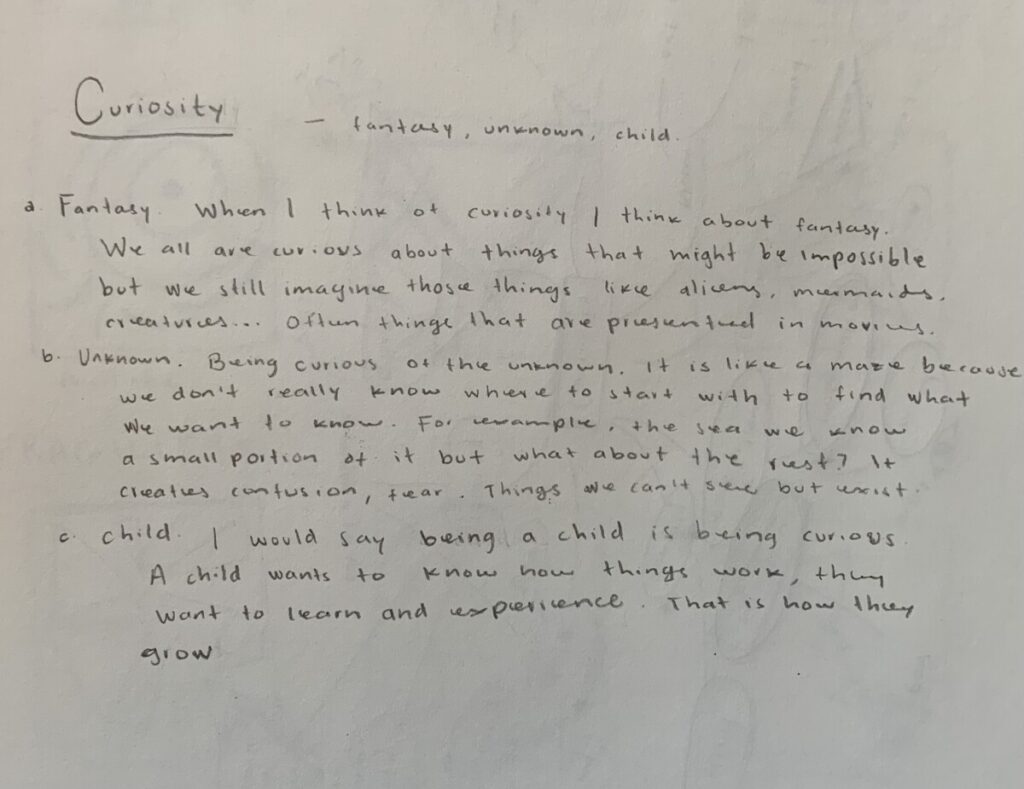
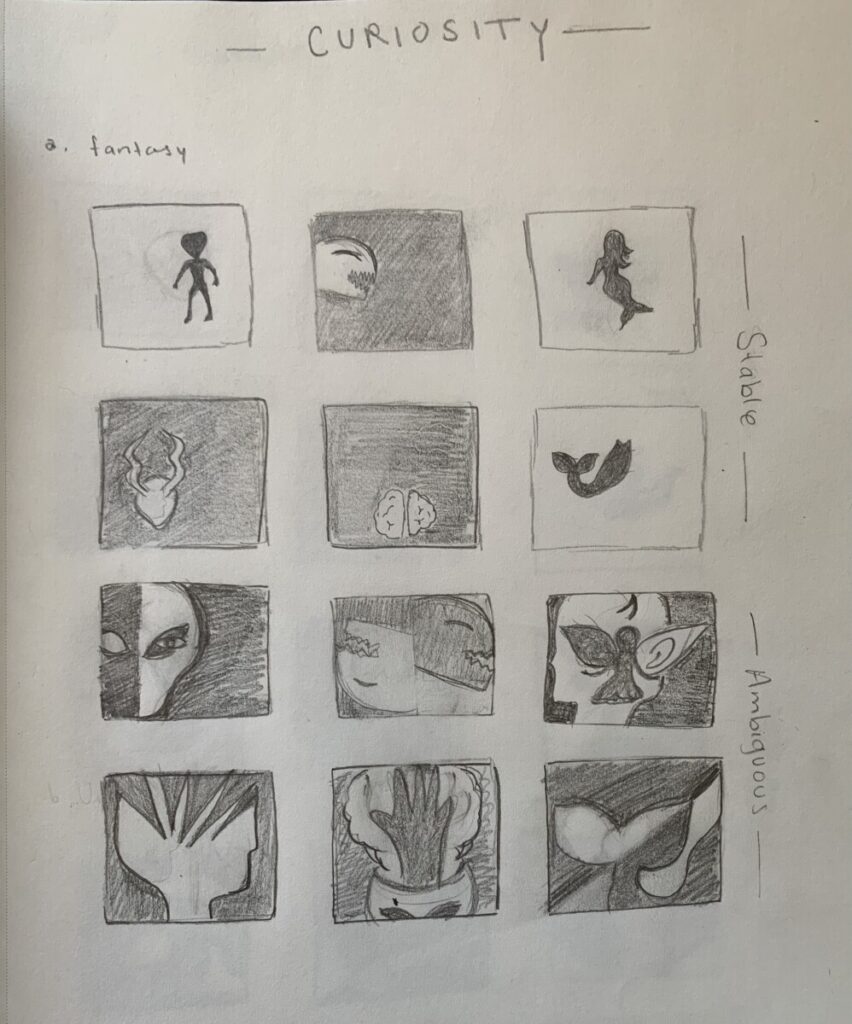
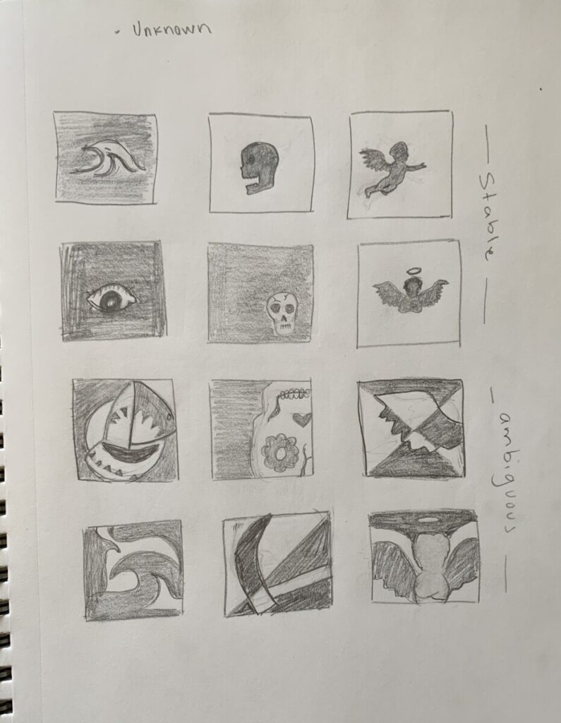
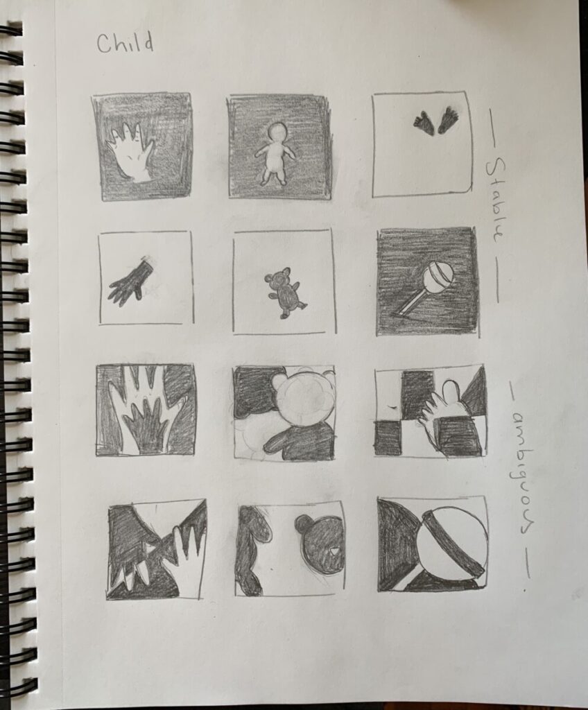
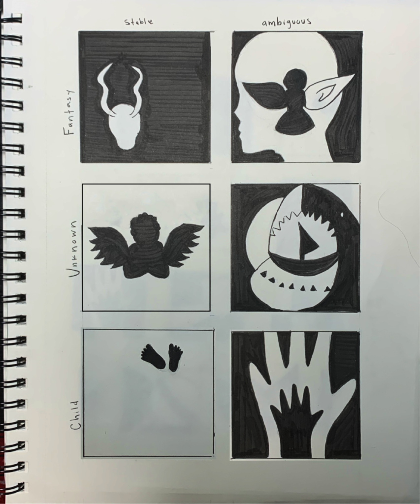
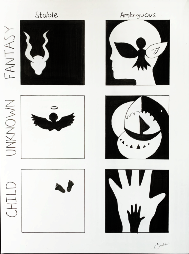
In this project we learned about figure ground compositions (ambiguous and stable) as well as using mind map as design thinking. We used curiosity as prompt. First we started with a mind map about what we think, makes us feel or represent curiosity and categorized those words into three subsections. Then, we wrote more about these three concepts. After that we created thumbnails, 6 for each concept (3 ambiguous and 3 stable). Unlike the last project, I this one we used shapes rather than lines with the combination of negative and positive space. Later, we chose the best 6 designs, one stable and one ambiguous for each concept and refined them. Finally, we used ink and bristol paper to redraw the final refined sketches and delivered them.
For me this project was a little more complicated than the previous one because of the ambiguous figure ground compositions. It was a little hard to think about how to create that ambiguity, how to interchange the figure and the ground. But once I got the hang of it I could see a little more clearly how to do it. One thing helped me was keeping in mind the 50% 50% of the positive space and negative space, as well as make my figure touch the frame. In terms of representing our concepts it was somehow easier since we used figures rather than lines but at the same time it was quite a challenge trying to keeping lines out of our shapes.
Overall, I liked the project. I learned more about ambiguous figure ground compositions. I had seen these type of designs in advertisements or some images and I think it’s pretty cool how it kind of plays with our mind since we can see right away the difference between figure / ground. So it was interesting we practiced that in our designs. After this project I’m thinking and find more interesting the concept of ambiguous figure-ground compositions.


I really enjoyed the wide variety of options for each concept, it shows a lot of imagination to be able to come up with so many different iterations and options. I like that some of the concepts were not necessarily in the same line as their ambiguous or stable counterparts because it shows even more options to choose from. I really like the final sketches and they look very clean and convey the message. Great work overall, super creative.
Good job! I really enjoy your final designs and they look very clean and convey the message, those are very creative!
In your reflection you mentioned learning more about ambiguous-figure ground compositions during this project and I could not agree more. Your ambiguous compositions are very strong and intriguing, my favorite category is unknown.
I really enjoy Esmeralda’s creative and in Project II: Curious Compositions. as she clearly states “In this project we learned about figure ground compositions (ambiguous and stable) as well as using mind map as design thinking. We used curiosity as prompt. First we started with a mind map about what we think, makes us feel or represent curiosity and categorized those words into three subsections. Then, we wrote more about these three concepts.” And while looking through this project we can see what Esmeralda’s he thought process through out especially from the refine to the final drawing
I really enjoyed looking at your drawing, especially the unknown category. The ambiguous drawings are so eye-capturing and very creative you can tell that you put a lot of time into these drawings.