Old Style: Garamond (15th – 17th Century)
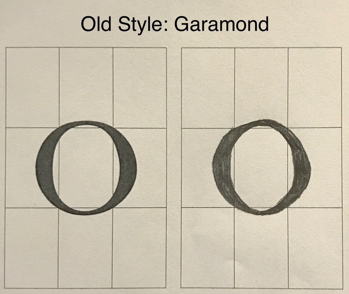
I felt like the Old Style font is classy and looks very elegant, the font was quite easy to draw and smooth as well.
Transitional: Baskerville (mid 18th Century)
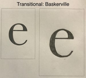
The Transitional was very close to the Old Style, and the smoothness I certainly didn’t feel. It felt more ruff.
Modern: Bodoni (late 18th Century)
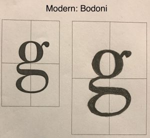
I really liked Modern, especially this letter. It was so much fun to draw, the curviness of the letter was a lot of fun drawing.
Egyptian or Slab Serif: Clarendon Light (19th Century)
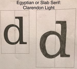
The Egyptian or Slab Serif seems very harsh and narrow. It’s a letter that’s straight and didn’t quite like it, to dull.
Sans Serif: Helvetica (19th – 20th Century)
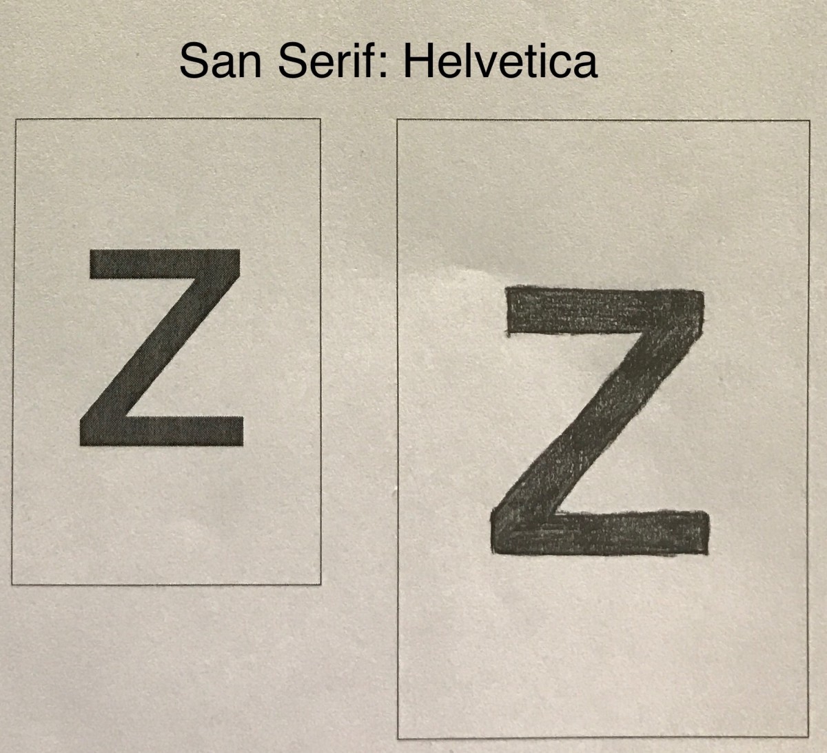
The Sans Serif is close to Egyptian or Slab Serif just without the serifs. Very straight but clean.

