For our 3rd assignment in Type and Media, my class was instructed to take pictures of the many typefaces that we bump into in our daily live. We were to hunt down at least 1 photo of each of the 5 Families of Types and distinguish them. At first I thought this assignment would be a little difficult, but after getting my self familiar with each typeface family, I was able to distinguish and find that I took a picture of each type face. This was a very fun and interesting practice, I now memorized each typeface thanks to this assignment. Follow below and you’ll be able to distinguish them yourself!
Serif: The right-angled or oblique foot at the end of the stroke within certain typefaces.
![]() Old Style: Garamond
Old Style: Garamond
The characteristics in this typeface that points it towards Old Style, is that the serif tips in the letters such as ‘F, H, I’ you can clearly see the soft curve finish that Old Style Type is known to have.
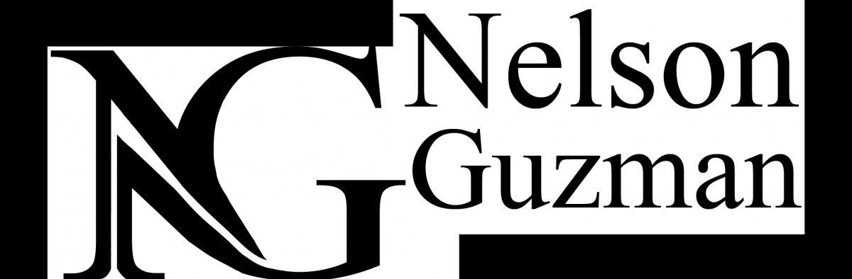
 Transitional: Baskerville
The characteristics in this typeface that points it towards Transitional, is that the serif tips has angular straight angle shapes, such as the ends of a rectangle. Look at the serif tips of the letter A in this photo as an example. It’s like Old Style, but the serifs are given a straight cut.
 Modern: Bodoni
The characteristics that are easy to recognize within the typical Modern style typeface, is the skinny rectangular crossbars and the serif tips that match the skinny rectangular cross bars. In this photo, you can see the skinny crossbars on the bridges of the H and the A. The serif tips (such as M, H, E) also have the familiar finish to that of the crossbars. They are like tiny very skinny straight rectangles.
 Slab Serif or Egyptian: Calrendon
The characteristics in Slab Serif reminds me a bit like Modern Typeface, due to the crossbars and the serifs all have a straight rectangle shape to them. However, Slab Serif makes its bars and serifs Fat, along with the overall typeface itself. As can see by this photo, the typefaces serif finish and bars are all fat and chunky. They are like many giant blocky rectangles.
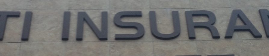 Sans Serif: Helvetica
The easiest and simplest way to spot a Helvetica San Serif font, is the lack of serifs. As you can see in this photo, the typefaces are all lacking in serifs at the end of every letter.

