I’ve come learn many new things in Graphic Principles class. In the class, we had gone over all the Elements of Art, the Principles of Design, Line Art, Form, Shape, Space, Value, Balance, Texture and much more. During the semester we were given many different art projects for each week, learning new forms of art and design as we go. Below I’ll share with you, a few of my favorite pieces that I’ve done in the class.
Heavy and Light Line Art
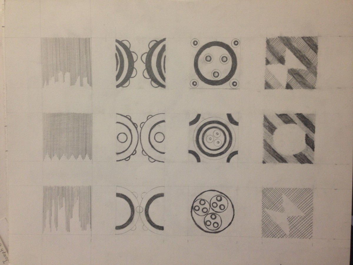
We were a given a lesson on Line Designs and Abstract art. A Line is a mark on a surface, usually created by a pen, pencil, or brush. Lines vary in width, length, direction, color, and degree of cure, and can be two-dimensional or implied. For this assignment, we were to write down any words or phrases that come to thought when you think Heavy and Light. Then we picked the words that we liked the most and create an abstract line design for each word. We then paired up with a partner who picks 4 designs that we’ve drawn, 2 from Heavy and 2 from Light. We then draw in pencil 3 different variations of each designed picked. Then our partners pick 1 of each row and draw the design’s carefully in pen. Below are the end results.
 Heavy and Light Line Designs
I had a lot of fun with the assignment, especially naming them.
Form Art
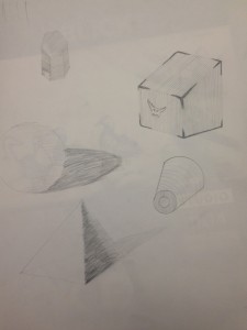
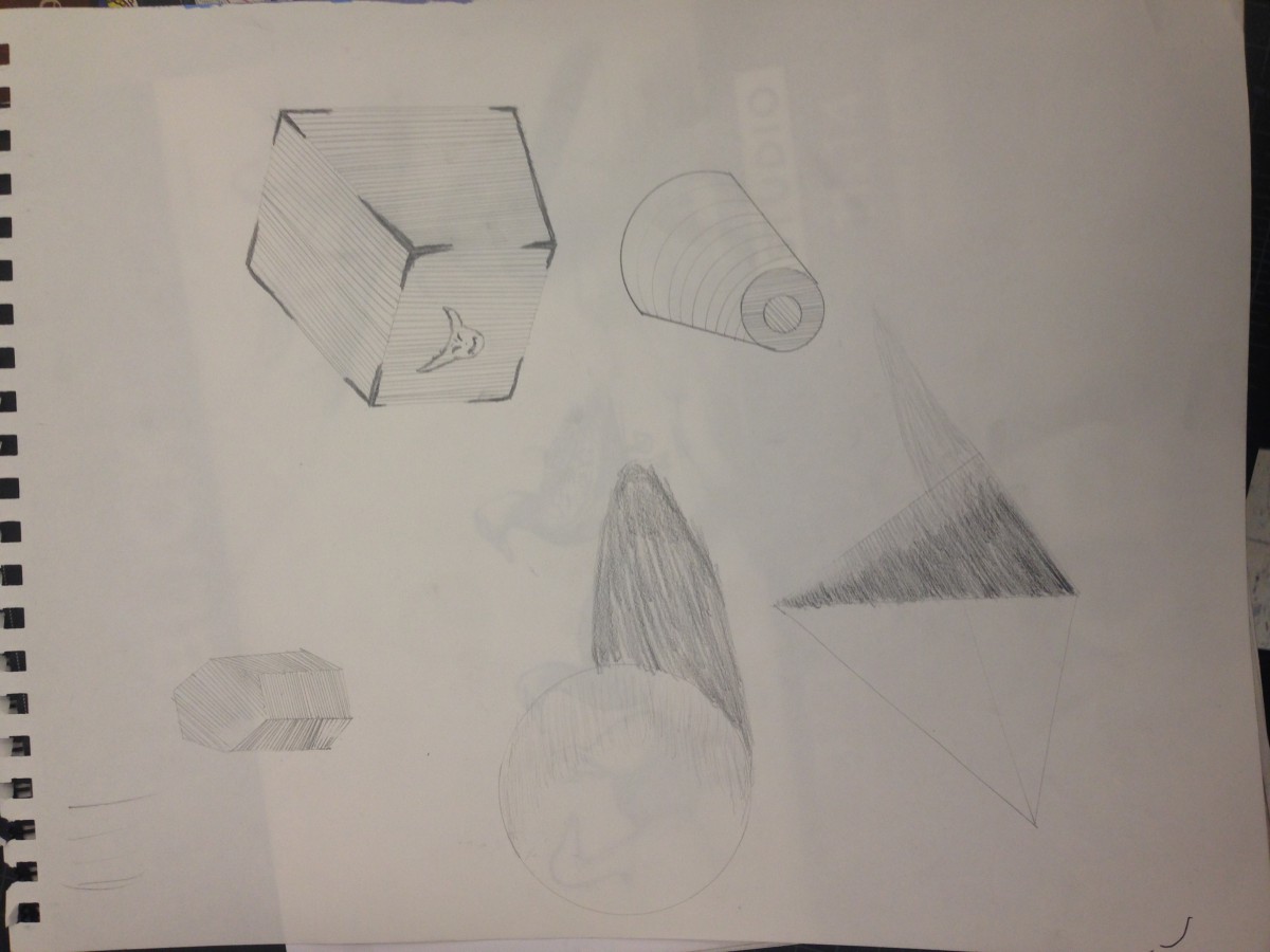
Another of my favorite lessons and assignment we were given, was a lesson on Form art and design. Form is a three-dimensional object or, in an artwork, the representation of a three-dimensional object, defined by contour, height, depth, and width. It was fun to draw in different forms and respective views. We were then given the assignment to design our on form art in adobe Illustrator. I created a 3D Model of a star, made copies and created a pattern with complimentary colors adjacent to each other. With a familiar shape of 3 triangles aligned together in 3D, it’s one of my favorite designs of art that I tend to place in my designs whenever it feels right. The End result is placed below.
 Form Design ‘3D Playground’
Simultaneous Contrast
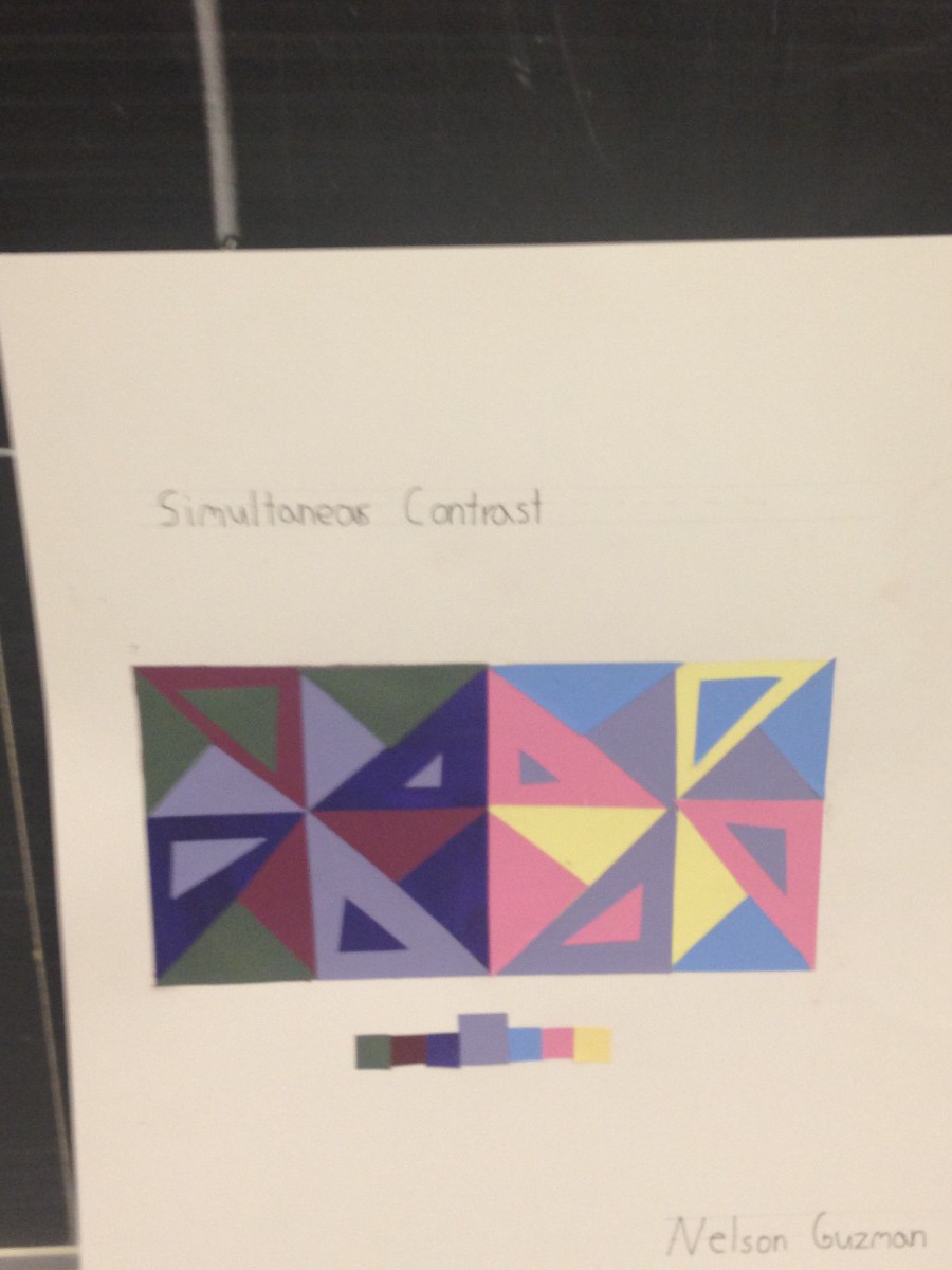
The lesson and assignment that I have loved the most were our lessons in Simultaneous Contract. Simultaneous contrast refers to the way when two different adjacents colors effect each other. One color can change how we see the tone and hue of another color when placed side by side. So for our assignment, were to mix paint, using only the colors magenta, colbot blue, yellow, white and black. With those colors, we were to create 3 dark colors, and 3 light colors, and 1 Middle color. We then align a complex shape using all 7 colors we created, but all the dark colors stay on 1 side, while all the light colors stay on the other, with the middle color being on both. I adored this assignment, due through its complicity and the end result that the class created together. It really messes with your sights when the middle color looks so different, just through the interactions of the colors around it. If I could, I would post everyone’s art from this lesson, I very much enjoyed this one and come to learn how it’s used in video games quite a lot.
I’ve learned many things in this class, that I plan to take to heart towards my goal to a graphic design career. I’ve already begun to use these lessons, to help me do well with my other classes. I can’t wait to work on new things for the new semester.

