Branding
In this assignment, I was given the task of designing a ligature logo for my ePortfolio banner. The logo is to be made up of type that will be branding me personally and my ePortfolio. Below I have provided multiple sketches, attempting the brand in different ligature styles. Using ligature examples from “Before & After Reading ‘Design a Logo of letters!’“. Followed by the final results of the logo you see now at the top of my banner.
How did you personalize the logo to communicate your brand?
From the very start of this assignment, I knew right away that I wanted my logo to have a big capital N, representing my first name ‘Nelson’. To me, the letter N comes off as a very assertive letter. Requiring a bit of force from the tongue to the top pallet of the mouth for words that start with the letter N, and ending words strongly on words that end with the letter N or an N sound. The letter N is a very shapely letter with tough spikes both from the positive space and the negative space. In order to feel consistent from using the first letter of my first name, I decided I would need to add a G for my ligatures, representing the first letter of my last name ‘Guzman’.
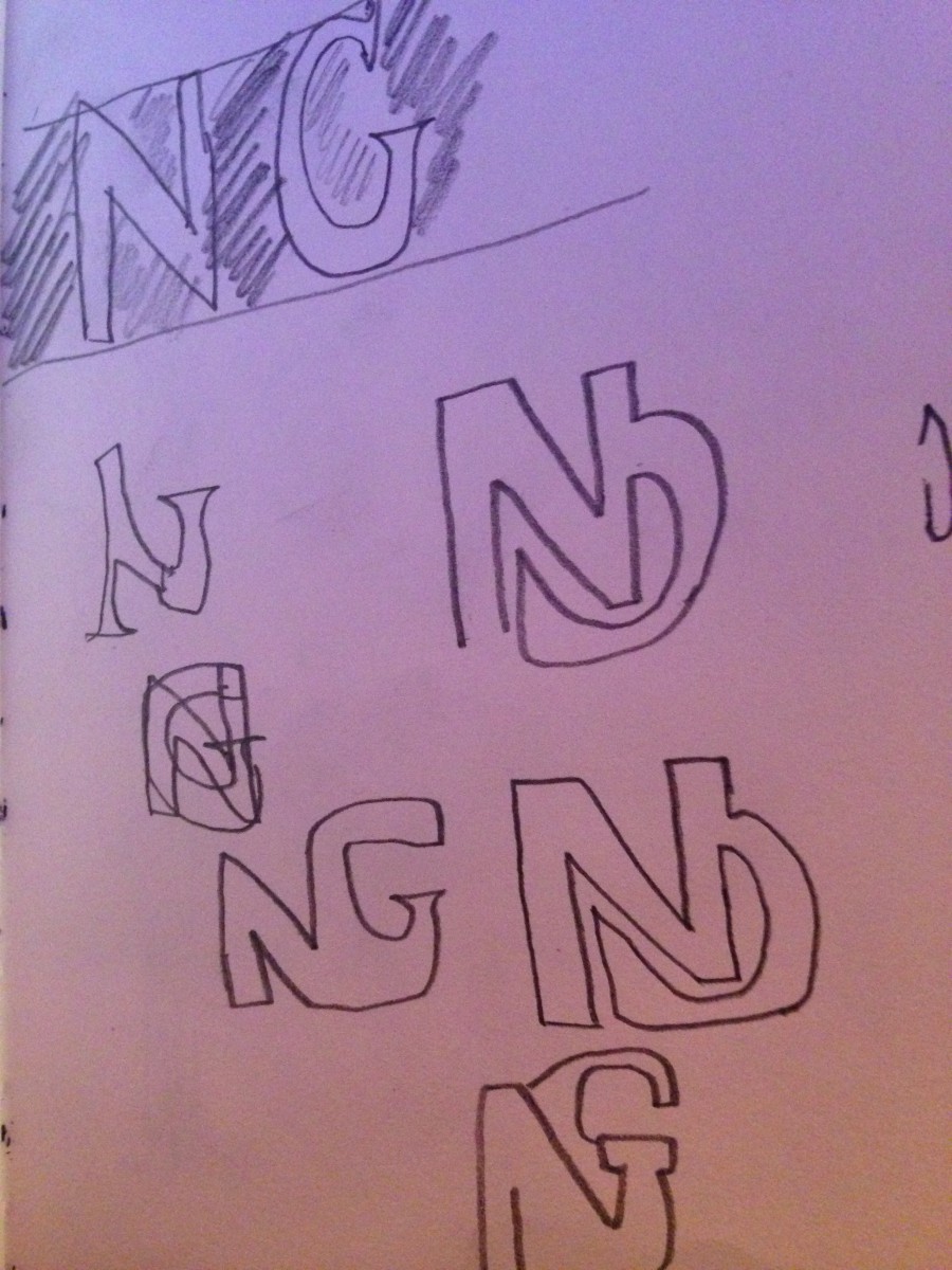
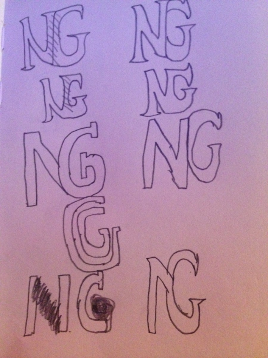
Sketch #1
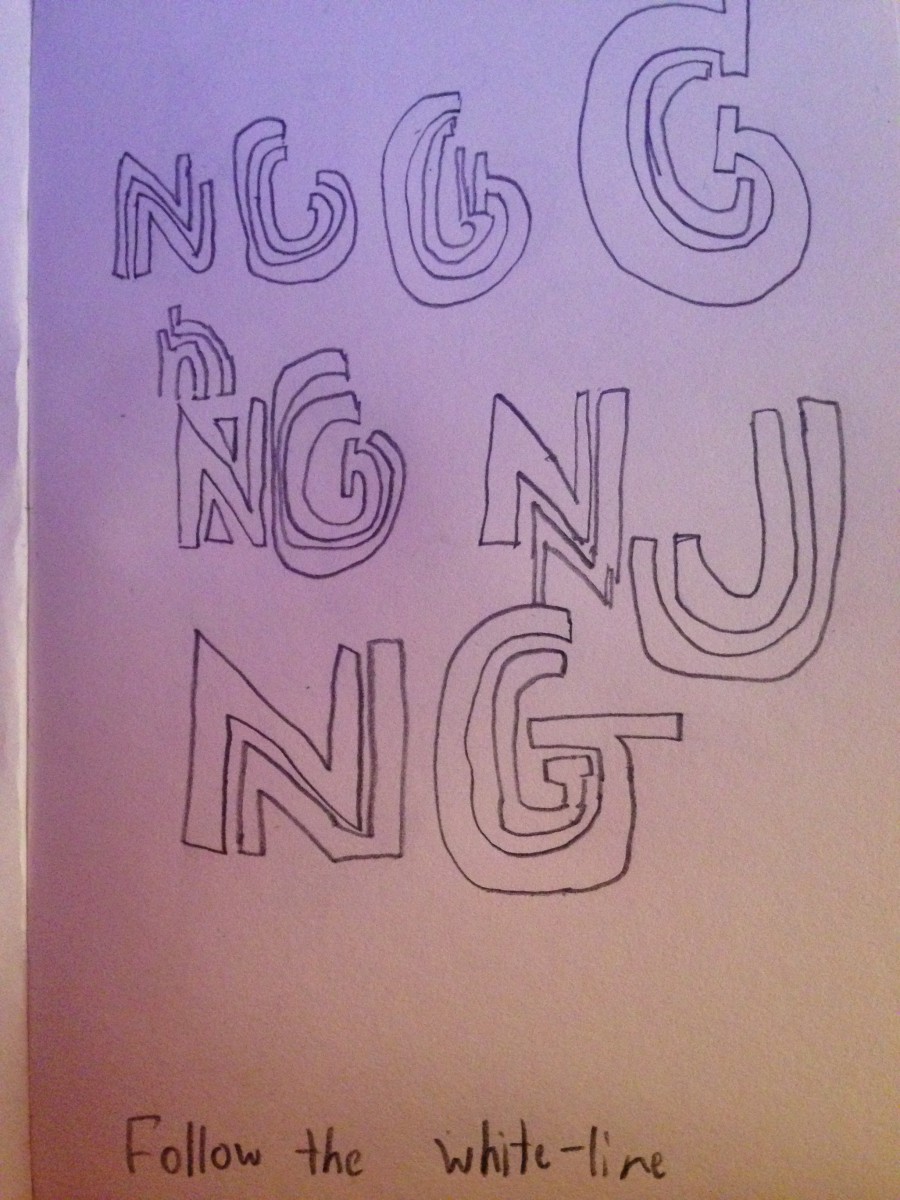
For my first sketch towards my ligature logo, I had first used the “Follow the white line” style. I chose to try this style first due to it’s subtle simplicity, making sure there is a white line down the middle of the letter, with the illusion of an attachment. The Letter N worked nicely with the follow the white line style. However the same could not be said for the letter G, which became the main reason I did not use this particular style immediately. I could not make the two letters attach through a white line, nor could I successfully design a white line on just the letter G. But I liked the way the N came out, so I kept this style in mind and placed it on hold to look back to later.
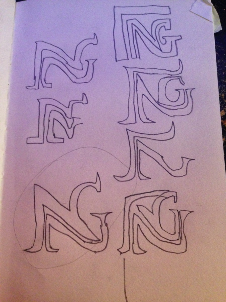
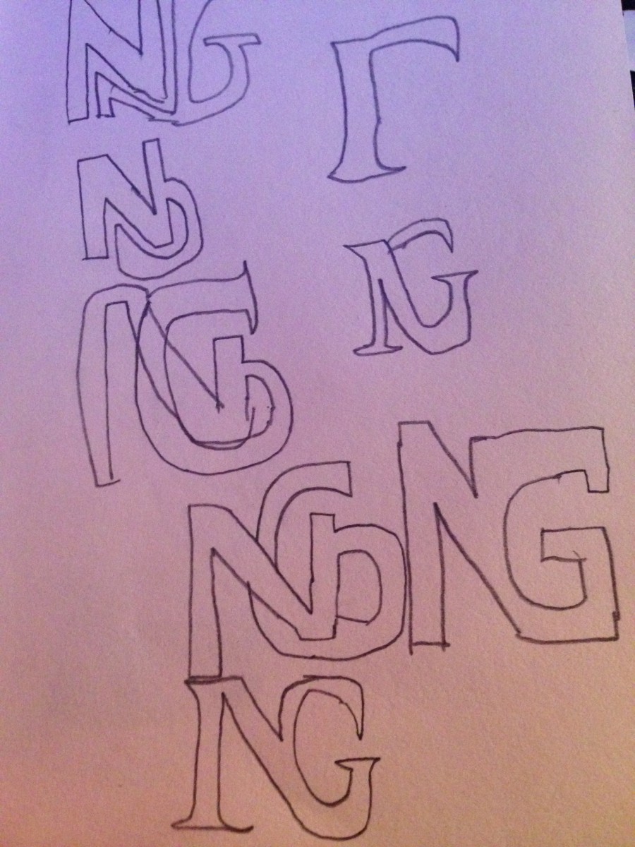
Sketch #2
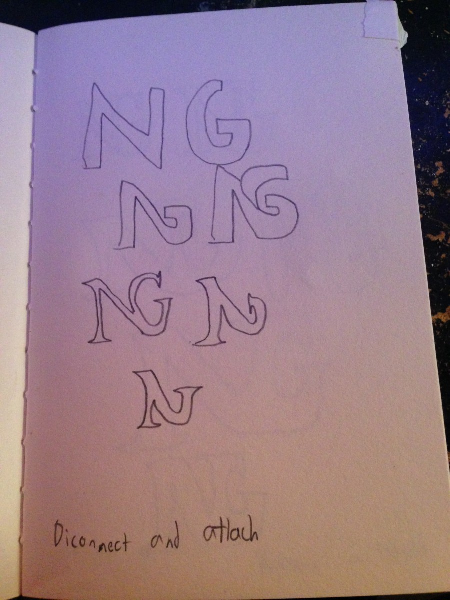
For my second sketch, I had used the “Disconnect and attach” style. I chose this style almost knowing right away that I would not like the end result, due to the two letter not having any kind of stem to detach and reconnect too. The shape of the N and G is completely different, one is more vertically straight, while the other is circular. But I felt I could get some ideas from it, so I decided to try and sketch it and see what I could come up with. But as suspected, the design looked a little to awkward, I felt someone might mistake the N for an A if I wasn’t to careful.
Sketch #3
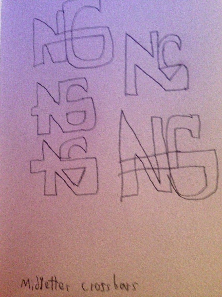
For my third sketch, I had used the “Mid-letter crossbars” style. I chose this style hoping to make a match between N and the G, I knew I needed the 2 Letters to connect or look right by each other, but I wasn’t sure how. So I tried this technique, hoping I can use the middle cross bar in G towards the N or to create a shape with the N. But as you can see, it did not connect at all. It made the letter N into something else entirely when I attempted to connect them. But I did not give up, I continued to sketch, trying out multiple ligature styles.
Sketches 4-17


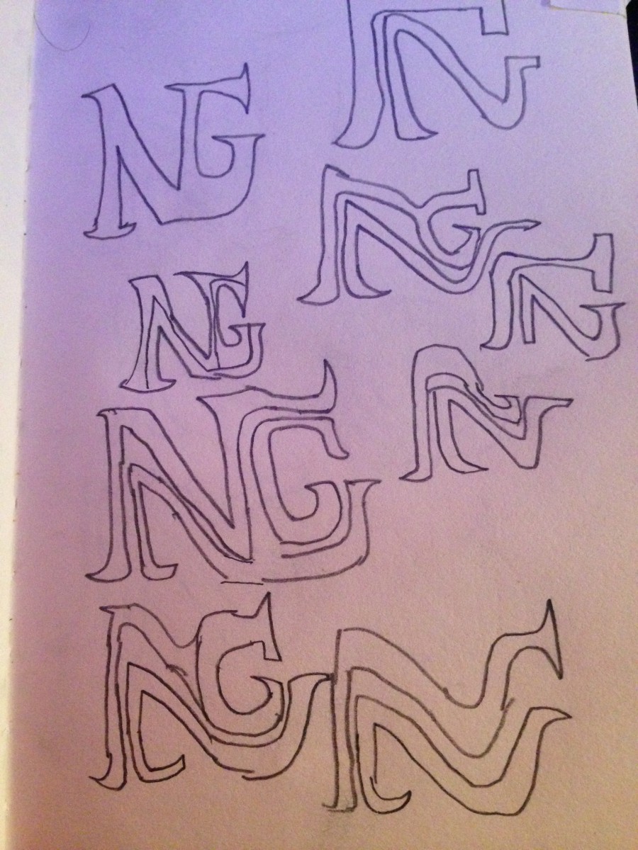
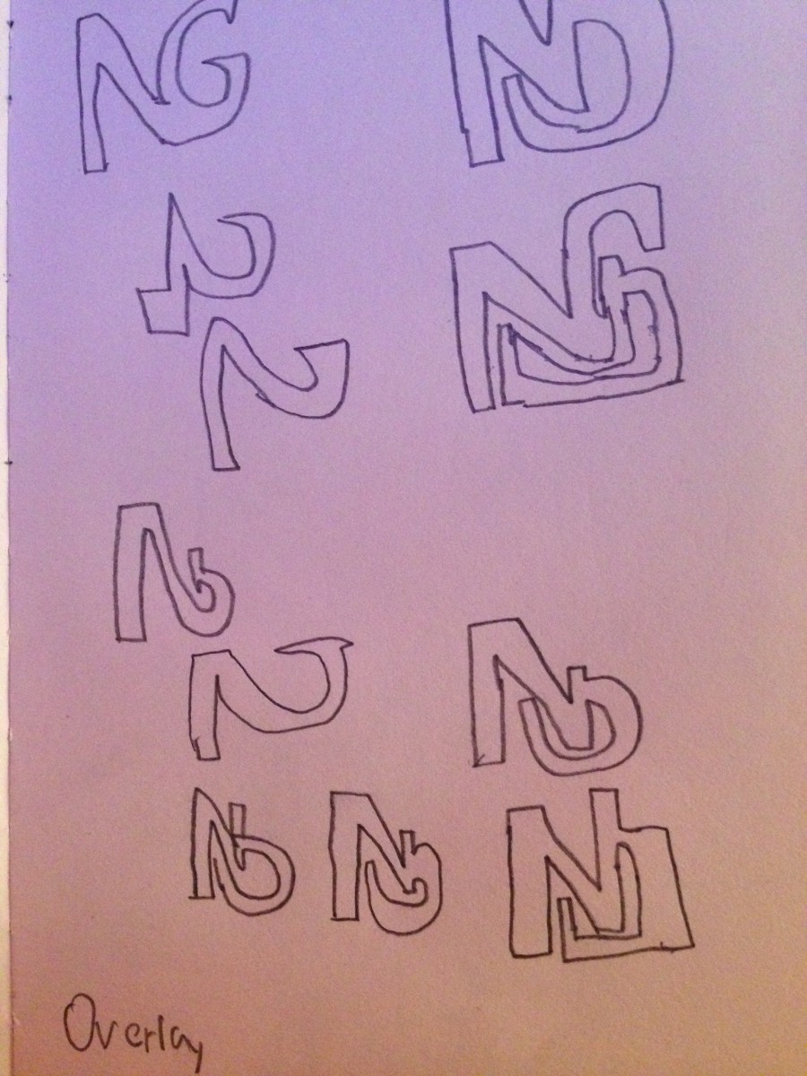


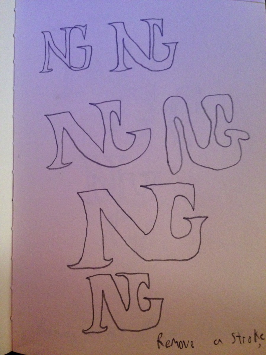
For a long time I continued to sketch multiple times, using more ligature styles and combining them for my final logo. It was very difficult to find a style that fit the combinations of N+G that left me satisfied. I really enjoyed the look of the ‘follow the white line’ style, so I had played around with that ligature style the most and trying to find my own version of that particular style, due to letters N and G not connecting. Below I circled a sketch of a design that I liked the most, deciding to mirror it digitally with Adobe Illustrator.
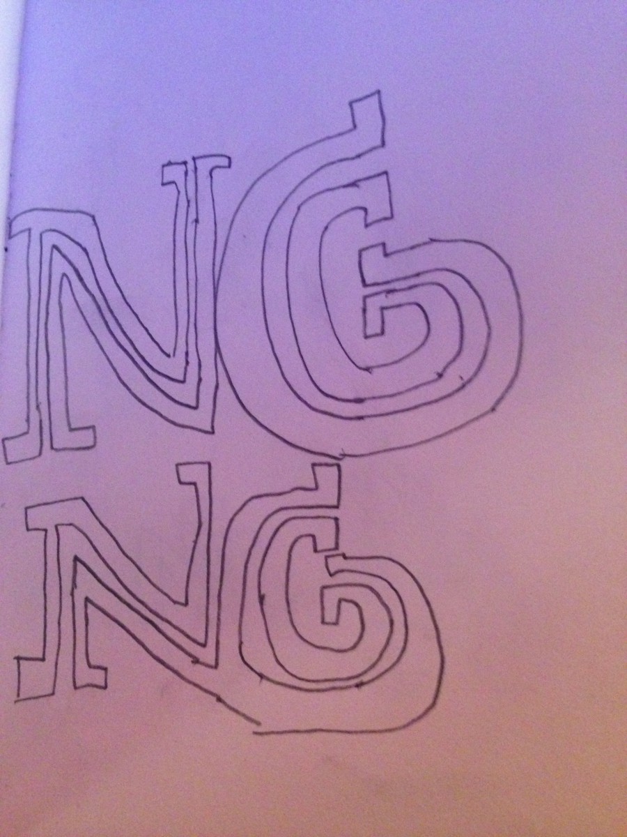
Final logo design
![]()
Design qualities of the logo
So after creating multiple sketches, I cherry picked what I liked from my sketchbook and combined them together to create this logo. I used a serif styled font, the classic Times New Roman typeface family of the letters N and G, twice each. The type height is 72 points, with the theme as regular. The 90 degree angle shape on the top left side is two black rectangles attached to each other, creating a nice balance of the positive and negative space with the letters. Everything is at 100%K, a simple black and white logo design.
Artistic Thought Process
The process for this logo was through lots of playing around with the ‘Follow the white line’ style through sketch. I really liked that style and I was trying my best to find as many different combinations as I can with that particular style. I knew the N and G will never connect in that style, but I still very much enjoyed the way the N looked. So I continued doing my best to keep use of the N in the ‘follow the white line’ style, attempting it in multiple different ways and found one that just made the white line open up to the cave opening on G.
I really liked the beauty of the serif cross lines on the N and the G, knowing right away that my logo needed to be in Time’s New Roman. So in adobe illustrator I had placed an N on top of an N, and a G on top of a G. Erasing the right side of the first N’s bottom left stem, and erasing the second N’s left side of the bottom left stem, placing them adjacent to each other to create the white line that would extend to the G’s opening. What I did was keep the top half of 1 N and the top half of 1 G, connecting them to each other. Then taking the bottom half of the second N, and connecting it to the bottom half of the second G. This created my own version of following the white line, I personally like to call it ‘follow the white line river into the ocean.’ I then added black rectangles in a 90 degree angle, shading over the letters, and finding a nice balance between the negative and positive space.

