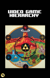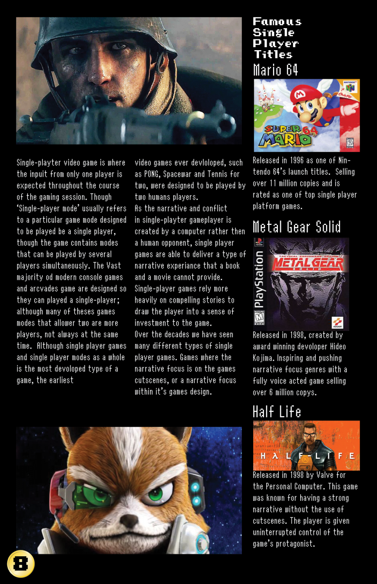
So the subject of my magazine is Video Game Theme. It gives a quick synopsis of Video Game history on what is the most relevant video game console releases. The over hierarchy with the video game industry, such as publishers, developers, distributors, and consumers. Along with a quick explain the most basic forms of video gaming.
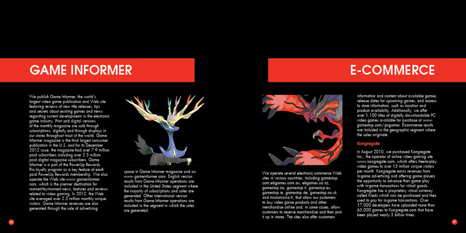
So I used game informer to help me get a guideline on developing my Project#2 Magazine, due to both Game Informer and my Magazine being Video Game Themed. On the top left one, I had used that as a guide to developing ‘Video Game Hierarchy’. The layout on the right picture with the small orange rectangles gave me a good idea on how to shape the timeline better.
Andy McNamara is the Game Informer’s Editor-In-Chief
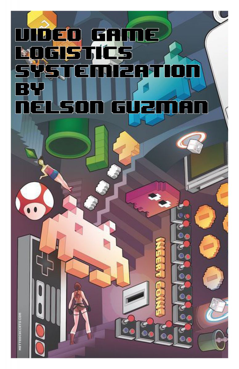
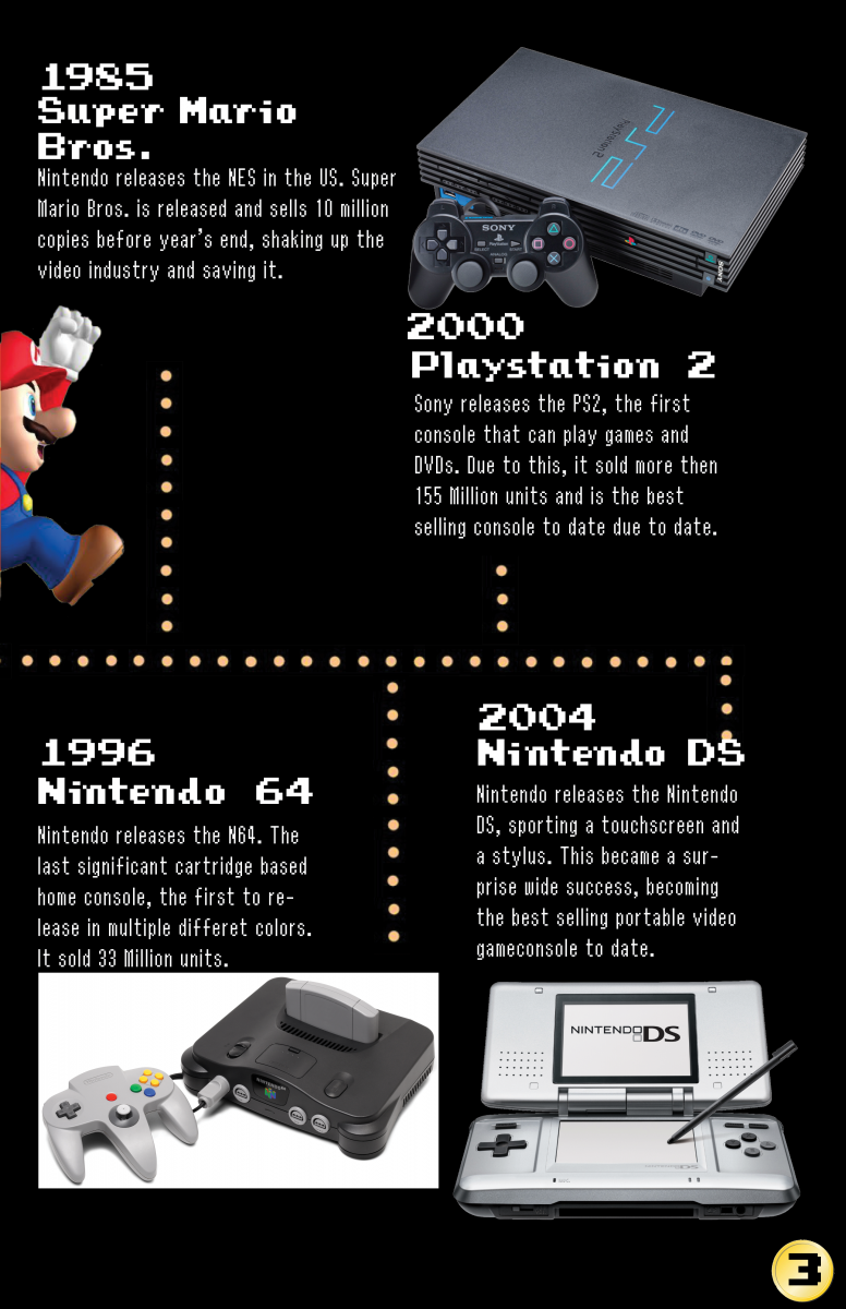
The challenged I faced was wondering how exactly how should layout everything. But the moment I picked up a couple game informer magazines for some inspiration, my thoughts came flooding in and I was able to cook something well. The picked typeface based on everything video game related. One typeface might be familiar to anyone who’s played The Legend of Zelda A Link to the Past, another is from the Marios Bros., and Pacman inspired font as well. Three Famous Video Game Icons. I also went with a black dark layout, I’ve noticed most game informer pages tend to have it and it does make sense to me, gamers are used to a dark layout from games in general. My favorite part of the design process was creating the timeline with the Pacman pellets. My original idea flipped upside down the more I worked on the magazine. Overall I had a lot of fun working with Indesign.
Below I will insert animation pdf