This being our final project, we focused on video as a media and how to edit as professionally as possible. In doing so, we were to interview a classmate where I got to get to know them with my both design-based and personal-based questions. Filming wise, I was inspired by Vogue’s popular “73 Questions” interviews with different celebrities and wanted to replicate their style straying from “traditional” interviews. Though, the biggest challenges I came across was when it came to editing my video effectively using a program I was not familiar with using. I spent a lot of time trying to decide how I wanted it to look—more specifically where my text was going to go, where I was going to cut the video and what effects I wanted to use. I stayed simple especially given my now very basic understandings of Premiere Pro. But overall, I enjoyed this project the most and learned that there are professional techniques in editing any type of video effectively such as using the rule of thirds not only as a graphic design method and how much using subtle music makes a big difference in playback. | Final Interview
Interview Questions
- What was your dream job as a child, and how is it different now?
- What field/branch of design are you particularly interested in?
- Best advice you can give to any beginner designer/anyone who may be interested in graphic design?
- What are some of the biggest things you’ve learned in college?
- What is one of your biggest fears?
- Do you see yourself moving and living anywhere other than New York?
- What are your favorite and least favorite classes you have taken so far?
- If you could travel back in time and tell your past self anything, how far back would you go and what would you say?
- If you could speak any language fluently, what would it be and why?
- What keeps you motivated?
Cooper Hewitt Field Trip Report
Since the year of 1896, The Cooper Hewitt Smithsonian Design Museum has claimed and kept their reputation of being the only museum in the country that is particular to historical and contemporary design. Located on the Upper East Side of Manhattan, the museum has been open to the public showcasing the history of design and the creativity it holds with works that span from as long as 240 years. With that being said, a visit at least once is a must when entering and taking interest into any branch within the design field. I had the honor of visiting a second time and had the opportunity to appreciate the Jazz Age as they opened an exhibition exclusive to a time where the popularity of multi-media took a peak. With two floors full of architecture, interior design, fashion and music, the museum gives an insight into the chronology of fine art and its potential.
During my second visit, the entirety of The World of Radio display, for one, really caught my attention. Especially because I saw some very familiar devices such as the iPod Nano and the Google Home, I was intrigued by the communication of sound and its evolution. Displaying an array of physical radios, photographs and drawings, it provided an ultimate time traveling experience.
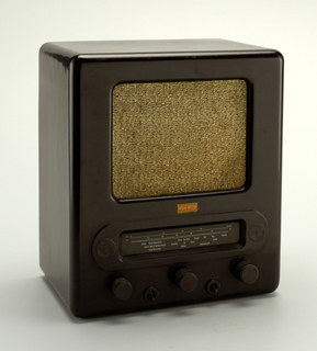
 Volksempfänger VE 301 DYN Radio, 1938
In particular, it included the Volksempfänger radio that dates back from the 1930s designed by Walter Maria Kersting. Being approximately a foot tall, it was made with bakelite, a type of brown colored plastic designed to be affordable so that such technology could be as accessible as possible to consumers.

Freeplay Radio, 1996
A later radio dating 1996 was the Freeplay wind-up radio designed by Andy Davey, Gabby Clarke and Anne Gardener. Made from molded plastic and metal, this radio was invented purposely to communicate to areas of Africa, powered by a crank rather than batteries.

FR 600 Radio, 2008
Similarly in 2008, the FR 600 was invented specifically for emergencies without the need of batteries while using plastic, elastomer, metal as its medium. Though, its versatility allows for a walkie-talkie ability, a phone charger and a flashlight to name a few.

iPod Nano, 2009

Google Home, 2016
And finally, the most recent being Apple’s iPod Nano and the Google Home using smart technology for even more conventionality. The iPod provided the ability to download music to listen anywhere at any time and the Google Home encompassed interactivity by using voice recognition to perform numerous capabilities such as playing music and searching the web. In short, this exhibition celebrates the amazing advancement of sound communication and production over time.

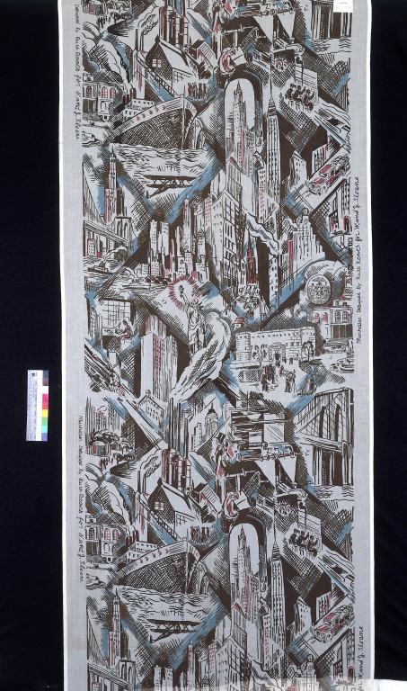
Textile, Manhattan, 1930
Additionally, I found inspiration in a textile design by Ruth Reeves in the 1930s called “Manhattan”—a medium of linen and dimensions of 203.3 x 89.2 cm. This design drew my attention mainly because it exemplifies what New York City entails from architecture to famous landmarks such as the Statue of Liberty, the Empire State Building, the Brooklyn Bridge and the Manhattan Bridge. I have found that as a collage and the use of tight to no spaces between each aspect of the city also gives off a sense of being busy and hectic thus the design being a true representation of the city. Reeves’ design is mostly comprised of black outlines with hints of blue and red throughout and has influences of Cubism, an art movement in which an image is broken up into parts using movement and abstraction.

Painting, Composition with Red, Yellow, and Blue, 1927
Not to mention Piet Mondrian’s Composition with Red, Yellow, and Blue painting in the year 1927 that, last but not least, stood out to me as well. With a medium is oil on canvas and unframed dimensions of 49.5 × 49.5 cm, I noticed similarity and reference to the De Stijl movement. Little did I know that Mondrian was actually a cofounder of the movement founded in 1917. It is clear that it prioritized geometric forms and simplicity while reducing to only using the primary colors of none other than red, yellow and blue. The style focused on asymmetry, harmony and abstraction in which its ideas were later expanded to architecture. Along with Cubism, De Stijl is one of the most influential movements to design.
From radios to paintings to textile design, it was eye-opening to be able to see the development of technology and the development graphic design through different art styles. The Jazz Age was a major component that helped shape modern day design and media that is more than deserving of its own exhibition.
Logo History Evolution
Being one of the biggest technology companies in the industry with their electronics, computer software and Windows operating system, Microsoft’s service and branding can be considered to be more than well-known. Founded in 1975, Windows has become the most popular operating system today followed by Apple’s MacOS. With that being said, Microsoft’s logo can be easily recognized despite its drastic changes over the years where the use of different typefaces and the addition of color are the biggest differences. Their current logo was introduced in 2012, a change that has not been made in as long as 25 years prior. Its new look celebrated the release of new products as well as the release of Windows 8, and when compared to their earliest logos, there is almost no resemblance.
The designer(s) of the first few logos is not known, however, the original clearly resembles the era of the 70s and 80s. Designed the year it was founded, it was known as the disco-inspired, “groovy” logo.
Microsoft’s first logo, 1975
In 1980, Microsoft then unveiled a “dark” logo that did not last long with its design looking as if it belonged to a metal band, some letters extending past the baseline with slanted edges and tight kerning.

Microsoft’s “metal band” logo, 1980
Their third logo was called the “blibbet logo”, introduced in 1982, it featured the name of the company in a type with much thinner strokes on a green background. It got its name from the middle “o”, the only letter with a design, standing out from the rest. This was in use until 1987 when designer Scott Baker designed their “Pac-Man” logo.

Microsoft’s“blibbet logo”, 1982
Resembling a classic arcade game, Microsoft’s fourth logo’s typeface is now set in Helvetica and in italics. It exhibits a slit in the “o” connecting it with the “s”. The idea behind this design was to indicate speed while putting emphasis on “soft”, separating it from the first half of the logo. 
Microsoft’s “Pac-Man” logo, 1987
Finally, fast forwarding to 2012 to present time, the Microsoft brand is now in color and uses the roman Segoe typeface. Unlike past logos, this now includes a visual icon of a red, green, blue and yellow window reminiscent of the Windows logo, instead as simple, flat, symmetrical shapes. To accompany the release of new products and improved versions of Windows and other popular applications, the redesigned logo signals Microsoft’s “new era” (Meisner).

Microsoft’s current logo, 2012
Microsoft’s logo can mainly be found on their products and official website. In their advertising, it can be seen that they are simplified to complement it. For instance, they now use one “flat” color as the background and short tag-lines along with only one image of the product in the center. Microsoft’s new era has turned over to a new modern, minimalistic style. Given that, as companies change and evolve, their branding follows representing and keeping up to date with its overall identity and success.
Visually Enhanced Quote Project
For my three concepts of my chosen quote “Adventure Is out There!”, I mostly focused on a very literal idea of adventure:
In my first and photographic concept, I have intentionally chosen a photo of some body of water in which you can see both above and below the surface. Since “adventure” can be broken down to numerous different meanings, I went down the water “route” and further empathized the quote with my type treatment. | pdf file
Because I imagine a more outdoor setting when I think of adventure, I chose mountains in this concept. I wanted to have the type to also visually depict the quote so I had a part of the mountains act as a letter “v”. | pdf file

The quote being from the movie Up, I wanted at least one of my concepts to resemble where it came from. Given that balloons play a huge role in the movie, it was a must to incorporate it. But instead of the balloons being tied to a house, I had them connect to the type/quote. | pdf file
UCLA Extension Posters

2016 Winter Keith Knueven

2015 Spring Willem Henri Lucas
I found these two posters for UCLA Extension the most appealing, especially the Spring 2015 poster by Willem Henri Lucas. What really worked/s for me is the photograph of rubberbands in the background to empathize “extension” in addition to its repetition and bright, contrasted colors. I also found the type treatment where “UCLA Extension” is stretched out and aligned with the photograph to be clever in keeping the theme consistent.
The Met
Before reading this article, I did not think that a change in logo would or could cause an uproar. Of course, logos are a company’s identity, but when The Met changed theirs, others did not exactly criticize the design of it/ Instead, they were just not in favor of the act of changing it. Some felt that their logo should stay as it was since it is a museum after all so it would only make sense to keep it “historic”. I did not think it mattered too much. nut I now know how much it could for your business to represent themselves.


