Being one of the biggest technology companies in the industry with their electronics, computer software and Windows operating system, Microsoft’s service and branding can be considered to be more than well-known. Founded in 1975, Windows has become the most popular operating system today followed by Apple’s MacOS. With that being said, Microsoft’s logo can be easily recognized despite its drastic changes over the years where the use of different typefaces and the addition of color are the biggest differences. Their current logo was introduced in 2012, a change that has not been made in as long as 25 years prior. Its new look celebrated the release of new products as well as the release of Windows 8, and when compared to their earliest logos, there is almost no resemblance.
The designer(s) of the first few logos is not known, however, the original clearly resembles the era of the 70s and 80s. Designed the year it was founded, it was known as the disco-inspired, “groovy” logo. ![]()
Microsoft’s first logo, 1975
In 1980, Microsoft then unveiled a “dark” logo that did not last long with its design looking as if it belonged to a metal band, some letters extending past the baseline with slanted edges and tight kerning.
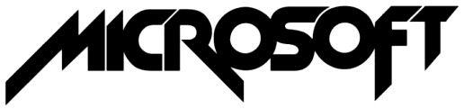
Microsoft’s “metal band” logo, 1980
Their third logo was called the “blibbet logo”, introduced in 1982, it featured the name of the company in a type with much thinner strokes on a green background. It got its name from the middle “o”, the only letter with a design, standing out from the rest. This was in use until 1987 when designer Scott Baker designed their “Pac-Man” logo.
![]()
Microsoft’s“blibbet logo”, 1982
Resembling a classic arcade game, Microsoft’s fourth logo’s typeface is now set in Helvetica and in italics. It exhibits a slit in the “o” connecting it with the “s”. The idea behind this design was to indicate speed while putting emphasis on “soft”, separating it from the first half of the logo. ![]()
Microsoft’s “Pac-Man” logo, 1987
Finally, fast forwarding to 2012 to present time, the Microsoft brand is now in color and uses the roman Segoe typeface. Unlike past logos, this now includes a visual icon of a red, green, blue and yellow window reminiscent of the Windows logo, instead as simple, flat, symmetrical shapes. To accompany the release of new products and improved versions of Windows and other popular applications, the redesigned logo signals Microsoft’s “new era” (Meisner).
![]()
Microsoft’s current logo, 2012
Microsoft’s logo can mainly be found on their products and official website. In their advertising, it can be seen that they are simplified to complement it. For instance, they now use one “flat” color as the background and short tag-lines along with only one image of the product in the center. Microsoft’s new era has turned over to a new modern, minimalistic style. Given that, as companies change and evolve, their branding follows representing and keeping up to date with its overall identity and success.

