Presentation on Google Drive [x]
Visualizing NYC Exhibition
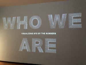
After seeing the Visualizing NYC exhibition at the Museum of the City of New York, I would name it as one of the most interesting exhibitions I’ve seen. Using collected data and statistics, it highlights NYC’s unique history and its peoples. There is a reason why this city is known as a melting pot.
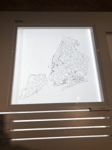
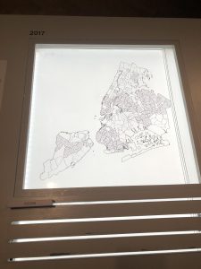
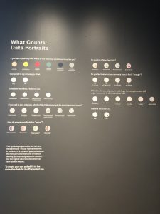
One of the works that caught my attention was an interactive display that showed the migration of 4 different racial groups between 1970 and 2017. It was particularly interesting because my neighborhood’s (Bath Beach) population, in particular, was predominantly Italian-American historically. It was only until the 2000s when it became more ethnically diverse. There was a rapid growth of Asian residents and the maps here showed exactly that.
Another display at the exhibition was the Languages of NYC by Jill Hubley which graphs the predominant languages spoken within the 5 boroughs. Naturally, I was curious about Chinese. It was really interesting to be able to isolate the data on where Chinese is spoken most from the others. I was not surprised to see my own neighborhood to be highlighted here. 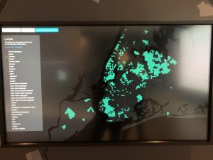
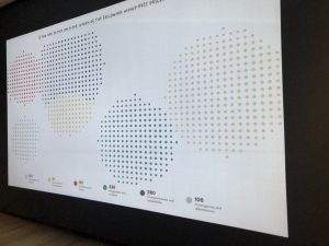
The other display I found most interesting is not hard to miss. Unlike all the other displays, the exhibition created and is collecting their own set of data by inviting all visitors to answer a series of personal questions. These answers are then visually represented on a projection on the wall. Interactivity will always catch my attention and it was compelling to see how your response compared to the hundreds of people that participated.
Client Back & Forth
Recently, I was tasked to address comments from a client on a video. It was already close to being done, however, it took longer than I expected to get their approval. I ended up sending over about 4 rough cuts within two weeks because the client wanted certain shots to be replaced within each one.
At MATTE, we use Wipster to not only keep a library of all our work and projects but to also share cuts with the clients. When a link is sent to them, they have the ability to comment directly on the video and on a certain timestamp. In this way, I knew exactly what shot they wanted replaced. At the same time, the account managers that have contact with the client are also told what changes they want to be made.
But, it came to a point where we were running out of b-roll to use. After giving them many options, they finally approved. In the end, every shot but one I replaced with did not make the final cut. They opted to completely remove the others and to extend the other clips to fill up the empty space. Although I am disappointed, it was exciting to work with a client. It was also satisfying to be able to take a video to the finish line.
Webinar
As a newbie to the video/film industry, I found a webinar on LinkedIn Learning called, “Foundations of Video: The Art of Editing”. Upon coming across the course, it interested me since it was specific to post-production. The speaker, Norman Hollyn spoke about the beginnings of video editing to the editing process to different editing styles. This being a beginner webinar, I found this to be very easy to understand and follow. He not only broke down topics but he also showed examples.

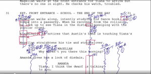 Some of the information was familiar to me such as shot types and scripts since haven taken the Intro to Film class and the Intro to Video class. However, I still did learn a lot. The key points of this webinar were: video editing is an extremely powerful process that helps bring about certain emotions from an audience and that editing is a craft by the process of arranging clips/scenes to tell a story.
During the webinar, Hollyn visits a short film where he goes through his thought process during the editing. Here, he explains the decisions he makes such as why he made a certain cut or why he arranged the scenes in a particular way. I find this to be very informative since there is an infinite number of ways to edit any type of video or film. Thus, this was interesting to see.
Later, Hollyn talks about the different genres of editing such as documentaries, comedies, music videos. He also goes into commercials which are more in line with MATTE and their work. For instance, he talks about how commercials can be cut down to 30 seconds to 15 seconds. At my internship, I did take note on some of the projects they have down where there were multiple different versions of one video—one of which may be 60 seconds, one would be 30, and another would be 15. There are many formats of a commercial and when it comes to editing, the same concepts of cutting and arranging will still apply to them.
A Video from Start to Finish
My day to day varies at my internship from making pickups to sourcing stock footage and music to editing videos using Premiere Pro. On days I am editing, I am either making selects, editing a rough cut, or making changes to a rough cut from client feedback or feedback from my supervisor.
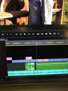
During my experience here, I have learned about the stages of video editing from start to finish. Selects are first made from the raw footage. As mentioned before, this involves picking out the best shots for the final edit. This compilation is known as a stringout. Using this, rough cuts are then made, which are drafts of the video. These are more refined—but still ways from finalization—assemblies that involves trimming, the input of audio, arrangement of the shots, etc. During this process, there may be many back and forths with the client until it is approved. At the same time, other employees such as the in-house director or the account manager may take a look at the video and offer their two cents as well. After given the green light, it gets sent to another company to be colored. Prior to this internship, I was not familiar with a “colorist”. In short, they are responsible for the final “look”, color correcting and grading the video.
Once the colored video is sent back to us, it is finally a finished piece.
Re: AIGA Design Ethics Guidelines
The AIGA’s guideline makes clear and good points on design for both designers and the clients. It explains what it is, what it isn’t and breaks down what makes one effective. For instance, it first states that style and “good looks” are only secondary to the main goal of design—communication. I find this important to emphasize as the reverse is still often believed by many. These guidelines also touch upon the purpose of a creative brief to going into detail about the components of a design from software to fonts to illustrations to photography. Although this seemed basic initially, I am not too informed about licensing besides the basic knowledge of needing permission to use/alter someone else’s original work. I was unaware about registering and paying an application fee for copyright protection. I have always been careful about work that is not my own but copyright has also always been cloudy to me so these guidelines really helped answer the questions I did not know how to ask. It discusses the difference between exclusive rights and fair use and licensing when it comes to fonts and photography, all of which are important to know for designers.
App Reviews
Slack
At my internship, we regularly use Slack to easily communicate with each other. After having used it for a while, I would praise this application to be great for productivity. For one, this application helps reduce the level of noise in the office as we have an open workspace. With its group and direct messaging feature, there’s no need to leave your seat to speak to someone. The culture of the company can be quite fast-paced where many of the employees are in and out of meetings or in and out of their desk area so you would have to spend time to look for them half the time. But as both a desktop and mobile application, everyone keeps their line of communication open and will respond quickly at almost any given point in time.
Slack also helps with organization. There are always multiple projects being worked on at once and all of them are separated by channels. Within each channel, only those involved in a certain project has access to it. In this way, everyone in the office would not be receiving a notification for every message sent across the company-wide platform. This system is also beneficial in keeping all messages and files related to one project in one place.
Wipster
MATTE also relies on Wipster which, like Slack, is a collaboration platform. However, this site and app is specific to video sharing.

Networking Event at The One Club
 As a member of The One Club, I attended the Gold on Gold event in their Hudson Yards office. This event in particular is held annually as a way to hear from the winner of both the Gold Pencil and the Gold Cube award. But also, between checking in and the anticipated panel, they had an open bar, a food table, a big couch, and rounded tables for everyone to converse and get to know each other. And a major benefit about being a part of The One Club is being able to be surrounded by like-minded people as an exclusive organization that supports creatives.
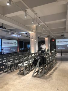 I arrived early and was one of the first there but the room was soon packed that I had trouble hearing my own self talk. I did get to speak to two people during my time there while also connecting with them on Linkedin.
I first met a recent graduate from Cornell who has an interest in UI/UX. While this was my first One Club participation, she also shared with me her experience with being a member. For instance, she attended a few other events such as one that taught her about making a salary and another on being a female in a creative field. Hearing this gave me the urge to be more involved and keep my eyes peeled on upcoming events.
I also met someone who is currently studying advertising at FIT, which is almost right next door. Like me, this was also her first event with the organization. We both shared our favorite things about the industry and the process of designing and she told me that she’s currently been focusing on a project with MLB. Not to mention that we also talked about the food served there. I passed on eating anything but I did hear from others that they were impressive.
Agency Event
Today I attended what they call “Agency Standup”. The Director of HR sent out a company-wide invite a week earlier and upon receiving it in my email, I was beyond confused by what that meant. So when the time came, all the employees gathered around at the front of the office and I just followed suit.
One of the co-founders, Max Pollack, was front and center to discuss the fall season for the company. He started off by giving a formal welcome to those who have only recently joined the team. Such as us interns, we, one by one, handed each other “the mic” to introduce ourselves and to state what we were most excited for during our time here. They referred to us as the “second generation interns”, leading me to assume that their internship program is likely to be fairly new. But nevertheless, I felt grateful to be where I am. If there was anything I was not expecting, it’d be standing in a lineup of interns in front of everyone but it did feel good to be acknowledged.
Max also took the time to recognize the employees’ hardwork, to address what’s to come, and to motivate them for the upcoming months. He shared that they’ve already been kicked out of three offices before their now, Tribeca home. Hearing this took me by surprise but this fact was treated as an indicator of success because of how much MATTE has grown over the years. They were apparently receiving complaints for being too loud, taking up parking spots, and using the elevator “too much”. In his words, he said that they’ve “outgrown” those spaces literally and metaphorically. He followed up by extending his appreciation to the team by reminding everyone of the big clients they’ve worked with and the 4 Emmy nominations they received this year. Even though they haven’t won, they’re rooting for next year. And before we all separated, he briefed us on the new clients and company updates.
Hope Poster Case Study
After reading the case study on Shepard Fairey, I personally believe that his use of Mannie Garcia’s photograph of Obama qualifies as fair use. While he did use a piece of work that did not belong to him and without consent, Fairey does raise a valid point that his Hope poster is transformative of the original. He not only performed some retouching but the photograph was used to create an entirely new creative product in support of Obama’s presidential campaign. He used the photo as a reference and a foundation for the poster. Therefore, I would consider Fairey as having followed the fair use guidelines.
However, I do stand with Fairey deserving of a penalty for tampering with evidence. At the beginning of the lawsuit, he insisted and truly thought that he had used a different photograph. But he was then shown and proven that the original source was in fact what he was being sued for by Associated Press. Especially since his initial mistake was genuine, Fairey should have admitted and disclosed it upon realizing.
