Tag Archives: Project 2

TxTure & Pattern-5, delivery

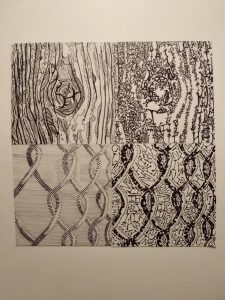
Final sketches were developed and defined furthered with ink and transferred onto bristol. Backgrounds were added for the line and type pattern.

Thoughts on this project:

While the process of thinking up backgrounds for the pattern picture nearly drove me crazy, the feedback from class was incredibly helpful in overcoming thischallenge. I learned to not follow the traditional contours of pictures, that what we see isn’t really a “line” but a defined aspect that had been enforced by a background.

As for the technical aspect of this project, I could have definitely scaled my pieces much better and ahead of time. Not all the pieces are exactly 5×5 inches, as I made the mistake of not checking the dimensions before inking everything. For the next project I hope to remember that small, yet vital detail.

TxTure & Pattern-4, develop in ink


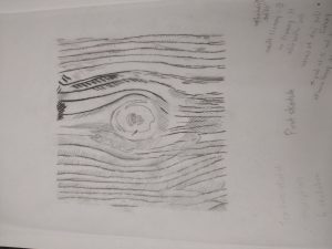
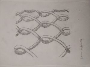
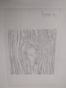
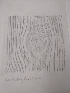
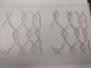
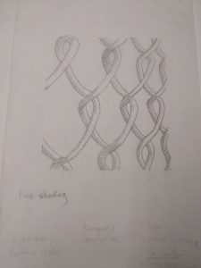
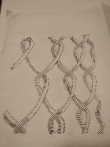
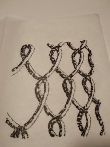
Sketches I did to visualize and interpret my ideas for line and type. I experimented with different styles ranging from hatching, cross hatching and line shading. I developed/finalized some of these into type once I felt ready to do so.


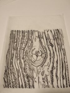
Line sketch for tree bark and developed with ink.

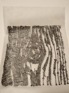
Type sketch of tree bark that was traced over with a 6B pencil and later transferred on bristol for inking.

Line sketch of a fence/chain developed with ink. Darker lines were used to represent the areas with the most shading.

Type sketch of said picture developed with ink. Sans serif and bolded letters were used to accomplish different types of shade.


Texture: Tree

The tree bark picture is an example of detailed texture with a high amount of contrast. In addition to the balance of light and dark within the photo, the shadows casted within the crevices of the bark offer thick linings for this piece. Each bark outline is evenly spaced apart allowing movement and flow throughout the piece, contrasting the rough texture.

Pattern: Fence

The picture of the fence offers a strong light source coming from the front, which cast shadows behind its structure. This also forces the viewer’s eyes to focus on the much lighter areas of the piece, instead of the blurred background. Combined with strong shadows, it makes for a smooth and rounded surface with even composition throughout.