Here are my before and afters for my three compositions. I chose to work in my neighborhood for this project so I could freely go back and forth to the locations for my project if needed but I feel like it limited me slightly, but eventually I did find things to work with of course. The project wasn’t too hard but weather was the only thing that set me back at all so I just learned that I would have to plan more accordingly for future projects that would require similar efforts to complete. I think the yellow blotch was my best composition as it touched on color and texture more than the others although being slightly less readable due to the ‘T’ looking like a ‘J’. All in all the process went smoothly for the most part, disregarding the slight frustrations I had initially looking for places to work, but I’m content with my results and think I did alright this time around. This wasn’t my favorite project but I think it would have been more enjoyable had it been done a different time of year, so maybe I’ll try something like this again in the future.
Graphic Design Principles 1 – COMD 1100 – Fall 2018
A City Tech OpenLab Course Site

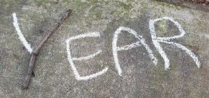
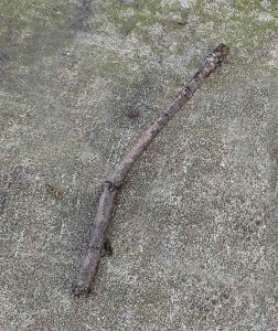
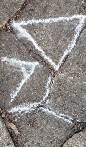
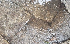
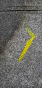
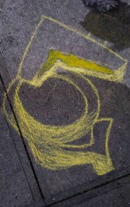


You translated the texture of the second composition nicely. The chalk’s color could have been more grey to match the background, but I think the typeface fits very well with the cracked lines.
This a good deign and good fonts some items make it stand out