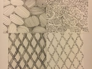
Throughout the course of this project I learned just how much of a difference both lines and typefaces can make. I could have avoided all the unnecessary spaces in between the lines and used more than one typeface. The board itself was way too big and next time I’ll definitely try and be more care with the studio tack. By taking my time and carefully planning out each step carefully it could really make a difference, which is what I’ll do for the next project.
Graphic Design Principles 1 – COMD 1100 – Fall 2018
A City Tech OpenLab Course Site


Great type work in your rock images, the contrast was achieved very well!!