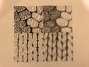
Rocks: hard, dark, light, smooth and rough (rocks on the top layer)
Graphic Design Principles 1 – COMD 1100 – Fall 2018
A City Tech OpenLab Course Site


Our goal is to make the OpenLab accessible for all users.
Our goal is to make the OpenLab accessible for all users.

This looks great! I think you translated each picture into line and type quite nicely. The only thing I have to mention would be the white spacing in both of your type drawings. I think the letters could have been stretched/warped even further to the contours of the rocks/yarn. Other than that, the backgrounds for each piece are fantastic and work nicely to said images.
Good stuff.