Observe_&_Discribe_DT
observe and Describe
Leave a reply
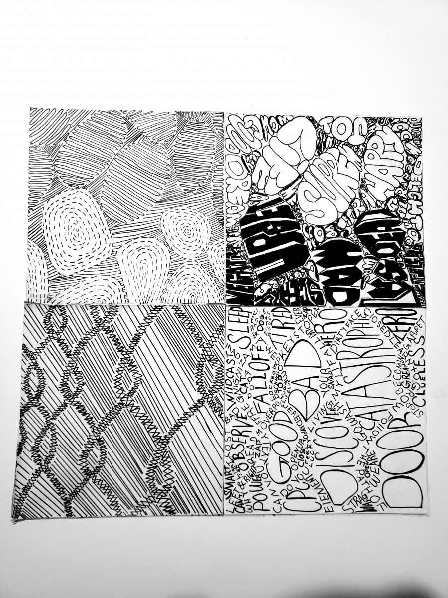
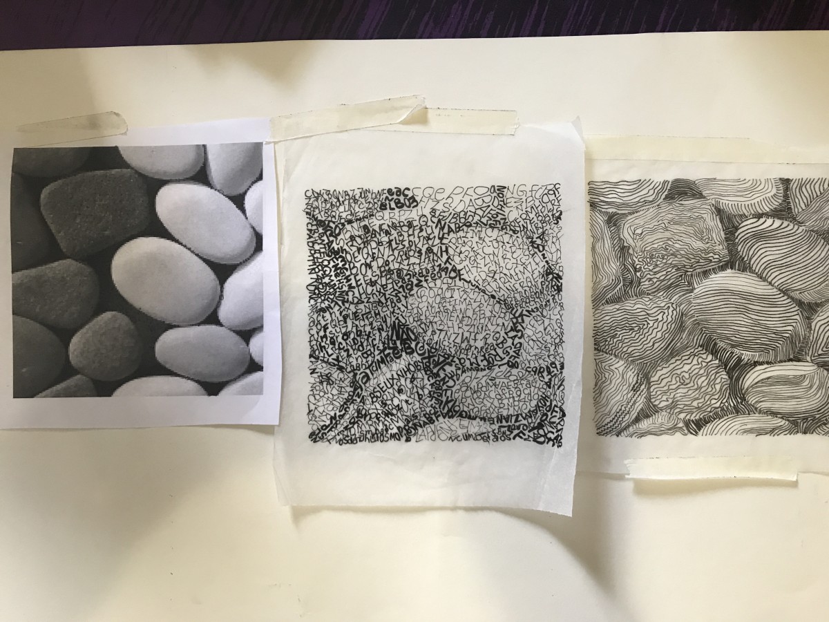
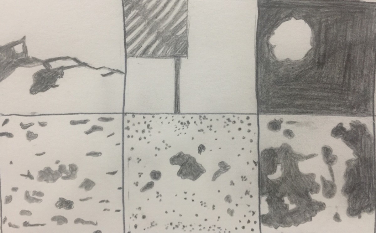
Here I implemented largely bolded like text for stones and for the gate I used a lighter approach. For the dark stones I used dashed lines and for the light rocks, I used curved lines. To finish up used zigzag lines intersecting to formulate a 3-dimensional vibe to its shape.
Final work
Texture and Pattern project was uneasy to understand in the beginning.It’s a project that taught me how to look to images differently and study them carefully. Definitely, my creative imagination was brainstorming to the limit because I wanted to deliver a great content.
It took me many attempts to achieve the final design and still think that I can do better.
In the critic session, I learned that each classmate has a different way to present his or her project, especially those who got to work with the same images and it was very interesting to see different point of views trying to deliver the same message. I also learned that lines and type could be powerful tools to deliver an idea or a message, for I will use them from now on to express my ideas.
I used different lines thickness and different typefaces to establish a tone and transfer the mood of my images.
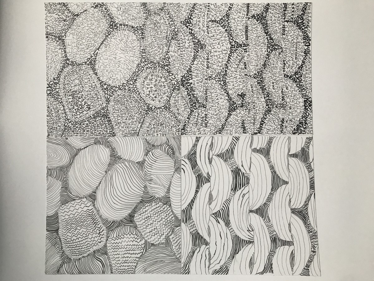
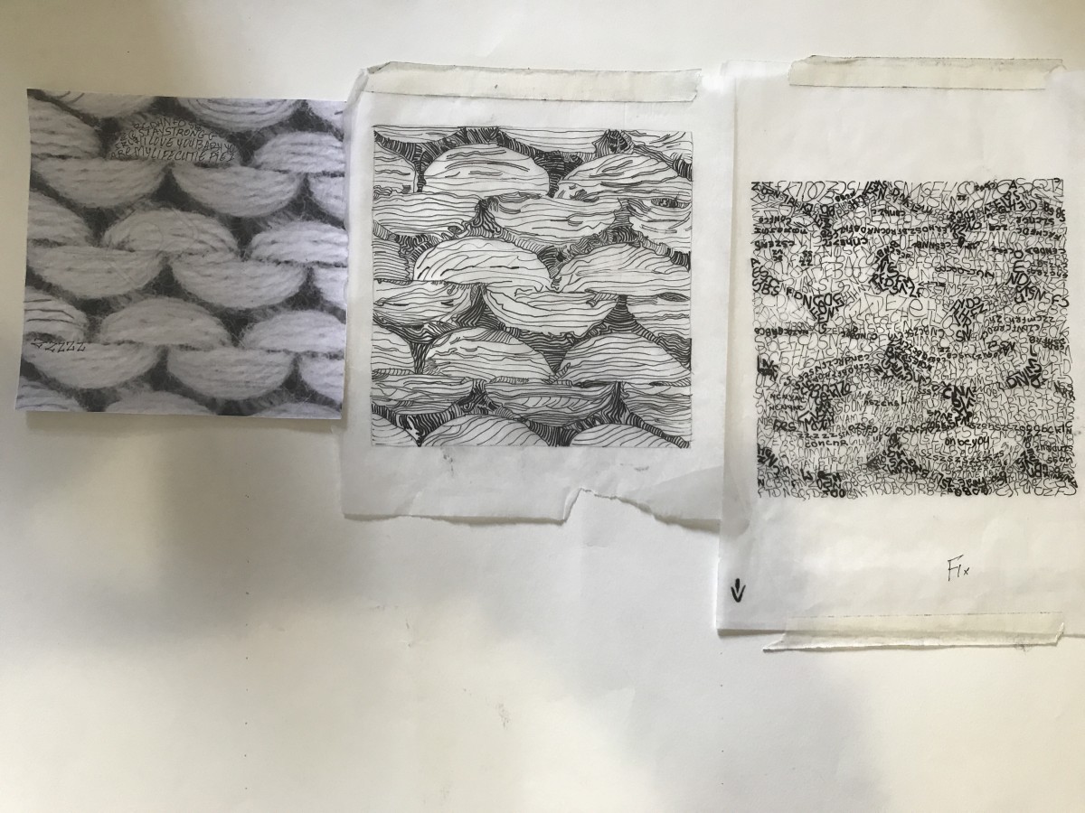
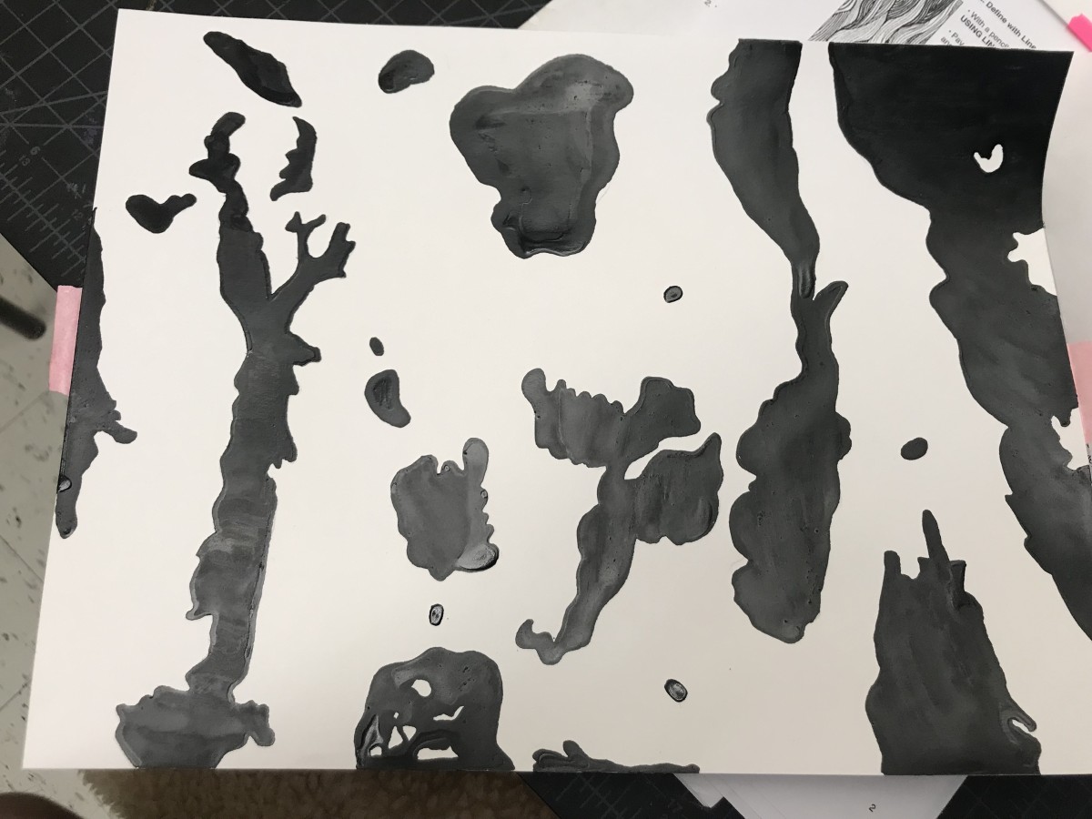
There is a repetitive sequence in the knit image which classifies it as a pattern picture.
It’s a black and white image that is also defined by the dark background, and the white part is just popping with a steady and monotonous rhythm. The texture is smooth in some part and scratchy. Through my project, the knit image was hard to deliver in lines because of the scratchy part. I was battling how to transfer it to my sketching and inking presentation. At the end I just leave it out of my consideration.
I never knew that an image could be delivered in many ways. In this project, we learned how to be creative, and play with lines and type to create the same image without omitting the feeling that it contain.
I chose the stones image for texture and the knit one for the pattern.
The stones image demonstrates two tones of stones, a dark gray and white with a very dark background. the background define the geometric shapes of the stones. the texture is smooth and bumpy in some stones, and slightly coarse in the rest. When I looked to the picture, it gave me a nostalgic feeling and took me back in time when I was a child playing in the river and collecting those stones, it is just like a classic song.
I have learned about what the graphic is and obvious, ambiguous figures. Seeing and disgusting about images helped me to understand what the concept was supposed to be. All the steps that I have done were new to me. I have never thought about what graphic design is. It was the first step to discover design.
Through this project, transferring photograph to graphic was interesting. It was the first time for me, so I could not do perfect inking that I have expected. While I reflect my final works, I think that I have to focus on detail things in my works more. I am exciting further actions that we will follow the projects.
Obvious 01
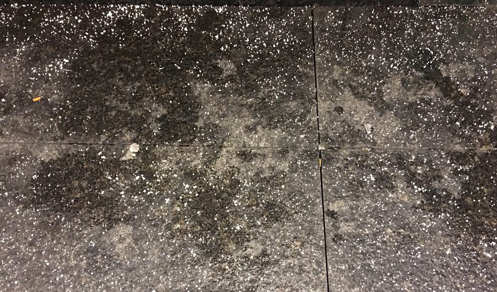
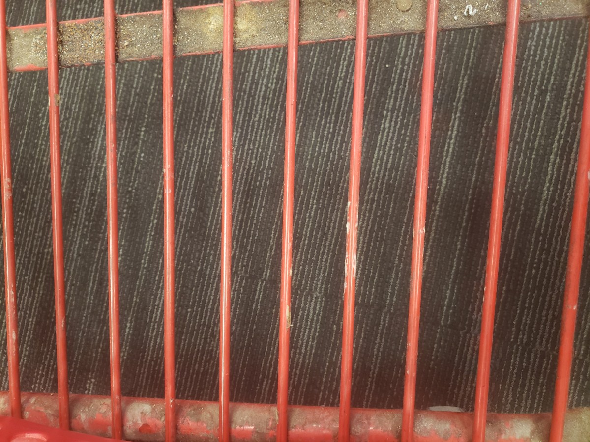
I found this crack while I was on the way to come to the class. This picture is obvious and has a 30/70 percent relationship with figure and background. I felt this crack showed how the history of the New York subway was.
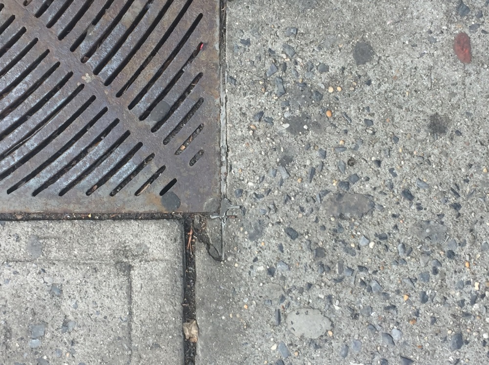
Obvious 02
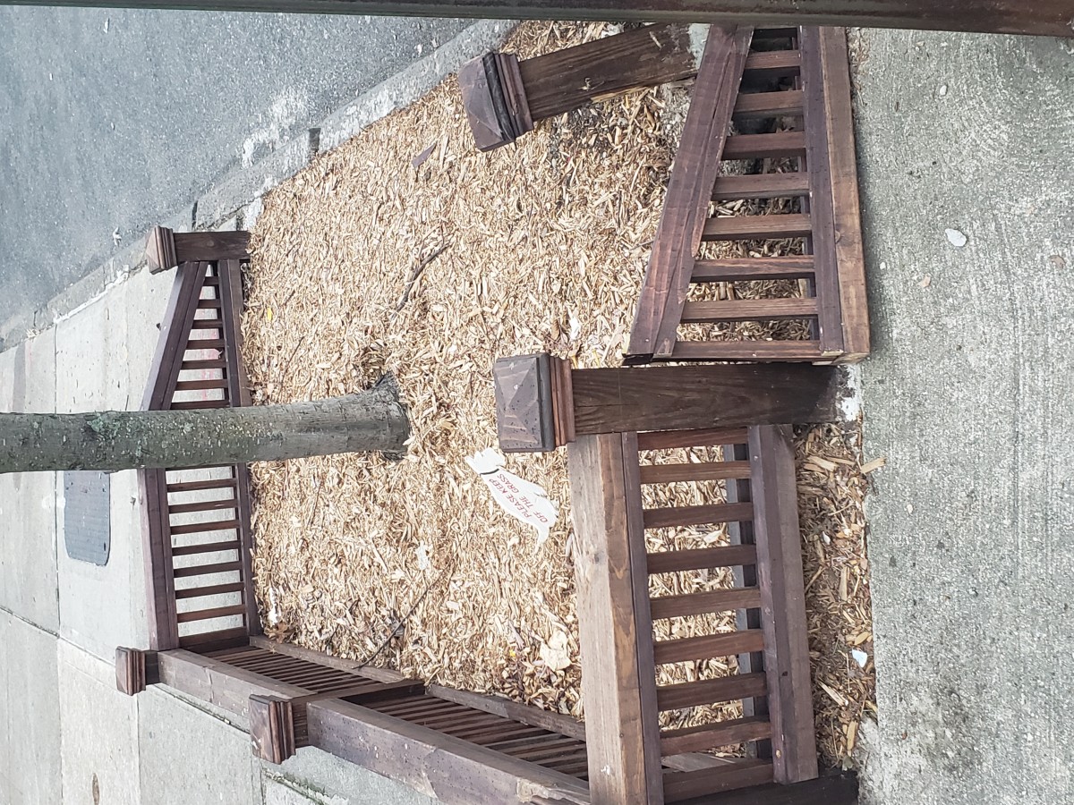
This picture found near the college. At first glance, the structure chaptered my sights because parallel things looked like bones of the fish. This one is also obvious.
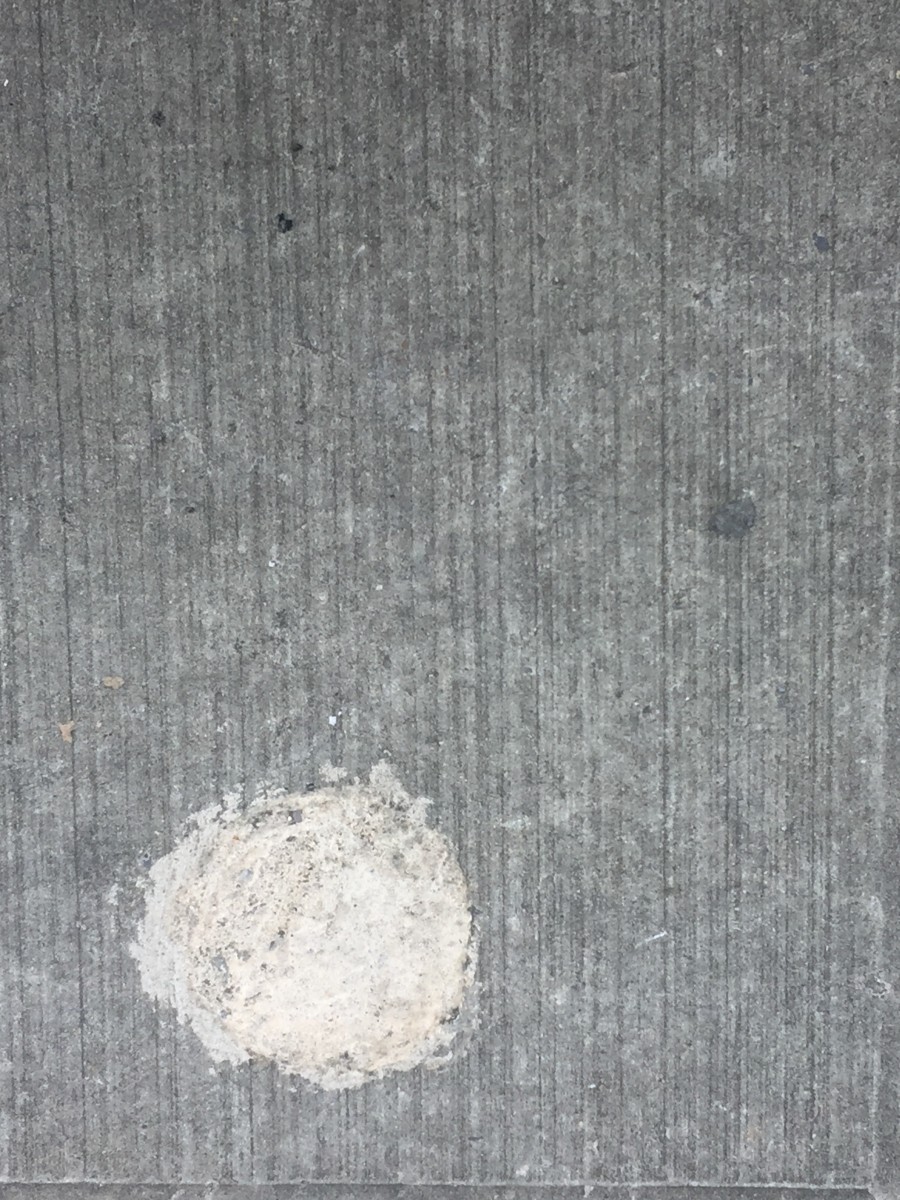
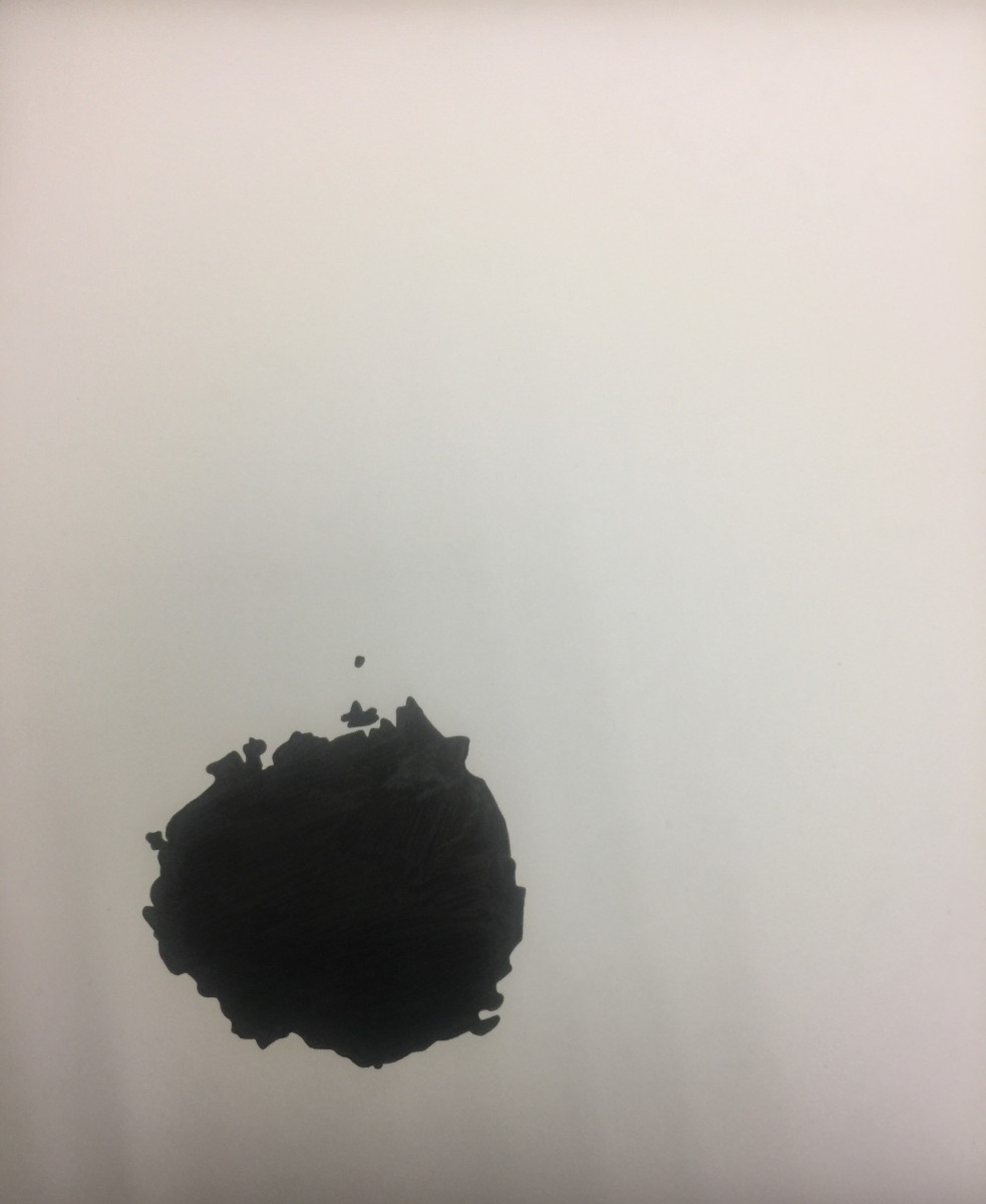
Obvious 03
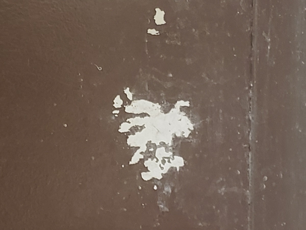
I believe that a spot would be made from painter by accident. The rough surface and almost perfect circle grabbed my sights. He or she might clear or make its brush rubbing the ground. As you can see, this is obvious.
Ambiguous 01
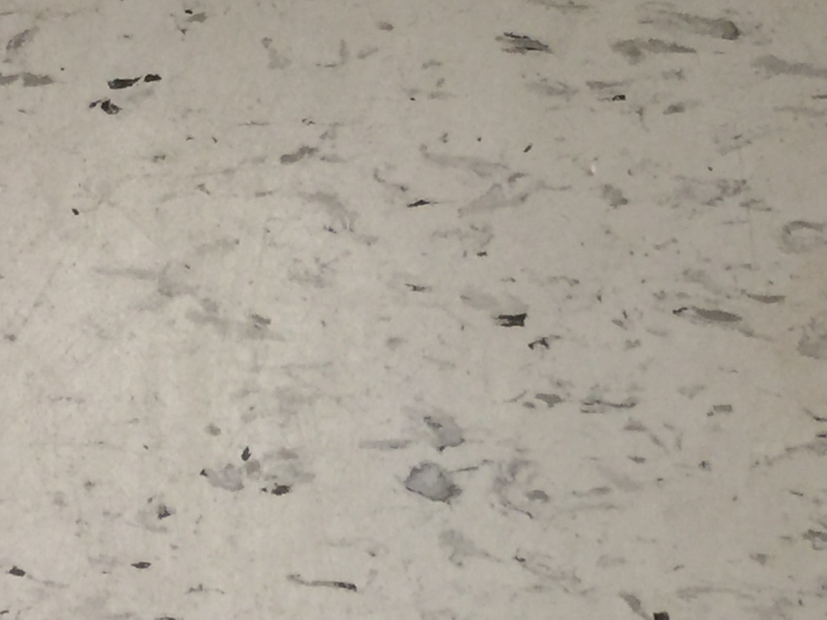
At first sight, the scattered salts got attention for me because it looked like snow on the ground. The object was like snow piled up in a heap. As can see, this picture is ambiguous. It has a 50/50 percent relationship with figure and background.
Ambiguous 02
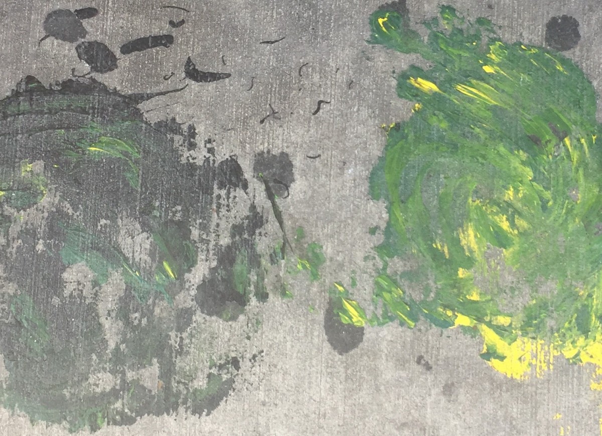
This wall looked like the practicing paper of painter. I felt as if the watercolor had spread in the wall. There were numerous touches, and some object presented a splash of paint in the water. It was like showing some of the painters’ hard work for their masterpiece. The wall also has an ambiguous figure.
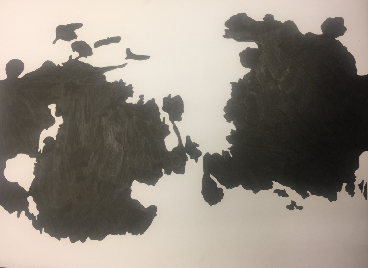
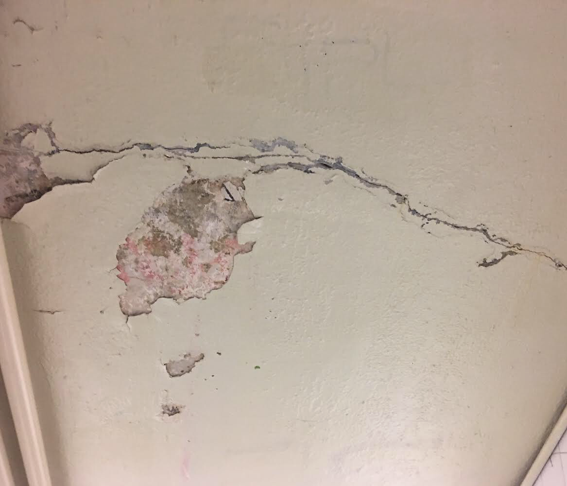
Ambiguous 03
Even though it has a plat picture, the feeling of the image is very whimsical. The change of color was very smoothe and natural as if the painter was meant to be. I believe it was an intended work. The two structures against each other caught my eye as well. The photo is ambiguous.
The OpenLab is an open-source, digital platform designed to support teaching and learning at City Tech (New York City College of Technology), and to promote student and faculty engagement in the intellectual and social life of the college community.

 Ambiguous figure
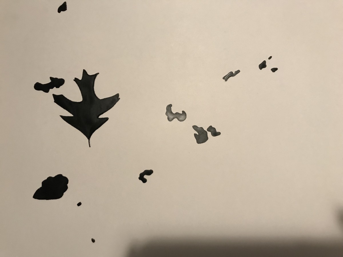 obvious figure