my favorite color characteristics

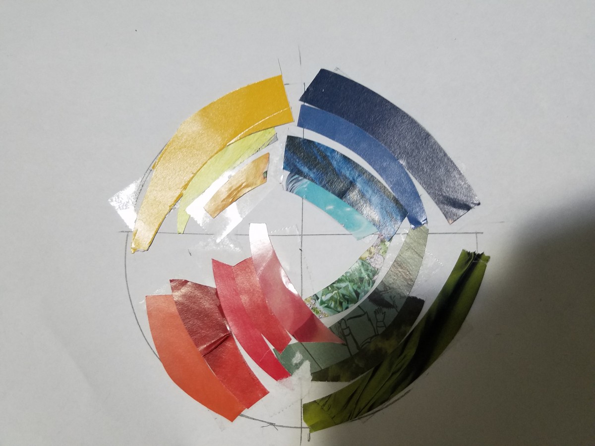
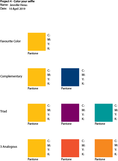
Being born and raised in Morocco, has a huge impact in my personality and my tastes. For those who don’t know About Morocco, its a beautiful country in North Africa, where modernity in the Arab world could be characterized. In the Classical Antiquity era, Morocco was a target for many invaders because of it position. Invaders like Phoenicians, Carthaginians, Romans, Vandals, and Byzantines, but with the arrival of Islam, Morocco developed independent states that kept powerful invaders at bay. Since that time, many Arab dynasties ruled over Morocco. And each time, the dynasty had changed, so did the architectural and artistic life in Morocco. However, the all dynasties agreed in one thing, they all built huge cities surrounded by huge walls to protect them in time of wars. And the walls were all having that mix of orange, brown clay. My favorite color, pantone number 49-10, which I called Canelle is a warm color that make me think of those walls and my country.
My favorite color CMYK is 0, 41, 37, 14.
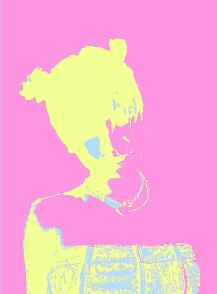
As you can notice Magenta is dominant in this color. It’s a color of universal harmony and emotional balance. Yellow is the next dominant color and its color of optimism and cheerful but its also a color for criticism and impatience. I believe my color define me.

My favorite color

My favorite color??? it’s amazing how,personally, my favorite color has changed through the years. When I was a child, my favorite color was blue. Then, as a teenager, it was green, but not any green. it was a deep green as in glass bottles. in my twenties, definitely I was in love with yellow. And now I like what I call Canelle. Doing this project, I realized that I was not changing my taste for colors,but only I was playing with the complementary, triad and analogous, until I found my favorite one.

Color Your Selfie Project#4

The color I chose as my favorite color was a Blue-ish tint: Pantone 2708. Here on the left is my Complementary composition. I choose this Tint Blue because whenever I see light/regular-tone blue, I feel calm and alive at the same time. It reminds me of the bright blue sky on a mid sunny day. It reminds me of the wide blue ocean and it’s salty smelling sea. It reminds me of adventure and fun.

When I search for the different meanings and feelings with the color Blue, many say soothing, peaceful, security, authority. Sometimes sadness, loneliness, depression. Over seas in other cultures, they refer the color of Blue to immortality, good health, love and/or joy.

Here on the left is my Triad composition. It consists of three colors: (INSERT COLOR NAMES). I began to play around with the different colors on different areas of my selfie. I chose purple as my background to give it depth and outline for my body. The darker color gives the photo a bolder and louder look, rather than a softer one like the Complementary composition.

I chose the Pantone 2708 (Tint Blue) as the color a highlight to pop out small details. This gives it character and rugged edge to this photo. The Minty Green next to the purple displays a POP ART genre, from the two contrasting tones of the colors.

The further into the project, the more it became vibrant in tones that I chose. I really enjoyed using bright and dark contrasting colors. It makes the photo POP and become bold and loud. Here on the left is my Analogous composition. I call it Pink limonade. The highlights here are more visible compared to the Triad composition. Here it gives it interesting character in the way where one can see the tiny dots of highlight. From the first all the way into the detail of the necklace and hair.

What I enjoyed the most about this project was that we got to use the computer. I enjoyed the exploration and the experimentation of Adobe Photoshop. An aspect that was difficult was selecting specific areas I wanted to work on/color. That was in the exploration part of the project which was all cool.

Red is the color of power and strength. Overtime red has been used to evoke emotion and passion. Humans have adopted the evolutionary meaning of red and use it as a warning color!

Favorite color is red! It represents resilience and passion which to me are two admirable traits!

I’ll be working with a green that is a complementary color to red.

A blue and yellow which is triad to red, and a orange and violet shade which are analogous to red!