Fatima BWHiCntrst
Leave a reply
Why Blue for my composition? I chose blue because of its my way of life its the color of my birth month September it’s a color that keeps me relaxed. Blue is my way of life it’s just me it’s like the flow of water for me it never knows where it’s going but when it makes it a great impact is made no matter what. That is what blue means to me.


In the development part of this project, the interesting part of it was finding colors that complemented set persons favorite color which in my case was blue. Finding set colors that complemented each other was indeed a fun challenge because it helped us find out what worked best threw the experimentation of this prosses. At the end of this prosses came out an avant-garde of an art piece with colors that complemented each other in a modernistic like look that is translated to the modern art we view today in museums such as the Moma or the Whitney and etc.
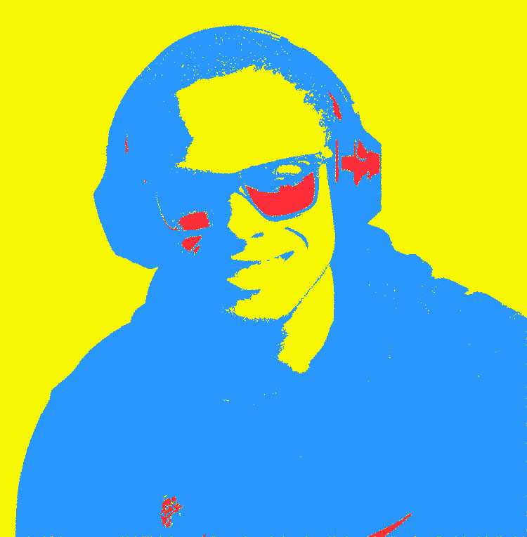
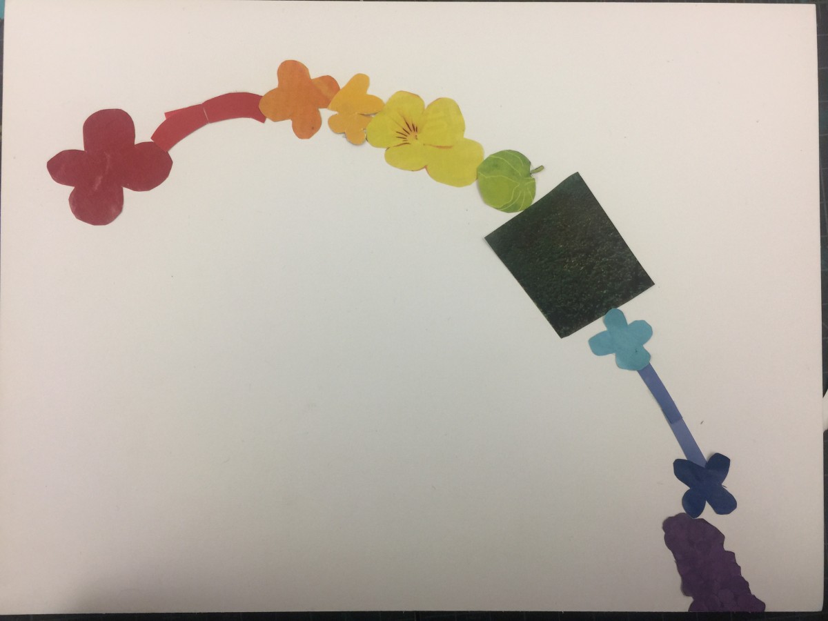
this is the cleaned up black and white before color production
I have never learned about color before, so it was an excellent experience for me. The color that I thought and I found through CMYK color is different, so it was surprised. It was hard to me make it neat and clear via using photoshop. It was terrific that several layers consisted of one image. Depending on the foreground and background colors, the picture shows a really different feeling to me. Finding the mood what I want is also fun. Through this project, I learned how the importance of color is. I was happy to doing this project as well.

My favorite color is violet. I like the mood of the violet. I think it represents mixed feelings: calm, glooming, gorgeous, and etc. The light tone of violet is accompanied by a pink feminine and romantic atmosphere. On the other hand, the darker tone of violet gives the more subtle and elegant the image. It is more sensual than red violet, and is also called the visionary’s color.
Violet is a mysterious and beautiful itself so that I like.
Also, in history, violet has long been associated with royalty and majesty. Moreover, in ancient Rome, they used the violet for common funeral flower. It is is also interesting to me.
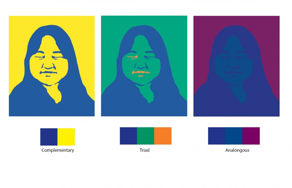
Complementary Composition: It was the uneasy part to understand the process and get the final result.
Triad composition: I am very pleased by the way I achieved the Triad composition.
Analogous composition: even though I get to master the process to change the color, I think I could do better on the level of the mouth to emphasis more the mood of the picture.
in general, as not familiar with photoshop, I did progress while learning through this project that colors as elements of design play a major role in communicating a mood.
Being born and raised in Morocco, has a huge impact in my personality and my tastes. For those who don’t know About Morocco, its a beautiful country in North Africa, where modernity in the Arab world could be characterized. In the Classical Antiquity era, Morocco was a target for many invaders because of it position. Invaders like Phoenicians, Carthaginians, Romans, Vandals, and Byzantines, but with the arrival of Islam, Morocco developed independent states that kept powerful invaders at bay. Since that time, many Arab dynasties ruled over Morocco. And each time, the dynasty had changed, so did the architectural and artistic life in Morocco. However, the all dynasties agreed in one thing, they all built huge cities surrounded by huge walls to protect them in time of wars. And the walls were all having that mix of orange, brown clay. My favorite color, pantone number 49-10, which I called Canelle is a warm color that make me think of those walls and my country.
My favorite color CMYK is 0, 41, 37, 14.
As you can notice Magenta is dominant in this color. It’s a color of universal harmony and emotional balance. Yellow is the next dominant color and its color of optimism and cheerful but its also a color for criticism and impatience. I believe my color define me.
The OpenLab is an open-source, digital platform designed to support teaching and learning at City Tech (New York City College of Technology), and to promote student and faculty engagement in the intellectual and social life of the college community.

 Pro
Pro