Fatima Complementary Composition
Leave a reply
Complementary Composition: It was the uneasy part to understand the process and get the final result.
Triad composition: I am very pleased by the way I achieved the Triad composition.
Analogous composition: even though I get to master the process to change the color, I think I could do better on the level of the mouth to emphasis more the mood of the picture.
in general, as not familiar with photoshop, I did progress while learning through this project that colors as elements of design play a major role in communicating a mood.
Being born and raised in Morocco, has a huge impact in my personality and my tastes. For those who don’t know About Morocco, its a beautiful country in North Africa, where modernity in the Arab world could be characterized. In the Classical Antiquity era, Morocco was a target for many invaders because of it position. Invaders like Phoenicians, Carthaginians, Romans, Vandals, and Byzantines, but with the arrival of Islam, Morocco developed independent states that kept powerful invaders at bay. Since that time, many Arab dynasties ruled over Morocco. And each time, the dynasty had changed, so did the architectural and artistic life in Morocco. However, the all dynasties agreed in one thing, they all built huge cities surrounded by huge walls to protect them in time of wars. And the walls were all having that mix of orange, brown clay. My favorite color, pantone number 49-10, which I called Canelle is a warm color that make me think of those walls and my country.
My favorite color CMYK is 0, 41, 37, 14.
As you can notice Magenta is dominant in this color. It’s a color of universal harmony and emotional balance. Yellow is the next dominant color and its color of optimism and cheerful but its also a color for criticism and impatience. I believe my color define me.
My favorite color??? it’s amazing how,personally, my favorite color has changed through the years. When I was a child, my favorite color was blue. Then, as a teenager, it was green, but not any green. it was a deep green as in glass bottles. in my twenties, definitely I was in love with yellow. And now I like what I call Canelle. Doing this project, I realized that I was not changing my taste for colors,but only I was playing with the complementary, triad and analogous, until I found my favorite one.
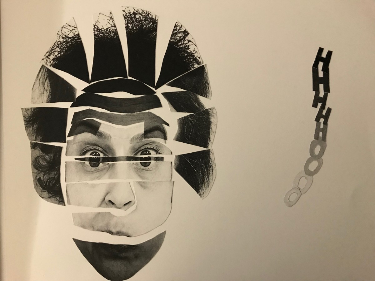
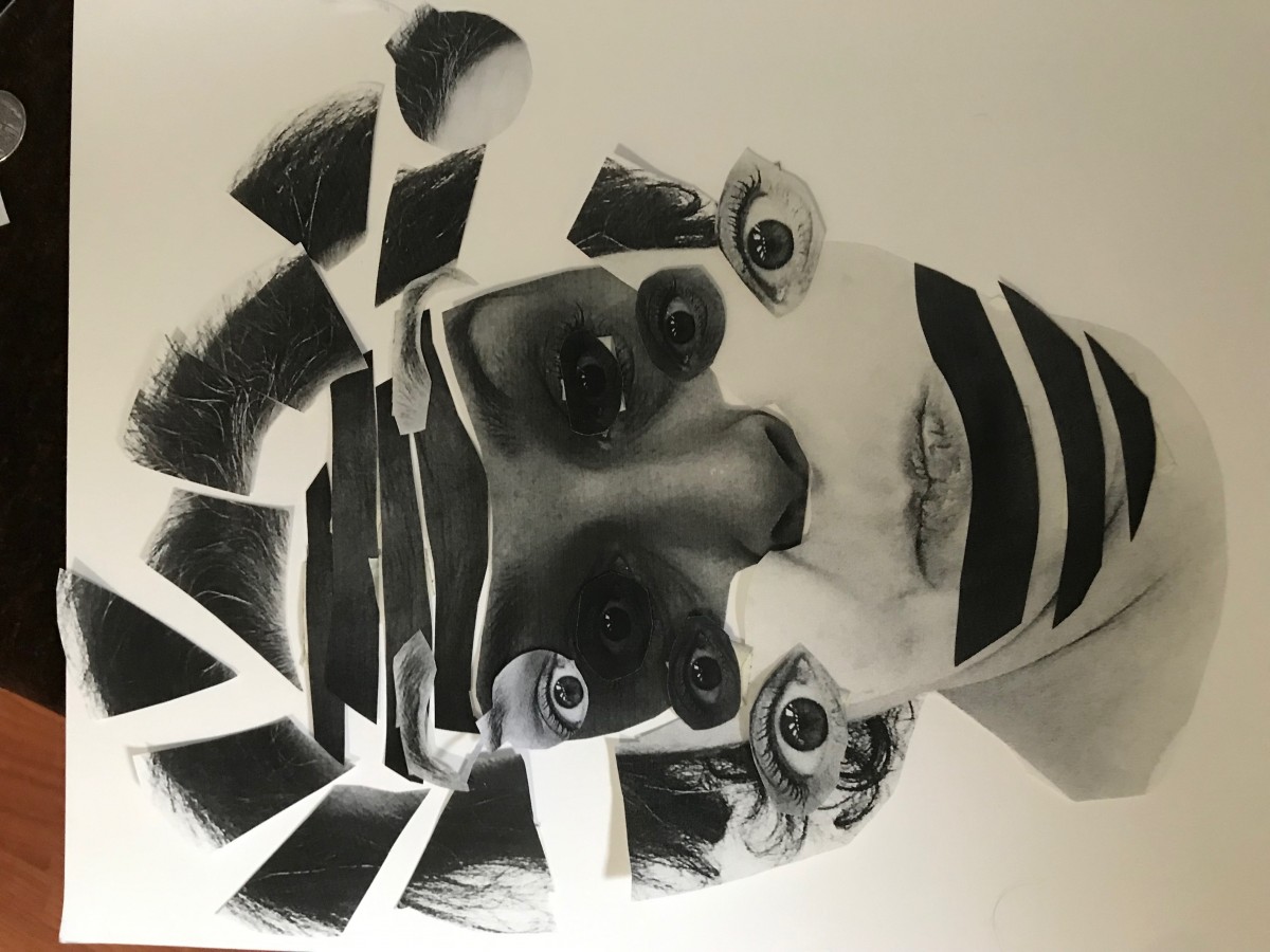
Very satisfied with my final presentation. as you can see, it was a long and thoughtful process where I engage all my brain to deliver my chosen mood: surprise. I also got chance to work the grayscale to emphasis my focal point and reach a satisfied result.
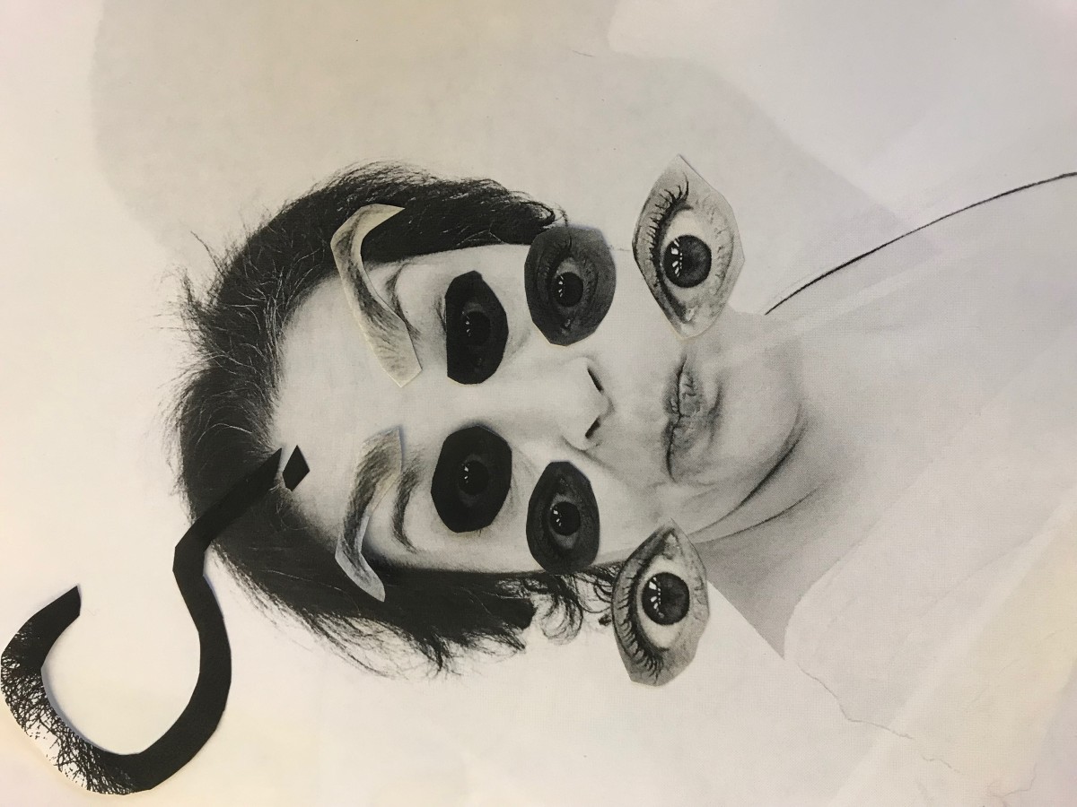
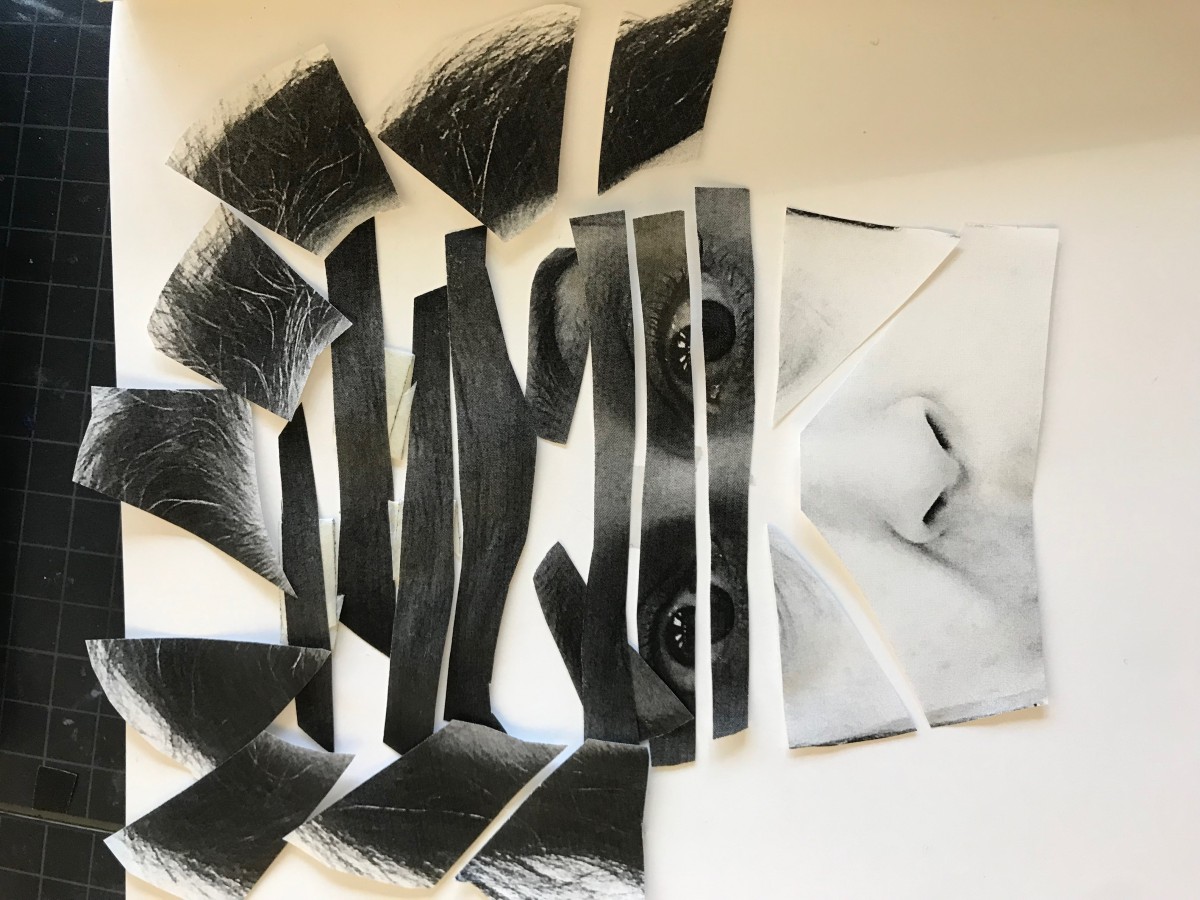
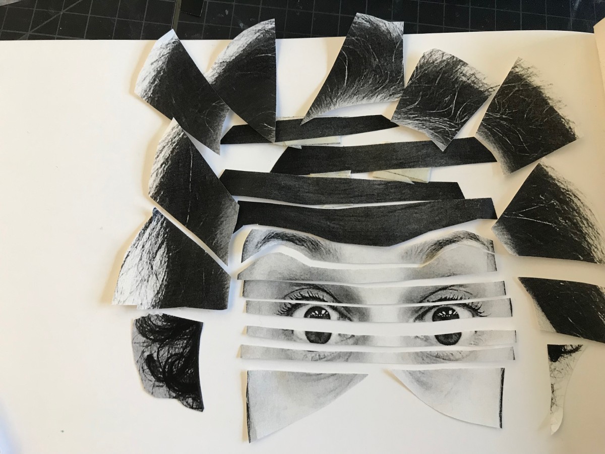
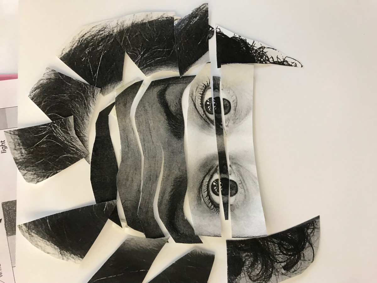

The Selfiemotion project was fun to do. As you can notice, my first collage was plain and easy. when I showed it to my professor she said:” Chop, chop yourself.”
I was like what? more than this! She answered: yes, and that was all. I started cutting and playing with the pieces to show my emotion. I think I worked hard to get the final one that I will show in the final step: delivery.
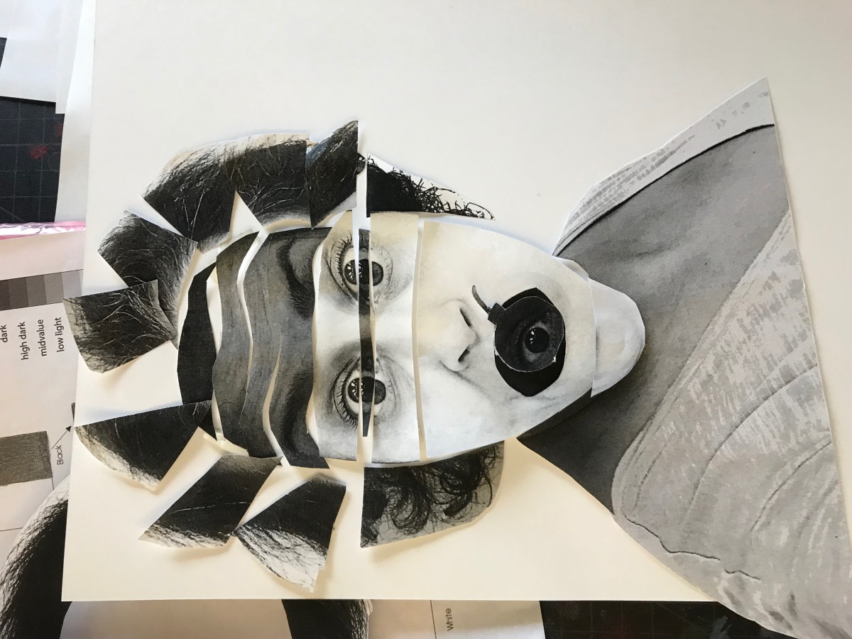
I enjoyed the process and the discoveries made while trying to deliver.
What I learned from the ‘Selfiemotion Project” that with a grayscale value you can create a mood by focusing in a specific point that shows that mood, and using different values of grayscale you can direct the viewer’s eye.
In my project, using the grayscale helped me to express the movement of the chosen mood, and to emphasis the point that shows that mood. In this case, it was the eyes and the head.
However, I wasn’t fully satisfied with the result, so I kept brainstorming; that’s the final result that I will put in the next step.
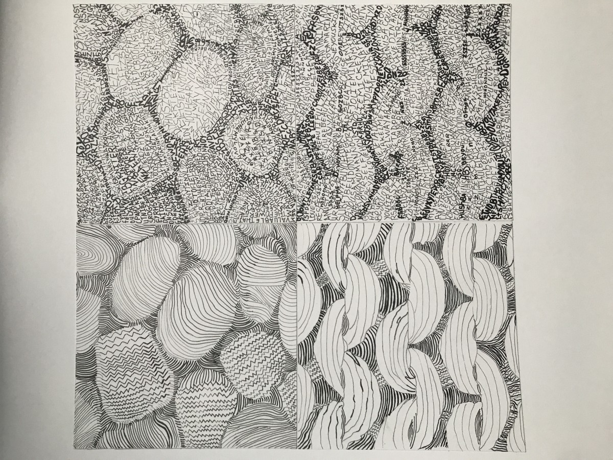
Texture and Pattern project was uneasy to understand in the beginning.It’s a project that taught me how to look to images differently and study them carefully. Definitely, my creative imagination was brainstorming to the limit because I wanted to deliver a great content.
It took me many attempts to achieve the final design and still think that I can do better.
In the critic session, I learned that each classmate has a different way to present his or her project, especially those who got to work with the same images and it was very interesting to see different point of views trying to deliver the same message. I also learned that lines and type could be powerful tools to deliver an idea or a message, for I will use them from now on to express my ideas.
I used different lines thickness and different typefaces to establish a tone and transfer the mood of my images.
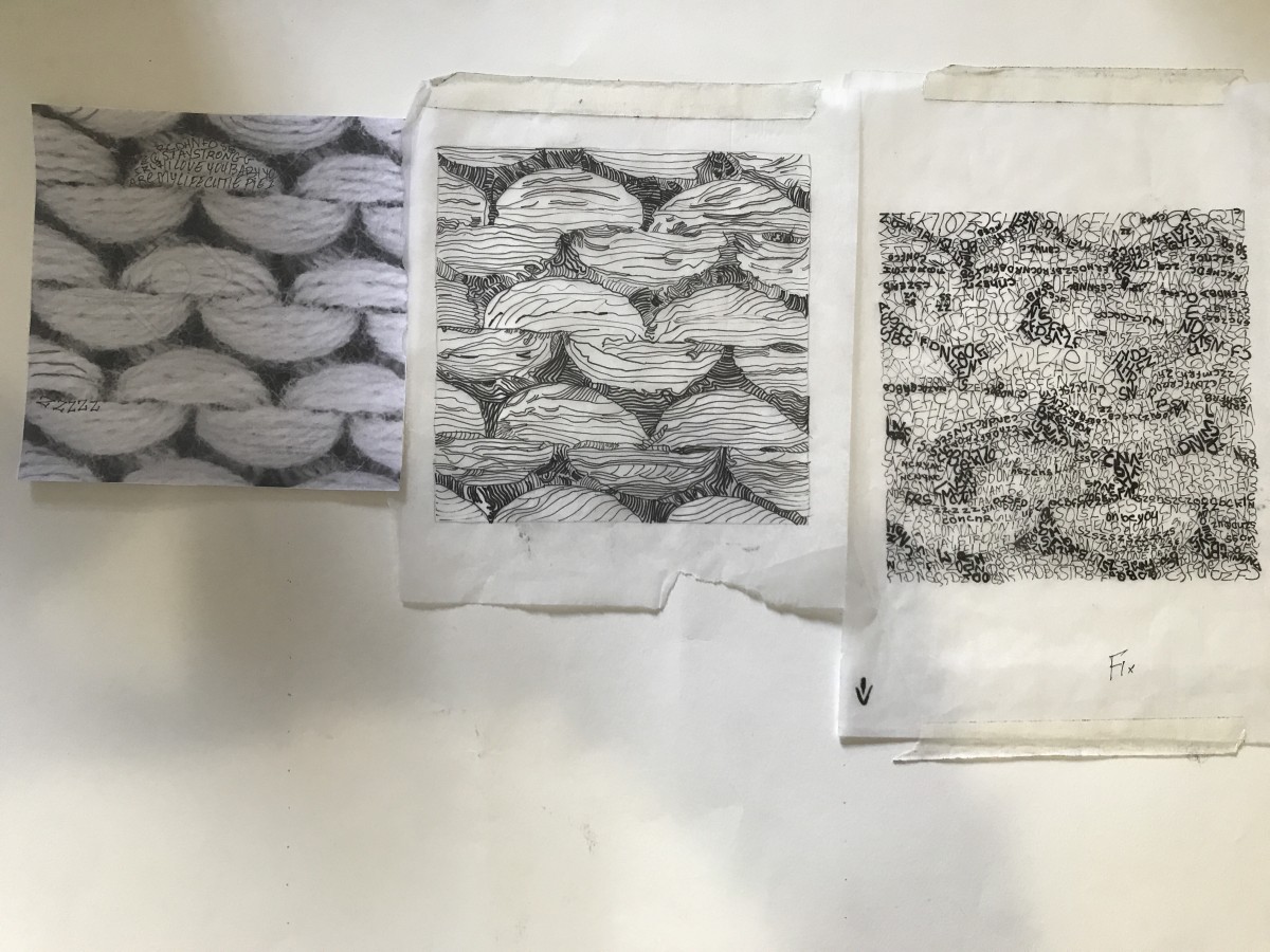
There is a repetitive sequence in the knit image which classifies it as a pattern picture.
It’s a black and white image that is also defined by the dark background, and the white part is just popping with a steady and monotonous rhythm. The texture is smooth in some part and scratchy. Through my project, the knit image was hard to deliver in lines because of the scratchy part. I was battling how to transfer it to my sketching and inking presentation. At the end I just leave it out of my consideration.
I never knew that an image could be delivered in many ways. In this project, we learned how to be creative, and play with lines and type to create the same image without omitting the feeling that it contain.
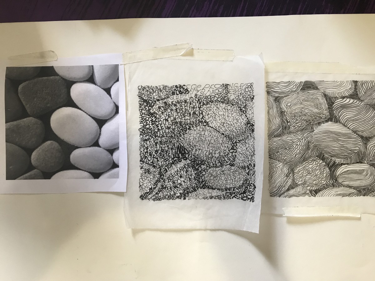
I chose the stones image for texture and the knit one for the pattern.
The stones image demonstrates two tones of stones, a dark gray and white with a very dark background. the background define the geometric shapes of the stones. the texture is smooth and bumpy in some stones, and slightly coarse in the rest. When I looked to the picture, it gave me a nostalgic feeling and took me back in time when I was a child playing in the river and collecting those stones, it is just like a classic song.
The OpenLab is an open-source, digital platform designed to support teaching and learning at City Tech (New York City College of Technology), and to promote student and faculty engagement in the intellectual and social life of the college community.

