Professor Montgomery

Category: Uncategorized (Page 3 of 8)

The Museum of Modern Art

The Museum of Modern Art has very interesting interior design. It shows us a new type of art that is not framed on the wall, and the composition of the garden reminds me of the Rockefeller Center and Central Park.

MOMA being an art museum, it doesn’t limit the art collection to paintings, sculptures or furniture. The museum included performance art. On the day of the visit, the museum set up a floor with peace of sculptures. I wasn’t sure why they are out on the open and no guard was looking at it. All of a sudden people wearing the same clothing came out and started to interact with the sculptures. We can also treat the movement of the visitor as an art. Because of the atrium, we can see people moving. It is just like the Guggenheim museum.  People on the top also have a clear view of the movent of the visitor on the ground level.

The garden in the museum has a good amount of square footage. I believe the sculpture garden at that spot is not a waste of square footage. The composition of the garden is just like the one in Rockefeller Center, many buildings surrounding a plan area. It is a small city with an open space, like the central park in manhattan on a large scale. The garden gives a moment of pause in this busy city.

Limiting the programs of buildings should not be the goal of the design. The exploration of the limit can bring wonderful ideas and designs.

How does the MoMA garden relate to other spaces in the city? What makes it special? How does the architecture relate to the space?

Besides the extraordinary modern architecture of MoMA, this museum has been collecting modern and contemporary art for many years. The museum is an historical institution dedicated to provides like about hundred thousand of masterpieces which are open to the public visitors.

The spaces that composed the MoMA are very dynamic and outgoing places. Like, the MoMA garden which is very beautiful and symmetrical. It looks very organic and aesthetical. There are two rectangular water fountains slightly located   on the side of the end of the rectangular surface; there’s one that’s facing the opposite of the other two.  The garden is decorated with different types of green plants with different sizes. Plus, it has sculptural statues made of concrete, bronze and other materials. These seem to adorn the park in an organic way because made people have the illusion the statues are part of the garden formation. The flooring of the MoMA garden material I believe is concrete paving.  So far from what I’d seen in New York City, the MoMA garden relates to places in New York city like the Ford Foundation interior garden. Since, the designers of both places contributed to have the same idea of having the presence of nature by having just green plants not other color of plants. Also, the Ford Foundation garden and the MoMA garden contains water fountains which  reinforce the gardens design by showing the connections between plants and water.

Another place in the city that I had visited and I think is some what related to the MoMA garden is the Whitney Museum balconies. People might think they rarely will relate one to the other but in my opinion, I think although the Whitney Museum balconies is not that green, stills relates to the MoMA museum. Since, both spaces are decorated with sculptural statues that represent each museum.  Finally, the liberty park is similar to the MoMA garden because is also adorn with only green plants and have few benches that allow the visitors to seat and enjoy the beautiful space and views just as the MoMA Garden does. The MoMA garden  landscaping  relates to many successful architectural places in the city  like the ones I previously mentioned.

The Guggenheim Museum

Architects imitate each other. Architects take ideas from old classical buildings, modern buildings, and sometimes even from their old projects. Consistent use of an idea, building elements or materials makes it easy to define an architect and an architectural period. The Guggenheim museum is one of Frank Lloyd Wright’s famous projects, and it has many characteristics of Wright’s signature design, such as organic form and cantilevers.

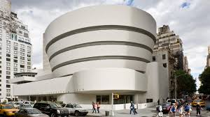
Fig. 1 View of the museum from 5th Ave and 88 street, 2008

The Guggenheim Museum, also known as Solomon Robert Guggenheim museum, is located in NYC on 5th Ave and 88th st. The construction is dated back to 1945 and it was built during the Modern Architectural period. The museum opened to the public on October 21, 1959. During the Modern period, many architectures aimed for clean lines, basic shapes, geometric forms, open interior floor plans, and many glass windows. Unlike other modern architecture, the Guggenheim Museum has more emphasis on the concrete form rather than a light and transparent approach using glass and steel. The decision of using concrete for the project is related to cantilevers. He loves to use reinforced concrete on his projects, such as The Fallingwater and Unity Temple. The combination of the tensile strength of re-bars and the compression strength of concretes makes it possible for cantilevers to extrude out.

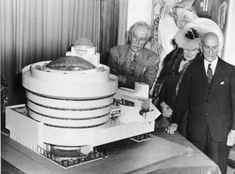
Fig. 2 Frank Lloyd Wright, Hilla Rebay, and Solomon R. Guggenheim at the unveiling of the museum model, Plaza Hotel, New York, September 30, 1945

The building massing is mainly circular and rectangular, but the construction of the simple shapes was very complicated at the time. It took 4 years for the initial submission of plans to get approved because the drawings contravened thirty-two buildings regulations.[1] It would be surprising if a one of a kind project got permitted to build on the first submission. The form of the museum amazed many people. It has a spiral shape and as it goes up, the radius of the circle gets larger. The spiral shape gives the illusion of the museum growing upward toward the sky. When we envision a spiral building, most of the time we think the base of the building is bigger than the top of the building. This way of thinking makes sense because the base of the building can support the small structure on the top. Guggenheim Museum is the opposite, with the top being heavier than the bottom, thus making it more astonishing. The skylight and the light coming in from the dome on the museum is a reflection of the Pantheon in Rome. The light enters and shines the interior space of the museum following the sun path. The dome has an interesting function. The pressure of the building spread vertically downward along the circular wall, in conjunction with some critical located vertical columns, allows for the museum to be free of an interior wall.[2] The open interior space makes it almost impossible for us to not look up and search for things to watch. It is similar to people raising their heads and looking at beautiful highrise buildings, but in our case, we are judging the interior of a building. How are the spaces functional, are they safe to occupy and how are the colors, lightings, and materials decorate an interior space?

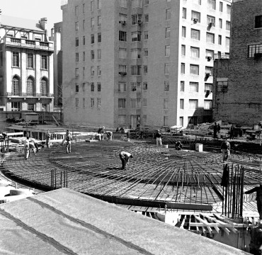
Fig. 3 Workers lay the foundation of the main gallery, Solomon R. Guggenheim Museum, New York, ca. 1957

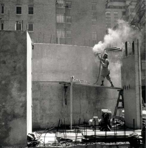
Fig. 4 A Construction worker grinds walls to remove form marks, ca. 1958

Wright was exploring organic architecture since the early 1900, especially under the guidance of Louis Sullivan. Wright’s envisioning of the continuous spiral design derived from concepts tied within the principal of the organic architecture. The structural engineer and the builders were faced with many challenges because the old methodology could not work on an alien-like building at that time. Wright decided to use structural steel and reinforced concrete as the structural shell of the museum. Plywood panels were used to form the shapes, and concrete was sprayed into the plywood formwork, rather than poured. This is known as Gunite. It uses dry, fine- aggregate cement, forced by compressed air through a  hose to a nozzle where it was hydrated and shot out at high velocity onto a surface where it set or hardened.[3] The tensile strength from re-bars and the compressive strength from concrete made it possible for the cantilevering spiral ramps to extrude away from the wall without falling apart. The surface of the concrete can be smoothed out after the gunite is cured. The use of reinforced-concrete can be seen in many of Wright’s projects that have cantilevers, especially in The Fallingwater.

The color of the concrete finish was carefully selected. The museum was built after WWII and it had a big impact on many people. The white/ivory color finished has a symbolic meaning. It represents purity and hope. It gave people positive energy and thoughts. The color as a whole makes people feel good. The spirals look like many halos stacking on top of one another. Since the spirals are growing toward the sky, it makes it looks like the people who died during WWII were heading to heaven. The symbolic meaning of the museum is comparable to that of the Oculus by Santiago Calatrava. The white steel ribs give us warm and comfort, sheltering the people who got affected by the terrorist attack. The building is shaped like a bird that is getting ready to fly, which symbolized freedom and hope.

Fig. 5 Gordon Strong Automobile Objective and Planetarium (unbuilt), Sugarloaf Mountain, Maryland, 1924-25. Aerial perspective. Graphite on paper. Frank Lloyd Wright Foundation, Scottsdale, Arizona 2505.023

Wright designed a building with characteristics similar to the Guggenheim Museum before, such as the Gordon Strong Automobile Objective. The project was never fully developed, but the central concept of this building has a strong relationship to the Guggenheim Museum. The spiral ramps are clearly emphasized on the sketch. Unlike the museum, this building has a bigger spiral base and a smaller top. Wright exhibited interest in geometry since he started working for Louis Sullivan. He did not limit himself to the two-dimension world of geometry. He tried to find a way to break the box and add three-dimension/ vertical emphasis to the project. He typically adds different shapes of flat roofs, different projections, and levels of height to create a three-dimensional space.[4] His exploration of the possibilities of the spiral concept started during his later years. The spiral is continuous with a beginning and an end, qualities to a linear path. It also exists in three-dimension. The spiral gives a feeling of depth and perspective. It defines space without strictly containing it and it has powerful connotations of movement. [5] The spiral creates movement, it gives us a sense of direction, a starting point or an ending point. The spiral can be used in buildings and create livable space. It also fits the criteria of organic architecture.

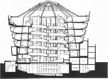
Fig. 6 Frank Lloyd Wright, Solomon R. Guggenheim Museum, New York, 1943-59. Final section (copy, original lost). Frank Lloyd Wright Foundation, Scottsdale, Arizona 4305.750

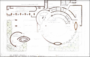
Fig. 7 Solomon R. Guggenheim Museum, New York, 1943-59. Plan (presentation drawing). Graphite, colored pencil, and sepia on tracing paper. Frank Llyod Wright Foundation, Scottsdale, Arizona 4305.049

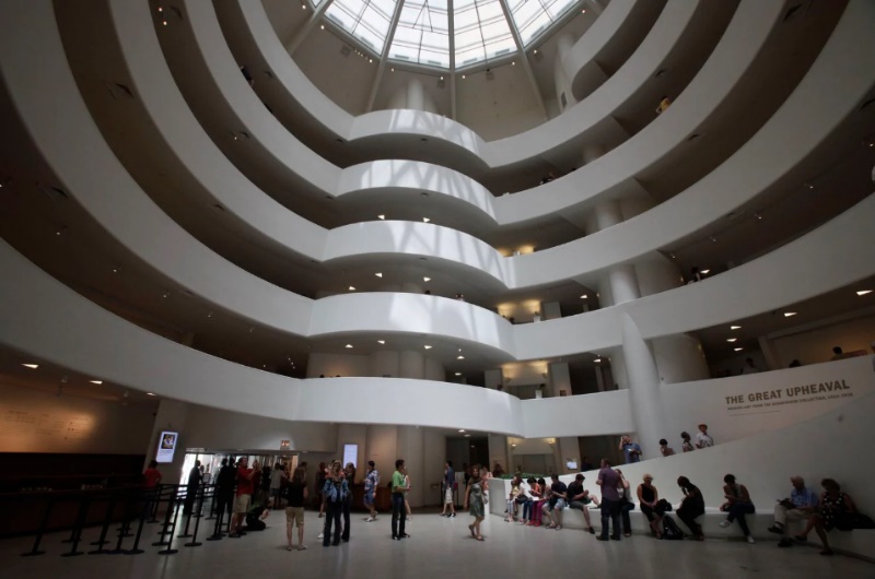
Circulation is a big component of the museum. As the exterior suggested, the interior looks similar to the façade of the building. Wright likes to expose the materials internally as well as externally.[6] There is a spiral ramp going around the wall and cantilevering away from the wall. We can see clearly where the columns and cantilevers meet and how they intercept. Wight doesn’t want to hide the columns. Wright’s intention is to let people take the elevator to the top and then walk down the spiral ramp following the motion of gravity. We can stop and observe the movement of the people and watch how they occupy the space. It is a form of art within the museum that is not displayed in a traditional sense. It is a piece of performance art where the museum is the stage and people are centers of the subject. From first glance, the interior of the museum gives an illusion of a circular slide that children play in the playground. The circular ramp is the slide and people are the children, riding on the slide and enjoying a wonderful moment. Or a blender that is blending all the things and people represent the motion of the blended objects circulating within the blender.

Wright’s love toward the Guggenheim Museum is beyond his other projects. He started calling it the Archeseum, rather than a museum. He borrows the word from a book on Egypt in which Rameses’ tomb-temple was referred to as a Rameseum.[7] He is implying that the Guggenheim Museum will be a holy place dedicated to architecture. Wright didn’t design the museum just to house a few abstract canvases of paintings and art, but to be a manifesto of organic architecture which could be studied by architects and historians.[8] His desire for architecture becoming the focal point of the museum rather than the art has come true. Nowadays many people visit the museum simply to enjoy the architecture and the interior experience that the architecture provides. Although there are also a good amount of people that visit the place purely for the art shows.

Fig 8 The interior of the Guggenheim Museum in New York 2011. Kathy Willens/ AP)

There is one group of people who objected to the building of the Guggenheim museum. Twenty-one artists published an open letter accusing Wright of this inappropriate emphasis on the art museum. Sloping ramps with outward-leading walls are not suitable to hang and admire the paintings. Wright got portraited as an arrogant man. Wright defended himself by saying that they know too little of the nature of mother art: architecture. The paintings are exhibiting on the slope and they are lit from behind and above, making it a dark spot for paintings to display.[9] This makes people wonder if Wright dislikes art. In Falling Water, many walls are replaced with glass windows and uneven rock columns. There are not many places to hang paintings. If there is a place to hang paintings, the light will not shine toward that place to give a clear view of the painting. Not that he dislikes art, he tends to put more priority on architecture rather than on art. He also received an objection from the director of the museum, Hilla Rebay. She didn’t question the quality of the architecture, but she expressed her concerns that Wright’s design will not be functional or negatively impact the power of the paintings on display. They preferred the old standard housing for the paintings like the Frick Museum. It is hard to imagine Wright designing a building base on the Frick Museum, where there is no control of flow or circulation. Everyone is out of place and scattered around the building. Whereas a singular path gives strong directional control.

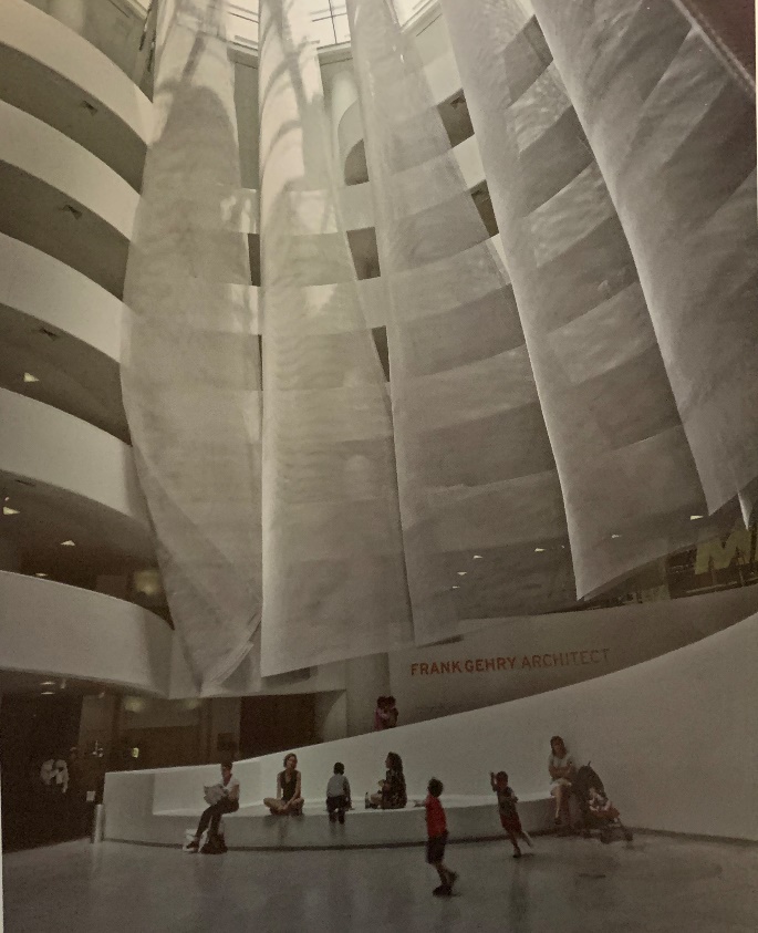
Fig. 9 Installation views of metal-mesh sculpture designed for Frank O. Gehry & Associates for the Solomon R. Guggenheim Museum for the exhibition Frank Gehry, Architect, 2001

Wright had issues with lighting the paintings inside the museum, but his lighting choices on an architectural point of view is very thoughtful. The lighting on the base of the exterior wall is lit in such a way to trick our eyes to think that the building is floating in the air. The lighting strategy gives a sense of weightlessness to the building. Unlike the Guggenheim Museum, the Unity Temple looks robust and heavy. In fact, The Guggenheim Museum is much bigger than The Unity Temple. The museum can house many arts and paintings and allow many occupants to enter at once. The light entering from the dome act similarly to that of the Pantheon. Casting light from one section to another and circulating throughout the building. Suddenly the sun travel path becomes part of the circulation, a part of the performance art without notice.

When it comes to building, Wright’s first concern is the context and site. The second is to provide interior space that is functional and yet sensually and intellectually satisfying.[10] The Guggenheim Museum does have a functional interior space condition and it does provide wonderful satisfaction. The settlement of the location of the museum stands out a lot from the contextual buildings. The museum doesn’t blend in with the surroundings. The buildings along the 5th Ave are rectangular, vertical, and decorated with bits of ornamentations, the Guggenheim counters this regularity with its purely sculptural façade.[11] Wright breaks the rectangular form of the neighborhood by choosing a circular form. He describes Manhattan as a “vast prison with glass fronts,” his dislike of the rectilinear glass windows can be clearly seen on the elevation of the building. He doesn’t have any glass windows on the main rotunda other than the dome and there are some circular glass windows on the second rotunda to the left. Lighting was used between the gaps of the spiral. The lighting gives an illusion of depth tracking our minds into thinking that the inside of the building is exposed to the weather trough the gaps.

The entrance of the Museum is not flush with the exterior wall. In order to get to the entrance of the museum, one would need to walk under the shelter of a ceiling. The ceiling extended beyond the entrance, framing and limiting the views. As one walks pass the ceiling, they are surprised by the amazing interior space. It almost gives a feeling of walking through the frame of a painting. It gives a chance to explore what is beyond the limits of the frame. Being an art museum and having this symbolic meaning makes one want to visit the museum over and over again.

Guggenheim Museum is a one of a kind building and it is on the top list of important architecture. New York is a busy city but Guggenheim Museum gives a good reason for people to stop by and enjoy the architecture and art.

Works Cited

Board, Editorial. “The Guggenheim Caves to Threats – and Squashes Free Expression.” The Washington Post, WP Company, 1 Oct. 2017 www.washingtonpost.com/opinions/the- guggenheim-caves-into-threats–and-squashes-free-expression/2017/10/01/2b64e6a2-a486- 11e7-8cfe-d5b912fabc99_story.html

Joseph M. Siry. “Seamless Continuity versus the Nature of Materials: Gunite and Frank Lloyd Wright’s Guggenheim Museum.” Journal of the Society of Architectural Historians, vol. 71, no. 1, 2012, pp. 78–108. JSTOR, www.jstor.org/stable/10.1525/jsah.2012.71.1.78.

Quinan, Jack. “Frank Lloyd Wright’s Guggenheim Museum: A Historian’s Report.” Journal of the Society of Architectural Historians, vol. 52, no. 4, 1993, pp. 466–482. JSTOR, www.jstor.org/stable/990869.

Watkin, David. “FRANK LLOYD WRIGHT & THE GUGGENHEIM MUSEUM.” AA Files, no. 21, 1991, pp. 40–48. JSTOR, www.jstor.org/stable/29543729.

Sutton, Ian. “Western Architecture: from Ancient Greece to the Present.” Thames and Hudson Ltd., 2004.

“The Guggenheim Museum from the Outside.” Guggenheim, 17 Nov. 2016, https://www.guggenheim.org/arts-curriculum/topic/guggenheim-from-the-outside.

  1. Watkin, David. “FRANK LLOYD WRIGHT & THE GUGGENHEIM MUSEUM.” Page 43
  2. Sutton, Ian. Western Architecture: from Ancient Greece to the Present. Page 18
  3. Joseph M. Siry. “Seamless Continuity versus the Nature of Materials: Gunite and Frank Lloyd Wright’s Guggenheim Museum. Page 78-79
  4. Quinan, Jack. “Frank Lloyd Wright’s Guggenheim Museum: A Historian’s Report.” Page 473
  5. Quinan, Jack. “Frank Lloyd Wright’s Guggenheim Museum: A Historian’s Report.” Page 475
  6. Sutton, Ian. Western Architecture: from Ancient Greece to the Present. Page 303
  7. Watkin, David. “FRANK LLOYD WRIGHT & THE GUGGENHEIM MUSEUM.” Page 43
  8. Watkin, David. “FRANK LLOYD WRIGHT & THE GUGGENHEIM MUSEUM.” Page 43
  9. Watkin, David. “FRANK LLOYD WRIGHT & THE GUGGENHEIM MUSEUM.” Page 44
  10. Sutton, Ian. Western Architecture: from Ancient Greece to the Present. Page 349
  11. “The Guggenheim Museum from the Outside.”


Compare place making and urban planning at Hudson Yards to Battery Park City:

The Hudson yard town is very famous in New York City   because its great and modern architecture. The beautiful urban designed landscapes and remarkable landscaping are what defined this community. Battery Park City is another successful community of New York City equally important as the Hudson Yard. However, battery park city is not identical to the godson yard. They both has their unique essence and characteristic that distinguish one from the other.

According to Michael Kilmmelman New York Times article about The Hudson yard explains that this town is constituted by mostly private developers and few public developers. He also talks about How this west side downtown project contribute in the society. The Hudson is mostly considered as a shopping mall. There’s a brand new architecture masterpiece controversially famous which is called the Vessel.

The battery park city is a neighborhood located in the lower east Manhattan in New York city which is   most likely residential with few commercial areas. The public areas that adorn this remarkable place is green spaces and pavilions. The peaceful environment of the battery park city is very different to the Hudson yard which is in my opinion more noise because is immensely overcrowded by people. The Battery Park City is a less expensive zone compare to the Hudson yards. But, the Hudson yard is built with more expensive materials. As well is more compatibly modern futuristic than the Battery Park City.   The magnificent architecture  happening in the Hudson Yards   relates to few  small places in battery Park City.


Aleksandar Dekic

Professor Jason A. Montgomery

ARCH 3522

12/16/2019

Research Paper: The Empire State Building

Introduction

As we know, the Empire State Building is one of the most recognizable structures and the most famous skyscraper in New York City and in the world. Construction of this building started on March 17th, 1930 and it was completed on May 1st,1931 and contains 102 floors. Architects for this building were Shreve, Harmon and most important William Lamb. The Empire State Building has influenced architecture in nearly every corner of the globe. It was completed in the style called Art Deco, which was influential between roughly 1920 and 1939. More specifically, we can say that the Empire State Building belongs to the late Art Deco style called Art Modern which was less about the ornamentation and more about the building as a symbol of progress. Materials used for constructing this building are steel frame with the use of Indiana limestone and granite, bricks, aluminum, and stainless steel. Empire State Building is declared as a New York City landmark by the NYC Landmark Commission on May 18th, 1981. This building is significant to history because it was the tallest building in the world for 41 years and it is a worldwide known structure. It represents one of the models and base in construction for almost all the future skyscrapers. New York City zoning laws in the first decades of the 20th century were passed to prevent city streets from becoming sunless canyons and led to stepped skyscrapers with seatback which is presented at the Empire State Building.

General Context

Skyscrapers are very tall, multistoried buildings. The development of skyscrapers came as a result of the coincidence of several technological and social developments. The term skyscraper originally applied to buildings of 10 to 20 stories, but that changed in the 20th century where we have the expansion of buildings greater than 40 or 50 stories. The increase of urban commerce in the United States, especially in New York City, was that social element that creates the need for office space. Technological inventions that help in creating these new skyscrapers, like Empire State Building, was invention and installation of first passenger elevators and James Bogardus process of using cast iron frame at first, and then the same process was used with steel as a stronger and lighter material. Over time, the need for building residential skyscrapers grows because of the density of urban areas. Structurally skyscrapers consist of pier deep under the ground, a steel frame skeleton above the ground that dictates the shape of the building and a curtain wall that hang on the girders. The design and decoration of skyscrapers have changed over the years. It goes from Neoclassical and Italian renaissance revival like the Metropolitan Life Insurance Building in New York City (1909), over the Woolworth Building (1913), by Cass Gilbert, as a prime example of neo-Gothic decoration, and the Art Deco style on such towers as the Chrysler Building (1930) and the Empire State Building (1931) (picture1), to the International Style with its total simplicity and redefine human elements in urban architecture and incorporation of plaza and parks with the example of the Seagram Building (1958). (Source 1)

Art Deco is the style that was influential between 1920 and 1939. It was a modernist style with the focus on characteristics unique for the 20th century, which was opposite to a traditional style from the past. This style uses modern materials, like steel and plate glass, and integrate pieces of architectural style from around the world into a unique new style with its recognizable flair. Art deco style is defined with a high level of ornamentation with bright metallic colors, that feature sunbursts, zigzags, and other dramatic shapes that often have a graphic, flattened appearance. More specifically, we can say that the Empire State Building belongs to a style of late Art Deco called Art Moderne or Streamline Modern which was less about ornamentation and more about the building as a symbol of progress. Structures in Art Moderne usually have simpler exteriors so eye can focus mostly on the streamlined shape of the building, suggesting the speed of industrial progress. Architects designed the building to mostly rely on vertical elements that emphasize height. (Source 2)
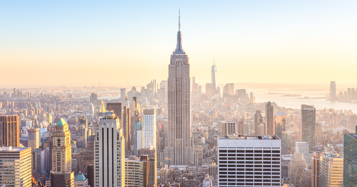
Picture 1. The Empire State Building. Source: getyourguide.com

Theoretical Context

Original owner and the person who creates the main idea for the project of Empire State Building was John Jacob Raskob (picture 2), a former General Motors executive. He chooses Al Smith (picture 3), former New York State governor to be the president of the project. Raskob planned to surpass the Chrysler building by developing the newer and taller skyscraper south of midtown Manhattan. The new building sits on a two-acre lot which occupies the whole block at the corner of 34th street and 5th avenue, at the site of the former Waldorf Astoria hotel, the biggest hotel in the city at that time. Originally, it was proposed to be 85 stories high. It was a big gamble because the location itself was not attractive at that time and comparing to the Chrysler building, it did not have secured any tenants. The great depression also did not help in securing the tenants. But it helped in creating plans for the even higher building which will become taller than the competitor Chrysler building. They marketed the building as docking place for dirigibles and the immigration point inside the Empire State Building. (Source 3)

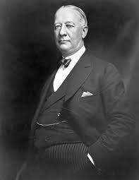
                                              

Picture 2. John Jacob Raskob, The owner of Empire State Building Picture 3. Alfred Al Smith, President of Empire State, Inc.

Source: Britannica.com Source: Britannica.com

In order to implement all these plans, Raskob and Smith hire the architect firm Shreve, Lamb and Harmon who will work on this project. Raskob demanded fast construction of this building to bring tenants and generate revenues as soon as possible. The Empire State Building was designed by William Frederick Lamb (picture 4) of the architectural firm of Shreve, Lamb, and Harmon. Lamb, who came up with a simple design, defined by requirements such as the budget, time limit and New York City’s zoning laws. The building would have a classical composition of a five-story base, a large tower with setbacks (required by the city’s zoning law) and a monumental spire. The limestone facade had little or no ornamentation. What makes the design so great is that for all its simplicity and sheer bulk it has a perfect composition and massing, giving the building a certain grandeur. (Source 3)
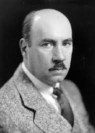
Picture 4. William F. Lamb, the main architect of the Empire State Building. Source: deviantart.com

Elements of the Empire State Building and the methods of construction were very modern and innovative. The Empire State Building was constructed using a frame of steel, a very modern material. Its presence is implied partly by the height of the building, and also by the materials of the façade. The exterior is covered in limestone and granite, accented with aluminum for extra luster. This combination of materials was very common in Art Deco and promoted an aesthetic that was industrial, modern and refined at the same time. The exterior materials of the Empire State Building are pretty easy to notice because there isn’t a whole lot of extra ornamentation. The focus is on the structure itself. At its tip, the Empire State Building is 1,454 feet tall, holds over 2 million square feet of office space, and covers two acres of land. (Source 6)

The Empire State Building spans from 33rd to 34th street and covers the whole side of the 5th Avenue. Much of it was occupied by the Waldorf-Astoria Hotel (picture 5), which opened in November 1897 as the city’s largest hotel with 1050 rooms. It was one of the most prestigious in New York and attracted an upper-class clientele. At the end of the 1920s however, the grand and plush design of the hotel had gone out of style and Waldorf-Astoria decided to build a new, larger hotel uptown. After the site was cleared, construction started on March 17, 1930. Thanks to an efficient design and standardized work – similar to an assembly line – the building would rise at an average of about four and a half floors a week, faster than any other skyscraper at the time. The building was officially inaugurated on May 1, 1931, by the president of the United States, Herbert Hoover.
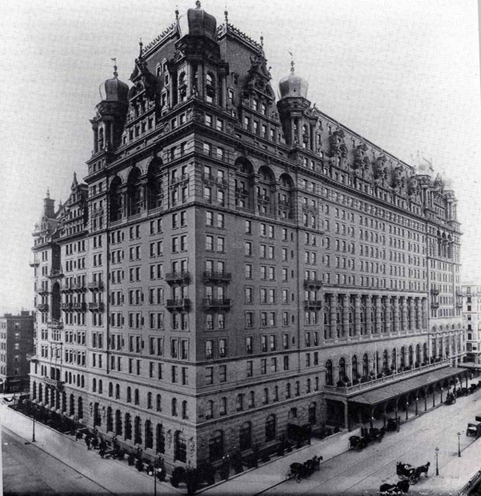
Picture 5. Original Waldorf Astoria Hotel, at the corner of 33rd street and 5th Avenue, at the site where is Empire State Building today. Source: nyc-architecture.com

The Empire State Building was part of the famous Race to the Sky between the years of 1929-1931. During this period, three buildings in Manhattan were in competition to eclipse the height of The Woolworth Building: The Chrysler Building, 40 Wall Street and finally The Empire State Building. 40 Wall Street would top out at 925 feet, while the Chrysler Building was only finalized when a 125 FT spire was added to the top of the Chrysler Building: its final height was 1,046 FT. This hard rivalry to win “The Race to the Sky” was finalized when The Empire State Building achieved a roof height of 1,250 FT and a total height of 1,454 FT, including its’ antenna.

Building Analysis

Analysis of the Empire State Building starts with its stunning height and simplicity. It is built as a part of the New York City 1920s building boom. Together with the Chrysler Building, it represents the power and prestige of the automobile industry companies. The exterior of Empire State building is covered in limestone and granite, accented with aluminum. This combination of materials was very common in Art Deco and promoted an aesthetic that was industrial and modern yet refined. Empire state building does not have a whole lot of extra ornamentation because the focus is on the structure itself.

Empire State Building basic planning starts with the blueprint grid where elevators, utilities, ventilation and pipe shifts need to set in a way to create the conditions for maximum rentable space, and with the zoning laws which allow only the first 30 floors to occupy the whole lot. After that, the building needs to have a seatback of one-quarter of the lot size (picture 6).

Picture 6: Isometric blueprints of Empire State Building looking at the corner of 33rd street and 5th avenue (looking North). Source: Smithsonianmag.com

All this left Lamb and his architects with the minimum amount of space in the center of the building for all these basic elements of the building to implement but on the other hand, to achieve maximum office space for the rest of the building. Also, while the building goes further up, the size of the floor is smaller. The size of the building depended in a great way by the elevator system (picture 7).
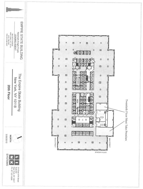
Picture 7. 20th-floor grid at the Empire State Building. Source: sec.gov

The second thing that architects planned was the exterior and that included the development of the floorplan, massing, and the establishment of the height and the strategy for the pinnacle/profile where the building meets the sky. The exterior is defined with the system of vertical strips of windows with limestone walls in between and attached with aluminum spandrels. These window strips are arranged in a system of one, two or three strips running from bottom to the top (picture 8). The only ornamental details are modernistic ripples in the aluminum spandrels and modernistic caps where the window strips terminate at building setbacks. The speed of construction and demand to finish it so quickly, produce this exterior and window system. The architects also mentioned the cost of stonework and its effect on the simplification and speed during construction. Savings in time, labor and money, were created when the windows were set slightly forward in front of the stones and with aluminum spandrels to cover the imperfections on the edges of the stones. That allows fabrication of the stones at the very source, in stone mine, and instant installation of the building materials as soon as it was delivered. (Source 4)
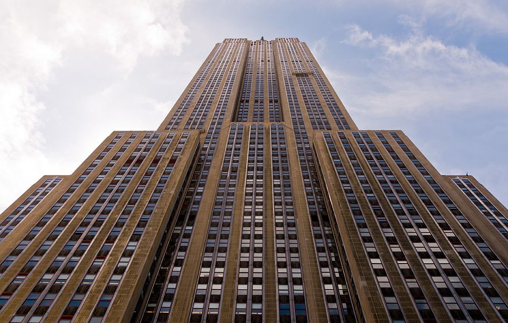
Picture 8. Look at the Empire State Building system of vertical strips of windows with limestone walls in between which are attached with aluminum spandrels. Source: runnersworld.com

The role of the window strips is to break up the mass of the building and emphasize its verticality and to express the simplicity and elegance of the building. The Empire State is symmetrical and without bright colors. Unlike other skyscrapers, the Empire State Building does not present itself as an enormous construction. If you are in midtown, you will only pay attention to its base which is part of its immediate environment, while from a distance it will be just one more skyscraper in Manhattan that represents metropolis like New York City. With its visibility from almost every corner of the city, the Empire State Building represents its uniqueness and serves as beacon for the citizens of New York and New Jersey.

The most notable art deco style elements are in the lobby of this building (picture 9). The building’s interiors were designed with the same idea as the design of its exterior and that includes simplicity of detail, long unbroken lines and great materials. It was also designed to give support to the exterior of the building in the meaning of scale and importance. Entrance lobby at the Fifth Avenue is set up in a long and narrow hall with ornamentation on the wall in a form of the aluminum outline of the Empire State Building (picture 10,11 and 12). Corridors together with elevators and inner store entrances and windows gave this lobby something grandiose which completely agrees with the exterior of the building. Elements of art modern are aluminum art shapes on the wall followed with the aluminum mezzanine bridges and zig-zag ribbed ceilings, all the supplement to the building as one of the greatest in the history. (Source 5)
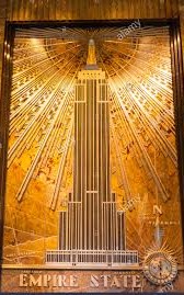
Picture 9: Empire State Building lobby entrance wall plaque. Source: Alamy.com
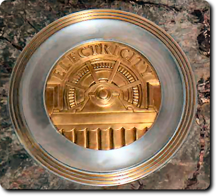
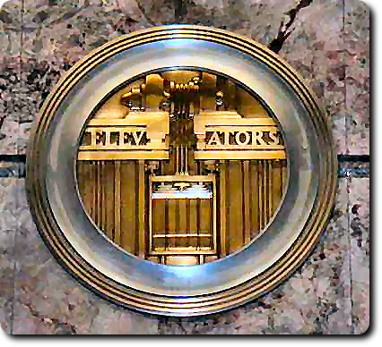
Picture 10,11 and 12. Brass Medallions on a marble wall of the Empire State Buildings entrance hall, work of Oscar Bruno Bach. Source: Interestingamerica.com

The Empire State Building design featured one major setback and several smaller ones. The top of the building is made of glass, steel, and aluminum with the spire which was added in 1950. Originally, the pinnacle tower on this building was meant to be a mooring dock for dirigibles. The amount of material used to construct the building was more than any previous construction project. The steel ordered for the structure exceeded the amount used in both The Chrysler Building and 40 Wall Street combined. Building materials came in from all over the country. Limestone came from a quarry in Indiana, steel from Pittsburgh, cement from upstate New York, marble from Italy, France and England, hardware from the New England states and wood from the American Northwest. The construction manpower employed was more than 3,500 people at its highest. These laborers were immigrants from Ireland and Italy, with a sizable number of Mohawk Indians from upstate New York and Canada. (picture 13 and 14) A primary focus of site management was to keep materials continually feeding construction. There were a series of cranes and derricks which lifted materials from the trucks below, while hoists and other lifts inside the structure enabled speedy movement of materials upwards. (Source 3)
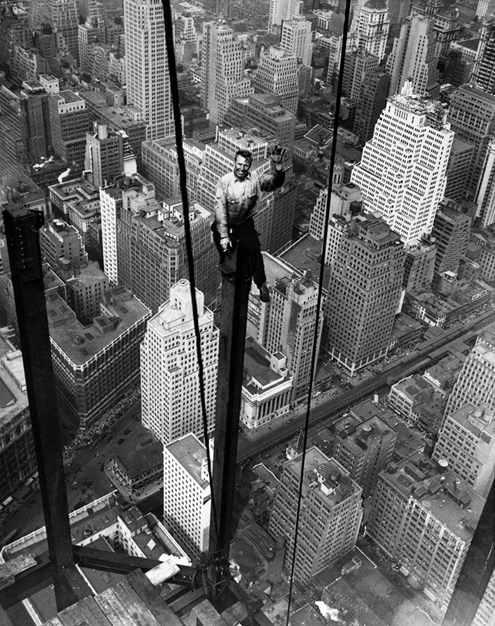
Picture 13. Carl Russell waves to his co-workers on the structural work of the 88th floor of the new Empire State Building. Sep 13. 1930. Source: atchuup.com
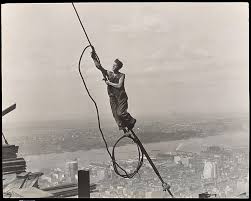
Picture 14. Icarus, Empire State Building, 1930, Lewis Hine. Source: metmuseum.org

Historical Evaluation

The Empire State Building was built before the advent of modern safety standards and measures. There weren’t any hard hats, or perimeter safety netting systems, specified work clothes, tie-off locations or regulations to protect workers. It wasn’t until state and federal regulations emerged that minimum safety conditions were required on all work sites. Five laborers died, while its’ neighbor the Chrysler building suffered no fatalities during its own construction.

The Empire State Building remained the world’s tallest building for 40 years until the North Tower of the World Trade Center surpassed it in height in 1970. It even survived a B-52 military airplane crash to the 78 and 79 stores in 1945, when, except for the limited exterior damage, nothing happened to the building and its general stability and construction.

The Empire State Building together with Chrysler Building represents the golden age of the American car industry and step forward into the modern world and new designs. Without each other, both will not exist in this form of beauty and heights. The Empire State Building was one of the last skyscrapers completed in New York before the Great Depression hit the real estate market. The demolition of the existing building at the site started just weeks before the stock market crash of 1929. This is the biggest reason why the Empire State Building held its title of the world’s tallest building for more than forty years. It was added to the New York City landmark preservation list in 1981, for both individual and interior landmark, which makes this building one of the unique places in the city that are protected both exterior and interior as a building.

References:

  1. Barr, Jason M. Building the Skyline: The Birth and Growth of Manhattan’s Skyscrapers. 2016.
  2. Breeze, Carla. American Art Deco: Architecture and Regionalism. 1st ed., W.W. Norton, 2003.
  3. Berman, John S., The Museum of the City of New York. The Empire State Building. Barnes and Noble Books, 2003.
  4. New York City Landmark Preservation Commission. Empire State Building | LP-2000. Landmark Type: Individual Landmark. Designation Date: 5/19/1981. Designation Report: http://s-media.nyc.gov/agencies/lpc/lp/2000.pdf
  5. New York City Landmark Preservation Commission. Empire State Building | LP-2001. Landmark Type: Interior Landmark. Designation Date: May 19, 1981. Designation Report: http://s-media.nyc.gov/agencies/lpc/lp/2001.pdf
  6. Tauranac, John. The Empire State Building: The Making of a Landmark. Cornell University Press, 2014.
 

Week 14

How does the MoMA garden relate to other spaces in the city? What makes it

special? How does the architecture relate to the space?


The Museum of Modern Art is a unique institution that provides modern art, historical culture, architectural designs and most importantly a beautiful garden which in my opinion makes the museum to stand up again other museums in New York City. At the museum, each floor at the museum is well categorized and organized which on one floor you can enjoy and observed amazing architectural models and drawings. I believed that the museum not only represents modern architecture but also shows the important connection between modern architecture and nature.

The garden is one of the spaces that interact and connects to the building combining both architecture and nature creating a unique special place to be. In my opinion, the garden is an important open space of the museum which attracts the attention of people as they walk through the museum because the garden is visible through the windows at the upper levels. There are sculptures, rectangular pools, fountains and several seating areas where you can relax and contemplate the beautiful views and features that this garden offers.

If I have to relate the garden of the Museum of Modern Art it would be the Lincoln Center ground design which in my opinion has similar designs and features. For example, both have rectangular pools, incorporated sculptures and enclosed spaces surrounded by buildings.  I can tell that both spaces represent modern architecture with nature and modern features.

In conclusion, the garden at MoMA is one of the unique and special spaces in New York City with an amazing view of modern art and modern architecture incorporating nature that give a unique image to the building design which both building and garden coherence one each other.

Week 13

Compare placemaking and urban planning at Hudson Yards to Battery Park City.

New York City is a beautiful place full of skyscrapers with different neighborhoods and communities that have improved through the years. The Hudson yards is the newest neighborhood in Manhattan with massive towers made of steel and glass that resemble the future of the city development. The design and structure of the Hudson Yards is way different than the planning design at Battery Park City.

The Hudson Yards provides a unique image of the city, the opportunity to contemplate amazing views of skyscrapers built of steel and glass which reflects the light of the sun giving an amazing view and experience to see. Also, it represents the future of a new generation full of largest buildings with different designs and shapes. The Hudson Yards not only have amazing towers but it also has on its favor the High Line which in my opinion played an important role in the Hudson Yards development. As you walk through the high line the Hudson Yards is visible and as you are getting closer to the Hudson Yards for a moment makes you feel that you are about to enter to another city.

On the other hand, Battery Park City has a more calculated and circulated space with more suitable residential buildings that have an amazing waterfront environment and green space with no massive towers. Compared to Battery Park City, the Hudson yards is more suitable for reaches people and high-income salaries.

In conclusion, the Hudson Yards marks a new begging and the future to the city development while Battery park city reflects the present that we are now. But in the end, both planning designs are built to take full potential of the land used to generate a well-urbanized city.

Week 12

Compare the Lincoln Center urban renewal planning to Battery Park City’s

planning. How does the spatial experience of the Tower in the Park differ from

the urbanism of Battery Park City?


The Lincoln Center and Battery Park City are places that incorporate open spaces and green architecture to its designs but each one is different in terms of symmetry and use of space. both planning designs compared to the location in which each site is located.

For example, at Battery Park City the design, greens space, and waterfront environment give a unique experience to the site itself creating a beautiful place to be. There are mainly high-rise buildings and open spaces where you can enjoy the views of the city and the Hudson River. Compared to battery Park city, the Lincoln Center is more of an enclosed space surrounded by the city with a symmetrical design. Its performance as a public space its more of an open space surrounded by massive structures and wide spaces to perform different kind of activities.

I feel that the Lincoln Center is more for people that perform arts, the whole site incorporates modern designs and art that are not just incorporated on the buildings but in stairs, fountains, and sculpture, while  Battery Park City provide an integration of open space and building that generates a unique area from the city that takes full advantages of the waterfront ambient which in my opinion attract more people.

In conclusion, both the Lincoln Center and Battery park city share some similarities like the open spaces and green architecture that are visible and distinguish from one another but its functionality and planning differ in terms of design which battery park city is a more circulated space and green space that creates a unique community to the city while the Lincoln Center has more art on it architectural design which bring more people that perform arts.

Compare the Lincoln center urban renewal planning to battery park city’s planning. how does the spatial experience of the tower in the park differ from the urbanism of battery park city?

The Lincoln center urban renewal and the battery park share so many things in common like both provides open areas to the public. On the other side, the Lincoln center and battery park city has some differences like the conceptual idea. The following paragraphs will explain briefly the similarities and differences between the two land mark.

When I visited Battery Park City the first think that came to my mind was the Lincoln Center, I realized the Lincoln center planning compared to Battery Park City planning strategies used by developers are very similar even though the buildings carry out different programmatic and conceptual functions. The Lincoln center buildings purpose is to perform and educate people about cultural art.  However, the buildings that composed Battery Park City are most likely residential or office towers. The Battery Park City could be mainly see as a green space full of vegetation accommodated in small park near the river is more like a representation of nature. The Battery Park City is designed small parks with bunch of benches put together to give the visitors enough sitting areas. Although, the Lincoln Center doesn’t have that much green spaces since is more a representation of cultural histories.

I believe is interesting how the developers stick with the nature idea  in Battery Park City and  in the Lincoln Center. I observed that the Lincoln Center and Battery Park share in common fairly open centers. Also, the buildings are aligned on the side where the side walk is.

« Older posts Newer posts »