ARCH3522 NYC Arch, FA2019

Professor Montgomery

Page 8 of 27

Compare the Lincoln center urban renewal planning to battery park city’s planning. how does the spatial experience of the tower in the park differ from the urbanism of battery park city?

The Lincoln center urban renewal and the battery park share so many things in common like both provides open areas to the public. On the other side, the Lincoln center and battery park city has some differences like the conceptual idea. The following paragraphs will explain briefly the similarities and differences between the two land mark.

When I visited Battery Park City the first think that came to my mind was the Lincoln Center, I realized the Lincoln center planning compared to Battery Park City planning strategies used by developers are very similar even though the buildings carry out different programmatic and conceptual functions. The Lincoln center buildings purpose is to perform and educate people about cultural art.  However, the buildings that composed Battery Park City are most likely residential or office towers. The Battery Park City could be mainly see as a green space full of vegetation accommodated in small park near the river is more like a representation of nature. The Battery Park City is designed small parks with bunch of benches put together to give the visitors enough sitting areas. Although, the Lincoln Center doesn’t have that much green spaces since is more a representation of cultural histories.

I believe is interesting how the developers stick with the nature idea  in Battery Park City and  in the Lincoln Center. I observed that the Lincoln Center and Battery Park share in common fairly open centers. Also, the buildings are aligned on the side where the side walk is.

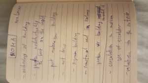
Aleksandar Dekic: MOMA

Aleksandar Dekic: MOMA as a New York City Cultural Institution


Museum of Modern Art is a unique institution which celebrates new and inventive art. Even though it is called the Museum of Modern Art, its collection is mostly more than 100 years old which puts it in a way of an older historical institution. The architecture of the building itself is interesting as much as it is its collection. The building is a grouping of series of periods of construction, with the most recent just completed. It also has two rooms with the architectural collection, one is called architecture systems, and the other one is called the architecture of modern art. This is not my first time to visit this place, but I was again surprised by what it can offer to one visitor.

When we enter the building, there was the main hall with its open space and high ceiling which extends in some parts to the 3rd or 4th floor. Annoying sound from the ceiling, which fills the room from time to time, shows us the great acoustics of the place which would be perfect for the concerts. The main steps are designed in a way that visitors can enjoy in the movement of another visitor, which made human movement in the space an inevitable part of the building. The building will be incomplete without human movement. The same thing we saw when we visited the Guggenheim museum. During my visit, one of our colleges takes a picture of me from the 4th floor while we were on the 2nd floor watching the live performance happening with people in black clothes moving temporary sculptures on the wheels around, as a part of a performance. We were hypnotized with the performance, eager to find out why there are doing that, and what will happen at the end, not knowing that we have been part of somebody’s bigger picture of that same performance, but just from the different angle.

The special place in this institution is the garden. It represents the museum for itself in 2 ways. First, the dynamic and symmetry of the garden are totally in coherence with the museum building that surrounds it. The pool in the garden, together with the sculptures in it, are symbiotic with the architecture of the building, with the seatback on in, and with the transparent glass façade on the ground floor which makes the garden looks bigger like it extends into the buildings hall. The colors that dominate in the garden are white (Granite white), green and black (sculptures) and are compatible with the building on all three sides. And, probably the most iconic thing that makes this garden unique and, some would say the best in the world, are the buildings that surround this area. It is sort of museum or collection in open, with all this building from different periods, and different architectural styles that have a relation with each other and reflects this garden. Here we can see archeology of buildings like postmodernism buildings (ATT building), or art deco buildings or something that looks like Lever Building or another building that has taken the inspiration from the Seagram Building.

It was an amazing experience today to visit this cultural institution and with the help of Professor Montgomery, to see it with the different sets of eyes. To see this “garden museum” which today modern architects are taking into calculation whenever they plan to build some building that is visible from this location. It produces some sort of awe into me, knowing that this garden stands as an architectural angel guardian for the future preservation of everything that is artistically and architecturally important for the “soul” of this city.
Week 11

How do civic centers like Lincoln Center relate to the city around them? Describe

the nature of the public plaza in this civic center.

The Lincoln Center is a postmodern architecture similar to classic style with a unique composition and urban space where the structure design is the main design of the building supporting a window wall. The Lincoln Center buildings have a massive sculpture with a regular scale with a unique structure that seems to be columns supporting the building but is just one massive structure or composition. The façade of each building is facing the center of the public space which there is a fountain located at the center of the Lincoln Center. The center is an open space separated from the street with different elevation from the street. Also, this site seems to be separated from the city where the streets are marking a separation between the city and the Lincoln Center. When you are at this place is quite you can only hear the noise of the water and cars passing through the street and for a moment you just disconnect from the city noise to just this particular site. At this site, planning was useful in an approach of urban planning making this site to be successful in the way the space was used. Each proportion and space have a meaning and purpose because of the way it was designed.

For example, the nature of the public space gives people a different experience at the site where people can enjoy and relax at this place. The design and details that are on this site like a fountain, trees, curved stairs, pool, art figures and building facing each other or facing at the center of the public space define the circulation of the site.

WEEK 10

 Compare the evolution of the exterior skin of these modern office/institutional

buildings. Compare their massing strategies.

With the end of World War two a new era began and a new beginning of modern architecture, architects start to define a new architectural image of the city by creating and reimagining buildings through massing, materials and exterior skin of the building and relationship to the ground. The Lever House, Seagram Building, Citicorp, lipstick building, ford foundation, and United Nations building are examples of modern architecture. Nowadays, we can see this building as an inspiration for architecture that at the time start a new beginning for architecture.

The Seagram building and lever House are similar in terms of shape and design in which both are great examples of the evolution of material and skin treatment, for example, the Seagram building structure has this unique glass material covering the entire building with columns on the outside and inside of the building. The ground floor is where the structure of the building is visible, we can see the use of glass and steel. The entrance is the main attraction as you enter the building you can see this big column which seems to be placed at the middle of the building acting as a support of the building. The Lever House building structure is also visible from the first floor to the beginning of the second floor in which after that is covered with this massive curtain wall made of glass and steel. From the outside at the front facing the Seagram building, this building seems to be floating in space which is an amazing view to look. Also, this building brings nature at the roof of the second floor filled with trees giving a unique experience at the building which is similar to the Ford Foundation building which has nature on the inside of the building supported by these massive beams and massive columns.

The Citicorp Center building and the lipstick building are also modern buildings that not only show an evolution of material and skin treatment but shape and color. For example, the Citicorp building has this unique curve shape and massive columns supporting the entire building elevating the building at a high elevation to the floor. On the other hand, the lipstick building is a circular building with circular columns at the entrance of the building with three compositions above one another.

The united nations building is a glass tower and one of the modern buildings that is not above the ground floor but is connected to the ground floor which was built to represent peace.  Modern architecture brings new ways of construction by integrating new ways of design and new materials that not only change the ways buildings were built but a new way of light pass through the buildings.

Week 9

How do the Chrysler and Empire compare? Describe the massing, materials, and

detailing of each?

Tall buildings had been amazed by people through decades with their massive structure and high elevation from the ground because they mostly were impossible to build. In the 1900s two of the great high-rise buildings were developed marking a new era of skyscrapers the Chrysler building and the Empire State Building, the first of their kind in which at the time were named as the tallest buildings in the world. Both buildings are examples of the Art Deco style in which were built to represent the power and status of the emerging automobile industry.

The Chrysler building structure is one of the tallest buildings in the world with a skeleton frame with an incredible roof design with arches and triangular windows and an antenna at the top of the roof making it look like a glass crown floating on the air at night. The building mass is full of brick, stone, glass and masonry details giving a unique image to the building which in my opinion makes the building stand up again others. How the building is built is interesting because at the bottom is wider and as the building is getting higher the building structure is thinner, likely that each story is on top of Each other to hold the high of the building structure.

The Empire State building was built after the Chrysler building surpassing it’s high and named the world tallest building until the construction of the World Trade Center building. The building count with a unique curtain wall, masonry details, and a structural steel frame. The roof has an antenna but it’s different from the Chrysler building because it doesn’t have arcs or triangular windows but it also looks like the roof is floating at night because the roof is the most illuminated part of the building.

The Chrysler Building and the Empire State building are masterpieces of architecture which started a new generation of classic skylines.  their massing is unique in which are examples of great use of materials and exceptional masonry details.

Research Paper Comments

Everyone,

I am reviewing all submitted papers, but here are some general comments that apply to everyone:


  1. All reference information must be cited with footnotes. You cannot use another researcher’s information without giving them credit.
  2. Your references should not be 100% internet sources. All these buildings are well documented in books and journal articles. Use them!
  3. Integrate your images and drawings throughout the paper, providing captions and citations for each on. Use these to illustrate your points in the text.
  4. If your paper does not follow my outline, adjust it to match my outline before resubmitting. Use clear subheadings for each section of the outline.
  5. Remember that the central idea in this paper is to be YOUR ANALYSIS of the architecture, NOT a historical narrative. Use the outline to guide your analysis.
  6. Many submissions have poor punctuation. Be sure all proper names are correctly presented with first letters in upper case. Be consistent every time you use the same term through the paper.
  7. PROOF READ!!! It makes a big difference to read your paper out loud to someone and see if they can understand it and to detect grammatical errors.
  8. All references must be properly and consistently formatted in MLA style. Use a citation tool/machine like EasyBib or Endnote to help you.

See you all at MoMA at 3:00pm.

Best,

Prof. Montgomery

Week 13 – Hudson Yards

Architecture for the general public is known to be about the upbringing of buildings and residences and the way people circulate or move through a certain space. Yet as a person who goes more in depth with technicality and as you study the focus of architecture more in depth you realize that it’s also about the language an urban project or a specific building has with its surroundings. You come to realize the significance that you want the project to evoke on a person and you also want people to understand the statement that you’re trying to express as an architect or as a group of architects.


Hudson Yards is most definitely one of the newest tourist attractions in New York City. Therefore, it is a very picturesque place but with luxury as a forefront. It’s an urban project that interacts with the High Line creating a larger responsibility in circulation and the proper flow people. As most of us know the High Line is a museum of architecture, a pathway that cuts through neighborhoods and buildings allowing a person to have various experiences. Nonetheless, the High Line achieves all of this with historic significance and smoothness for various blocks; not highly altering the design that a neighborhood already had. Meanwhile Hudson Yards is a project that creates its own world such as the Lincoln Center and Rockefeller Center but I would say in a less successful manner. Every building in Hudson Yards just speaks its own design which is not bad as an individual figure but it’s unsuccessful as a unison besides the entities of glass. Circulation fails to lead you to a main attraction or the tallest buildings as it is done in Rockefeller Center.


Therefore, how does Hudson Yards compare to the urban planning of Battery Park city? I would say that Hudson yards is clearly driven by money and luxury. Meanwhile Battery Park city is driven by the true definition but what architecture stands for which is the interaction of society, the interaction within a neighborhood, the blend and coherence of a new neighborhood with the existing one and the concept of utilizing money for the progression of society rather than the waste and exalt of money.

Week 11

This short writing is about my visit to Lincoln Center. It focuses on how the lincoln center relate to the city around.


At first a civic center can be interpreted as an eminent land area in a community that represent an image of power, dominance, and civic unity. It usually carries space for conventions, sport events, and theatrical entertainment. The lincoln Center is a preforming art center located in Upper West side Manhattan. It’s a complex of buildings design by multiple architects. The lincoln center plan was highly attacked when they first announced it by Jane Jacobs and other Urban planners. They said that” it’s going to be a sterile island cut off from the real life of the city.” I can agree more, during my visit I saw that the center looks different from it’s surrounding, and it takes a large part of the area. With the main entrance facing broadway and the other sides sort of blocking life around it especially on both Avenues, also it’s kinda impractical to access on foot. Jane Jacob said “no neighborhood or district, no matter how well established, prestigious or well healed and no matter how intensely populated for one purpose, can flout the necessity for spreading people through time of day without frustrating its potential for generating diversity.” clearly the center is not an example of a perfect neighborhood. The design ignores the importance of knowing how things work in the city which is short blocks, and mixed uses buildings where people can gather easily enjoying life in the neighborhood.

Nevertheless, the Lincoln Center success comes from the program his offering the people in the neighborhood around with the opera House, Dance, music etc and also because of the mass of stores, restaurants and new housing they started building around it. The building never function as an Acropolis idea but now really represents the city’s most elegant area.

Week 12

This short writing is about my visit to Battery Park City It focuses on the comparison between Lincoln Center and Battery Park City urban renewal planning.


New urbanism it a movement started in the late 80’s and early 90’s were they focus on Jane Jacobs observation on how cities function, evolve and fail. she basically revolutionize the world of architects, planners and politicians with her writing. She saw cities as nonsegregated systems that had their own logic and energy which would change over time in relation to how they were used. She proposed that cities should be built as they been built throughout time with streets, open space, parks and short blocks. The blocks should define the street edges nicely, and people should be able to see the street from their buildings. The lincoln center didn’t adopt any of this new urbanism approach instead the idea ignores the importance of knowing how things work in the city. The center looks different from it’s surrounding, and it takes a large part of the area not allowing any connection between itself and the street or the block. Compare to Lincoln Center Battery Park City really embrace Jane Jacobs approach on how a city should be built. So they changed the previous plan created in the late 60’s with a better one showing a connection with the rest of lower Manhattan. The new plan also contains many principles that makes Battery Park City a great urban environment. Some of those principles was not be self contained ; show a connection with Manhattan grid; reproduce what’s great about New york City neighborhoods ect.

« Older posts Newer posts »