Category Archives: Homework

Jonathan Flores Faking it: Manipulated Photography Before Photoshop Metropolitan Museum

When visiting the Metropolitan Museum of Art I found the exhibit: Faking It, to be very strange, but interesting. The way a photograph can be manipulated into different ways to trick the human eyes is unbelievable. The way people faked a photo was by adding people to a scene or adding anything that was never created into a photo. Everything was done manually until computers were introduced and the inventions of software took off in the later years.

The one photograph that caught my attention was the Dirigible Docked on the Empire State Building. It’s a landscape photo of the Empire State Building and New York City skyscraper. The photo had some shadows, dark tones and high contrast. The white and black color made it look scary as while. However, what caught my attention was the blimp that was on the peak of the Empire State Building. Its looks scary because to me it looked like an alien spaceship on top of the building. After looking closer to it was a U.S. Navy blimp but it was strange that a blimp can be balance on the peak. In result, I knew it was a fake photograph because first, you can tell the blimp was adding onto the building, second, no airships ever landed on top of the building and lastly, it was usually for an aircraft to fly that low. Taking everything under consideration I knew it was a fake photo. The reason for it was to make the Empire State Building a popular site in New York and to draw attention for people to visit. Also, they wanted the Empire State Building to be the best skyscraper in New York and take out the Chrysler Building who people thought that was best building at that time. When Empire State Building was built the creator thought by them adding a blimp that it would’ve lasted along time but the fake report surfaced and then it was edited.

The process that was used in the photograph was called photomontages which mean they take two different elements from each photos and combine them into one piece. In other words, it a kind of collage that is composed of the photographs or fragments of photographs in order to direct the viewer’s mind such as the blimp on the Empire State Building. The reason why photomontages was used because bringing two different images into one image can bring the message of the photo and to trick how the mind may think of a photograph. In today’s world, creating a photomontage is much easier than before; you now have software such as Adobe Photoshop, Paint Shop Pro, Photo paint or GIMP.

The Metropolitan Museum of Art was a great experience; I got a better understanding on how photograph was manipulated and the process behind it. The way photographers transformed two different images into one creative image is amazing. In today’s world the way you fake a photograph so much different than before. Before you would have to create a fake photograph manually by cutting out the images and pastes it together. Now you have Photoshop which is much easier than manually doing it and it does all the work.
 

1 Comment

Filed under exhibit review, Homework

Museum Faking It Exhibit

Thompson Truong
Professor Michals
Gra2330
Faking it: Manipulated Photography before Photoshop
On my visit to the Metropolitan museum I’ve witnessed a lot of great works by some of the best photographers and artists around the world. One of the exhibits that caught my attention was the Faking it exhibits. I thought that this exhibit was great and it definitely shows the evolution of photography and retouching.
The Faking it exhibit consists of before and after pictures have been retouched. The most interesting part about this exhibit was how the photos were retouched. Before we had the technology we have today people did everything by hand. Just like the pictures that were in this exhibit. A photo that has definitely caught my attention was a photo by Jim Shaw. He used created illustrations of ordinary people and turned them into bizarre like creatures by retouching them. It is a Gelatin silver print and the photo was created in 1978. The way the before picture was laid out the theme was definitely interesting. The man in the photograph was symmetrical and was looking directly into the camera. The surrounding of that portrait was like a dark tone. While near his body there is sort of a light glow around him. It was surely an intricate photograph. The positioning, the tone, contrast and darkness of the picture captivated my attention and I think that Shaw wanted to capture the audience’s attention like that.
The exhibit showed a lot of great work by different artists and photographer’s retouching photographs. When I walked into the exhibit the first thing I thought to myself was how different the retouching and photography would be in today’s standards. With the technology we have today it is not a surprise that I would compare how a retouched photograph would be done with the programs we have now, such as Photoshop. The picture that I can describe about would be the retouched photo by Jim Shaw. This is the picture that he turned humans into reptile looking creatures. All of this is done by hand and it was done in 1978. I wondered how much time it took him to finish the retouching. The retouched photo showed exactly why the exhibit was called faking it. The head of the human was cropped off and a reptilian like creatures head was put in as a replacement. Every little detail had to be done by hand and I was amazed how things were done back then.
The whole theme of faking it impressed me the most. How we can take a flawed photo to retouch it and make it into a whole new photo. Retouching photos by hand every single detail was fixed by hand and there were no such things as an undo button so if they messed up they would have to redo the work again. The audience they aim for are designers, artists, photographers etc. In terms of a general audience I believe that different pictures would captivate different people’s attention unless you are an artist, designer etc. This is definitely an exhibit to visit for anyone because it shows how much work designer’s put in to get a piece finished and their work should be admired and appreciated.

1 Comment

Filed under exhibit review, Uncategorized

Museum

The exhibit in Museum of Modern Art was interesting in way they take the techniques of contrasts and sizes to make an image come alive. The black backgrounds added to the overall feeling of darkness and mystery within most of the images. The image had elements that applied to all viewers like the use of use of highlighting contours of the body and also the movements that person is creating with their body.

One piece that I saw interesting at the exhibit was an image of an eye and cutter on the black background. The black background makes the white background of the eye standout but also pop out. The differences in background bring focus to the reflection of eye and also the original eye with the eyelashes. The eyeball is enlarged and the main attention of the photograph of the eye. The enlargement of the eye gives the photograph the overall feeling of creepiness and fear. The light is coming from the front where the eye is staring at us. It feels like us as viewers are looking through the eye in a way that makes it our one eye just up close and personal. The contrast between the white and black but also the light and dark makes certain elements of the eye stand out and also come alive. The ways the squares are going back in the cutter create depth of field and perspective. It feels like the squares are going back in space. The artist that made this image was Anne Collier.

The second piece that I saw the exhibit as a new take on photography where artist challenged the principles of photography. They take the old techniques and highlighted certain aspects of the photograph. A second piece that I saw interesting at the exhibit was an image of a male driver that seems strong and has a good body. The man’s muscles are showcased in the photograph as he is driving from the platform. The photographer is using sidelight to highlight the contours of the man’s body. In this photo the muscles in the legs were the focus of the image but also the movements. The photo was asymmetrical with the positing of the legs. The leg give impression that the man was about to dive right into the water and make a big splash.

A third piece that I saw interesting at the exhibit was an image of a woman’s face and up to shoulders. This image is the only piece in color. The pose is very interesting and creates an asymmetrical composition. The woman is not seating in the center which makes the image unique. The colors bring the overall image to life and make it vibrant. The image looks like it was dropped in the water with the bubbles it produces and looks ruined. The eyes are looking away from the camera where we as viewers can only see one eye which introduces a new style in photography. I find the use of image to just make the image really pop and make it the best it can be.

Leave a Comment

Filed under exhibit review, Uncategorized

Museum Essay

Jessica Echevarria
Prof. Michaels
GRA 2330

New Photography 2012- MOMA

In class this semester we have examined different photograph styles, techniques, lighting, and some examples of work from famous photographers. The exhibit at the MOMA museum showed portraits, landscapes, political issues, social issues, and gender based photos. The theme that was most consistent was how they all evoked emotion related all around social issues. In this paper we will discuss the style techniques, used to evoke emotion in photography. Also how the artist is influenced by the subject they are photographing and how it is displayed to the audience.
The following works from photographers such as Michelle Abeles, Zoe Crosher, Birdhead, Carter Mull, Valie Export, and more display different styles, and how they influence much of today’s photography. In Michelle Abeles photos she used objects such as terra-cotta, wine bottles, newspaper, printed fabrics, and nude male subjects. All these material are cropped and meshed together to create a distorted and confusing image. She started combining photography and placing digital work in them. This is how photography is used today on computer screens. Artist Zoe Crosher composes self portraits in her works. Her works show a feminist role when she dressed as a nurse and emulates Mae West in those photos in the 1930s. She has different stills of herself in the nurse’s outfit in different tones. The ones where she appears as Mae West she looks strong, confident, and seductive. Crosher manipulated photos such as we do today digitally; she crumpled, re-photographed, and placed them on metallic paper making them shimmer.
The photos that Robert Heinecken produced involved magazine page light sensitive paper, and then exposing it to light. His image showed vanity and consumption and show recto/verso and how media culture influences us today. Another feminist photographer was Valie Export she in the photo she contorts her body to fit against the sidewalk protesting against conformant. The shapes in her photo fit the built of reality in photography. I believe that the artist show’s early styles that are used in modern photography today. In export photography we see how strong lines and shapes in the human form are used today and in her work. We can see how social issues are displayed with different styles to make the photos appear strong in this exhibit.
I was most impressed by the wide range of artist such as the works of Grete Stern and his work “Suenos” which uses the psychoanalysis of dreams. It also uses two photograph combined together using photo manipulation. The woman is the stem of the lamp in which the man is going to grab hold of. I would’ve liked to see more work from a certain movement or protest period such as the seventies. It was impressive to also see the combination of early styles of photo manipulation, digital composition, figures, and lines that we use in modern photography now. The intended audience is the photographers of today to be inspired by the environment around them, digital styles, social issues, and also use others work to inspire their own.  This exhibit helped me see how digital and photographic work can create an emotional and compelling feels too many of the thing we produce today. In seeing old photographer work I was able to see how they used their own inspiration to be creative and out of the box.

1 Comment

Filed under exhibit review, Uncategorized

Brooklyn Historical Museum

Visiting the Brooklyn Historical Museum was a great experience. We looked at different types of Daguerreotypes photos. Daguerreotype was the first successful photographic process. Depending on the angle view and the color of the surface reflected into it, the image can change from a positive to a negative. A Daguerreotype is a picture with direct-positive process that creates high detailed image on the sheet of copper plated. A thin coat of silver is used to block the negative.  This process was tough to maintain because you first have to clean and polish the surface until it looked like mirror. Then the plate would be closed inside a box until yellow rose appear. After being exposed to the light, the plate was made over hot mercury until the image appears. Although you can have problem with the image coming out correct, using salt and tones with gold chloride will fix the detail of the image. Digital photos are different than Daguerreotypes when comes to the process and features.  Digital photos you have pixels that sharpen the image. When it deals with exposure of digital photos are much faster than Daguerreotype. To take a Daguerreotype photo you would have to wait a least 30 minutes. Also, Digital photos have flash, zoom, production, enhancing and resolution.

Leave a Comment

Filed under Homework

The Epitome

This image captures the true beauty of this flower.  It truly depicts shallow depth of field.

The foreground is alluring — it makes me want to use my other two senses-touch and smell.

Even though the flower is in sharp focus, it does compliment its background-providing vivid contrast.

Leave a Comment

Filed under Homework

HW #1

In his series of photographs “Stepping Through the Ashes” Eugene Richards has chronicled the immediate aftermath of 9/11 in dwntwn Manhattan. In the positive space of this picture he has captured a magnitude of “missing” flyers that went up in the following days. It is def. not an ad and I can imagine that this could have been used in “Newsweek” or some other magazine. Being from NY and having a vivid memory of 9/11 I know what this is an image of, but w out a caption or the context of 9/11 I dont think he was close enough to tell the whole story of this wall. In fact there is another shot of a close up one of the flyers in the series. Through the “hole” you are drawn to the scene and by looking closer your eye is forced to see the little black boxes which are pictures of the missing people.  The police barricade acts like a line to bring you back to the center of the image when your eye wants to follow our instinct of reading from left to right. The soft focus ensures that the viewer doesnt focus on just one flyer but instead realizes there are many. There is a sense of “the lost” and “loss” in this picture and it is extremely somber as are  the majority of the photographs in this set. Being black and white also adds to the somber tone (of the series), being devoid of “color”.


1 Comment

Filed under Homework, HW1

Sandy Truong Hw #1

Jeff Chien-Hsing Liao

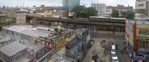
Long Island city

#1- The Photograph is a pigment ink print

#2- Liao’s is trying to show a separation by the taking the picture overhead showing the train in the middle separating both sides showing major differences.

#3- The train appears to be sharper because it runs horizontally across the page showing a separation between the streets.

#4- The main focus of this image is the train and its powerful because of how it separates the image almost in half.

#5- The train, catches my attention first, then moving on to the graffiti buildings because of the colors and finally to the other plain and peaceful side. The graphic elements are important or else the image would be a mess.

#6. This photograph has a strong meaning behind it. It clearly shows the separation by the train.  One side looks peaceful and calm while the other side looks loud and messy .

#7. The image makes me feel segregated like, like i don’t know which side to go to.

#8. All Liao’s images are located near train station or on train stations.

1 Comment

Filed under HW1

Digital Photography: GRA2330 7366

  1. It was a sidelit photo. The light was coming from the right side of the photograph casting a little bit of shadow. It’s also a low key photo and has dark tones.
  2. The picture seems like its capturing simplicity. There’s not much to it, just a picture of a room and not a lot to it.
  3. I believe the picture gives a sense of silence. It doesn’t have a strong point or a particular point of focus.
  4. I don’t believe technical matters hinder the picture. It seems like it all had to do with lighting and where it was taken from.
  5. Graphic, tone, line, and perspective are important but not so much in the picture to me. It was just an empty room that went from being completely dark to a little bit of lighting in the middle.
  6. It doesn’t reveal that much.
  7. The emotion this picture gives off would probably be sadness, mainly because it’s an empty room and not that much light or life to it.
  8. The photo that I choose relates to the others that this photographer took because all his photos are taken indoors. He mostly takes pictures of elegant rooms. His photos relate because they’re all indoors and have a certain feel behind them. Even though some of them might be an ordinary room and others might be elegant, they all have an emotional feel towards them.

1 Comment

Filed under HW1

Thompson Truong Hw 1

Thompson Truong

September 5, 2012

GRA 2330 Digital Photography

Flat iron building 2011 Jeff Liao

1. It is a scenery type of photograph.


2. The photographer may be trying to tell us about the everyday life of people. Showing the amount of boats moving back and forth tells us about the work people put in every day.


3. From the overhead view you can see low key has been used so the overall picture has a darker setting.


4. Technical matter does help the picture. From the overhead view the deep space of this photo can be seen and overall it shows the busy theme the photographer is trying to show you.


5. Yes it is. Perspective is important, when I look at the picture I look at the center of the picture first being that the picture is focused on the water. The deep space of the picture made me look from one ship to another and thinking about the photographer’s intentions.


6. At first when I look at the picture I thought it was just a photo of the scenery but as I looked closer I can see ships moving back and forth which made me think that the theme of the picture is the busy lives that people live through every day.


7. The photograph displays a busy type of theme such as the busy lives of people every day.


8. This photograph and his other photographs in the same series are alike because they mostly focus on the scenery of cities. It also shows a busy type of theme as well.


1 Comment

Filed under HW1