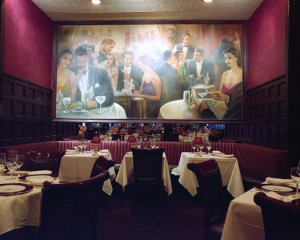
The photographer that I chose is Robert Mann’s image #17. Mr. Mann depicts this image of Delmonico as warm and inviting which was created by the dark tones. This advertisement also represents the glamor of New York City. Mr. Mann’s main goal is to create focus. He wanted to direct the viewer’s attention to this bold portrait-which creates a great conversational piece. This image was taken solely for advertising purposes.
The photographer emphasized on scale to convey selective focus.
Technical matters did not hinder the image in this setting. Mr. Mann intentionally did not place anyone into the frame, so he can capture the beauty of this scene and not to subtract from the image’s focal point.
Graphic elements are important in this image. In this one point perspective advertisement, the gigantism of the portrait is my view point, and its where my focus returns to, which in turn, creates positive space.
The illuminating lights on the photograph place emphasis on the portrait’s focal point. In addition, the lighting creates a sense of texture on the walls.
The hues of this photograph creates contrast with a low key tone.
This advertisement of Delmonico, relates to the other images by tone and contrast.


You describe the image by Wijnanda Deroo of Delmonico’s well. It is warm and inviting. While taken by itself it could be used for adverting, Ms. Deroo has done a whole series of New York restaurants from the very fancy to the very simple which becomes a catalog of the entire city.
It is very interesting that there are no people in any of the photographs in this series. I think you hint at why. Deroo wants the places to speak without the complications caused by individual people.