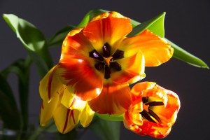
I chose this photo from our best four list because of how well the flower fits within the frame. The almost symmetrical placements brings balance to work not giving too much attention to the white space. Also the lightening emphasizes the orange tones of the flower which allows it to pop from the background even more. But the best part of this photo is the way the light slightly hits the inside of the main flower, thus bringing the purple alive. Another thing I really enjoy about this photo is the way it expresses the stages of a flower, the flower on the left is closed off, the one on the right is slightly opened and the middle is all the way open; in fact, that supports the tone I feel from this which is of a peaceful early morning, from the way the light hits the flowers like the sun to the stages of the flower opening.
-
Recent Posts
Recent Comments
Categories


the composition of this photo is symmetrical. the lighting is high contrast and because it is coming from the side at a relatively low angle as opposed from over head, I agree t could be said to have the feeling of the morning.