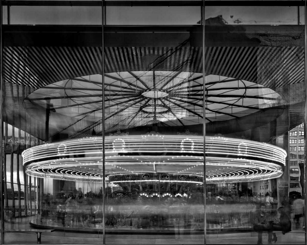
The photograph I chose is called Jane’s Carousel. It was taken in 2011 by photographer Matthew Pillsbury. The photograph shows a spinning and lit carousel, probably taken using a slow shutter speed. The carousel itself is located in the Dumbo area of Brooklyn, New York. The purpose of the photo is to show motion in an otherwise immobile medium. In a sense, the photo kind of feels like a cinemagraph. The grayscale component of the photograph portrays a calm and organized mood. A full color version of this photo would not have had the same effect.
The photograph uses some composition principles extremely well. A frame within a frame, symmetry, and contrast are all used to make a striking visual presentation. A frame within a frame is shown by the vertical lines on the glass walls surrounding the carousel. The glass frame is naturally framing the carousel inside the frame of the camera lens. This frame within a frame goes hand in hand with the compositional principle of symmetry. The vertical lines on the glass naturally split the photo into thirds, with the leftmost and rightmost third containing the same “amount” of carousel. Split down the middle, the photograph is perfectly symmetrical. Contrast is shown with the illusioned motion of the bright lights against the dark background and surrounding elements. This let’s the viewer primarily focus on the lights and it’s implied movement.
The principles of a frame within frame, symmetry, and contrast definitely help create the calm and organized mood. Frames, symmetry, and contrast in any form of design create a sense of order and organization. Overall, these principles coupled together with the grayscale component make a strong case for a consistent mood. Jane’s Carousel by Matthew Pillsbury is a great photograph that takes many things into consideration and delivers them powerfully.


Great choice. Symmetry, frame within a frame and contrast are all key players here. I love how the vertical lines of the building exterior pin down and control all the movement and energy of the carousel.