Statistics & Probability | Instructor: Suman Ganguli

Category: Projects

Personal Data Project – Instructions

Please hand in your spreadsheet with your Personal Data Project by Thursday, May 27. Submit either the share link or the spreadsheet file on Blackboard, under the “Personal Data Project” Assignment.

Your spreadsheet should contain the following:

  • your recorded data
  • summary statistics: mean, median, max, min, standard deviation
  • frequency table and frequency histogram
  • optional: time series plot (data over time)
  • a short paragraph describing your project:
    • background: what variable you chose, why you were interested in that variable, and your method for recording the data;
    • some comments on the summary statistics, including any patterns you notice in the frequency distribution and/or the time series plot

You can consult my Personal Data Project spreadsheet and use it as a model.

Gapminder: Data & Scatterplots

Please visit and explore the Gapminder website which I will show in class after spring break:

  • the homepage Gapminder.org has links to various features on the site
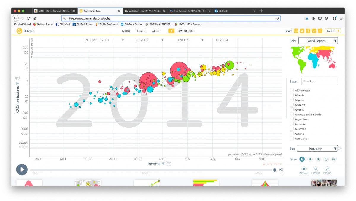
  • the Tools page has an interactive scatterplot tool which I will show in class:

GapMinder has a LOT of data that is available for download, and so is a very good source for project topics and datasets.  They provide datasets for 519 (!) different “indicators” listed alphabetically–everything from “Adults with HIV (%, age 15-49)”) to “Yearly CO2 emissions (1000 tonnes).”

Browse through the list to get some ideas for project topics (clicking under the “Download” column downloads the data in an Excel file; clicking under “View” opens a Google spreadsheet with the dataset.)

Here is a scatterplot I will show in class titled the “Wealth & Health of Nations“, as measured by life expectancy (a measure of a country’s health) vs. GDP per capita (a measure of its wealth):

gapminder

GapMinder actually shows a time-lapse animation of scatterplots, showing how this paired data set evolved over the past 200 years.

(In fact, they produced a video called “200 years that changed the world” in which Hans Rosling, the medical doctor and statistician who created GapMinder, provides commentary on this time-lapse data.  Rosling became widely known through his TED talks. His first one, from 2006, is titled “The best stats you’ve ever seen“–it’s worth watching!)

Project #1: Personal Data Collection & Analysis

For this project, you will collect and analyze data regarding some “personal metric” of your choosing. This project will count as 5% of your course grade.

Choose your variable:

Choose something you’re interested in measuring about your daily life. We will discuss some examples in class this Wednesday (and we will post some ideas in the comments below).

You can get some ideas by searching the web for “quantified self” or “self-tracking.” In fact, there is a recent MIT Press book titled Self-Tracking, which has this in its description:

People keep track. In the eighteenth century, Benjamin Franklin kept charts of time spent and virtues lived up to. Today, people use technology to self-track: hours slept, steps taken, calories consumed, medications administered. Ninety million wearable sensors were shipped in 2014 to help us gather data about our lives. This book examines how people record, analyze, and reflect on this data, looking at the tools they use and the communities they become part of.

https://mitpress.mit.edu/books/self-tracking

Deadline: Choose your variable by Monday, Feb 22.

Data collection:

After you have chosen your personal variable, start recording your data on a (more or less) daily basis:

  • Set up a spreadsheet with columns for “Date” and “[Variable name]”; you can also include a third column for “Notes.”
  • Each day, enter the data in your spreadsheet.
  • Use the optional “Notes” column to record any information that may be useful later when you analyze your data (for example, to explain outliers).

Data analysis:

At the end of the semester you will use your spreadsheet to

  • create a frequency table and histogram using your data
  • create a time series plot of your data;
  • compute the standard summary statistics (mean, median, variance, standard deviation);
  • briefly describe (in 1-2 paragraphs) the distribution and analyze the summary statistics.

Further details (and an example) on how to describe the distribution and analyze the summary statistics will be discussed in class over the course of the semester.